About Recentdesigns
Recentdesigns is built for people who collect great work: design archives, inspiration libraries, studio showcases and curated portfolios.
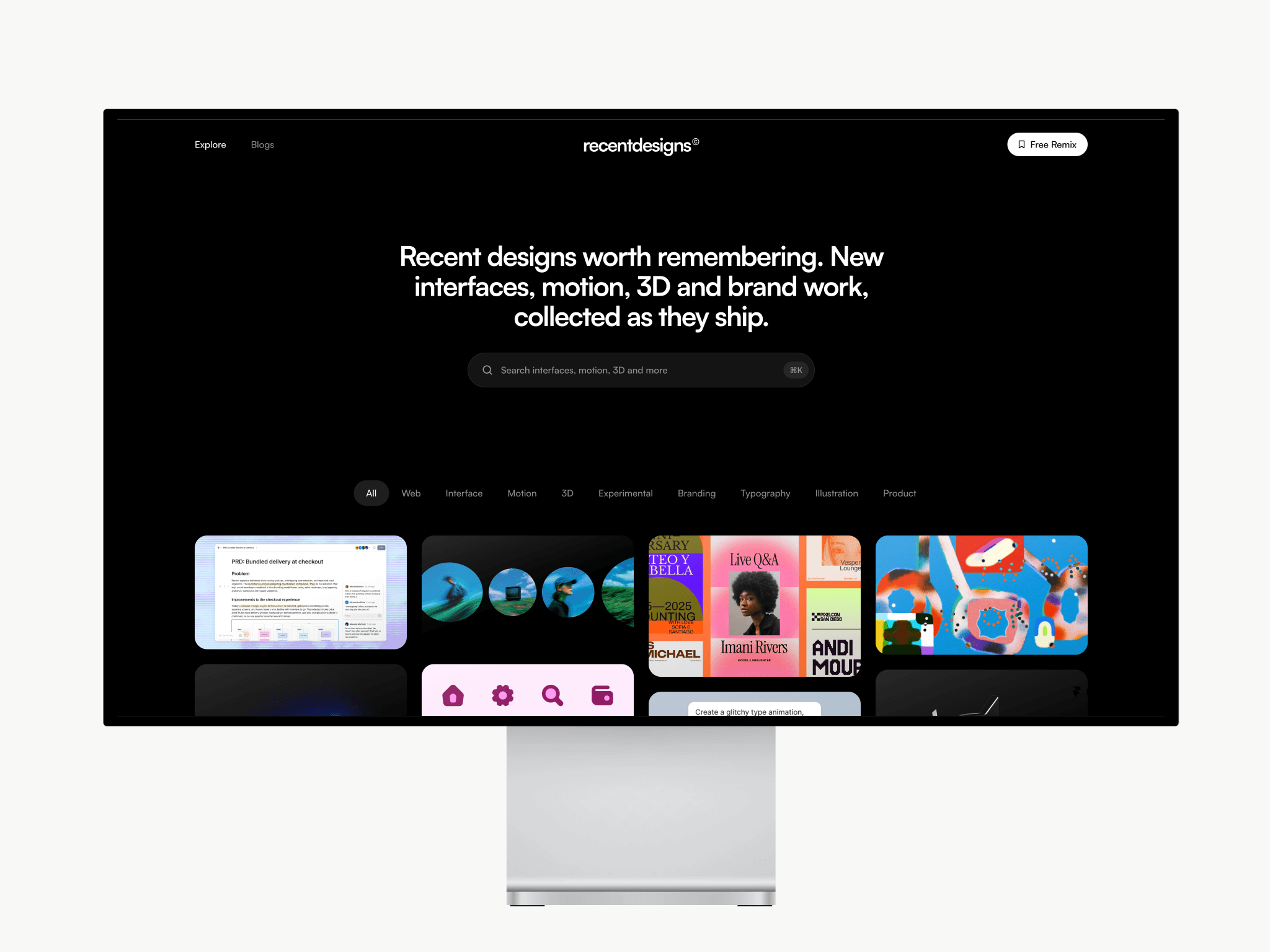
The home page opens with a clear headline and a search bar, followed by category filters and a masonry grid. Every card keeps its image or video at its natural shape, and videos play right in the grid.
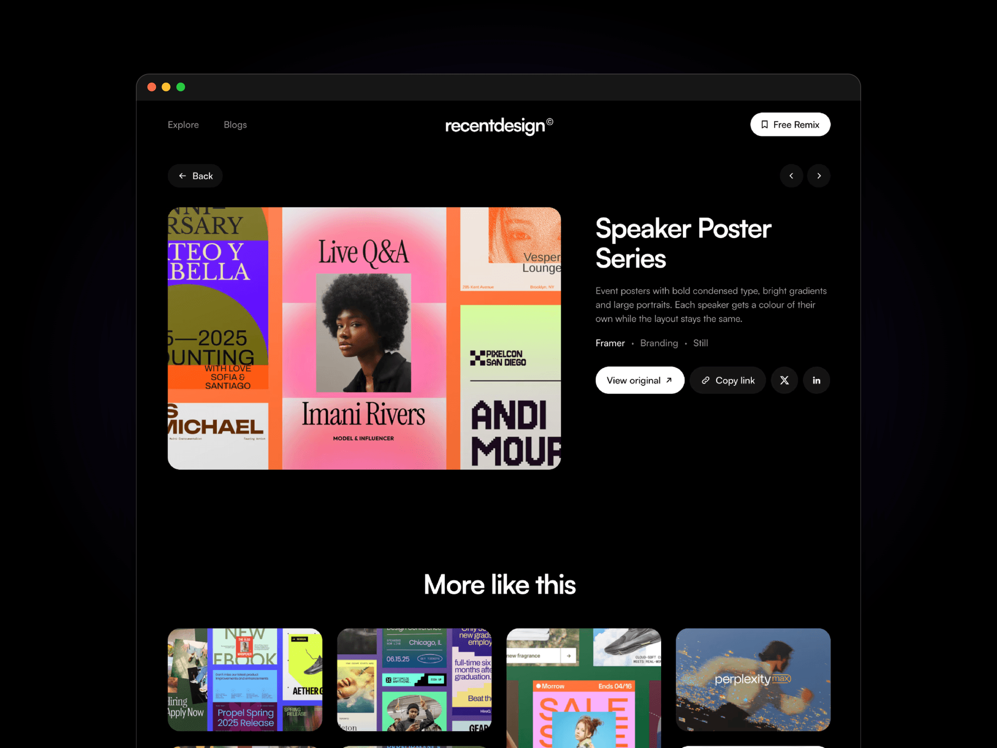
Each piece gets its own page, with the image on the left, a short description, credit and category on the right, and buttons to view the original or share it. Related work appears underneath.
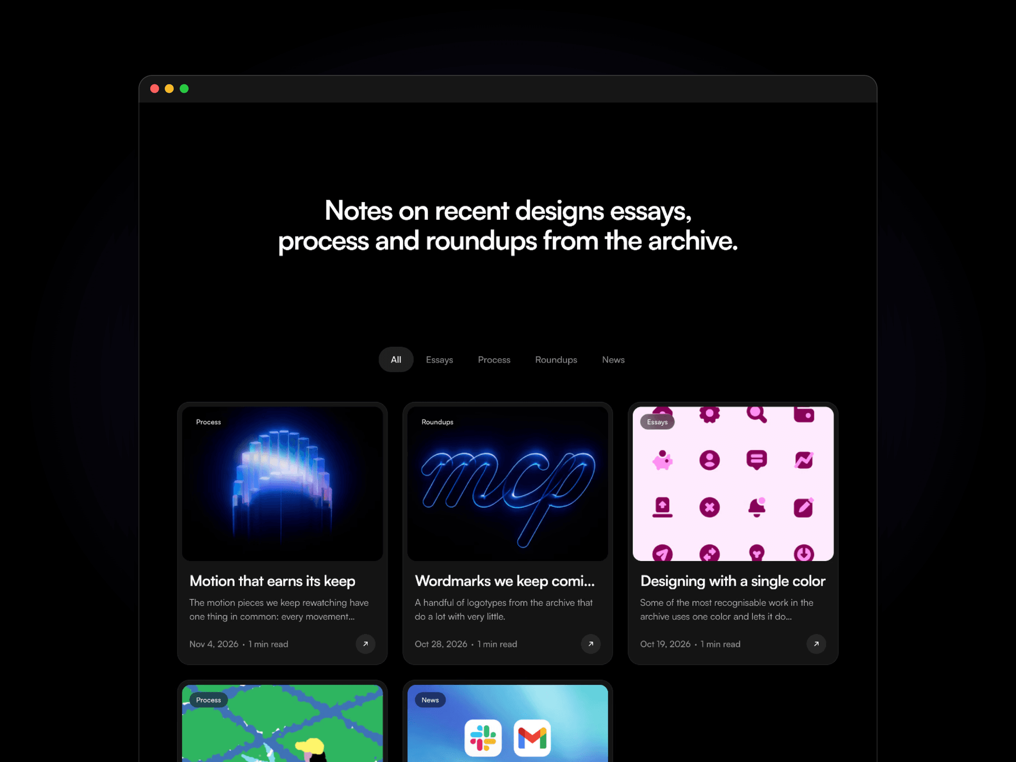
A built-in blog has cover images, topics, dates and read times, with topic filters, a featured post and “Keep reading” suggestions.
Everything is managed in the CMS. Add a work or a post, upload an image or video, and the grid, filters and detail pages update on their own. Desktop, tablet and phone layouts are tuned by hand.
Features
CMS-driven archive: works with an image, an optional video, a category, a description and a source link.
Masonry grid: cards keep each piece’s natural shape, and videos autoplay muted on a loop.
Category filters: nine categories (Web, Interface, Motion, 3D, Experimental, Branding, Typography, Illustration, Product).
Site search: a search bar in the hero opens Framer’s built-in site search.
Detail pages: image on the left and details on the right, previous/next arrows, and a “More like this” grid.
Share buttons: Copy link, Share on X and Share on LinkedIn (a small code component).
Blog: topic filters, a featured post, cover images, dates, read time and rich text articles.
Motion: the headline reveals word by word, pages fade between each other, and cards and buttons have hover states.
SEO: page titles, descriptions and per-item metadata are set.
Responsive: separate desktop, tablet and phone layouts, with content capped at 1440px on wide screens.