About The Stillform
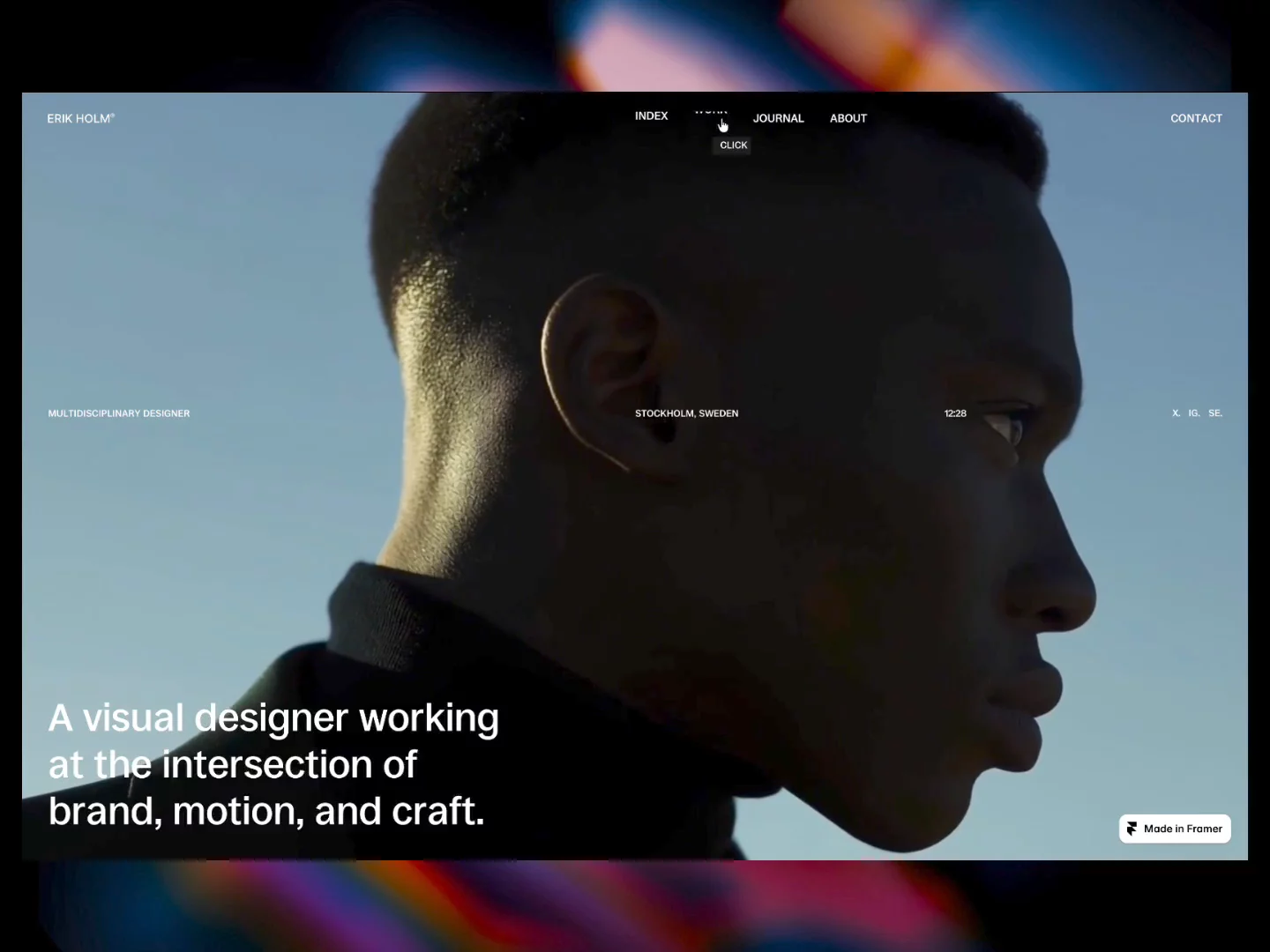
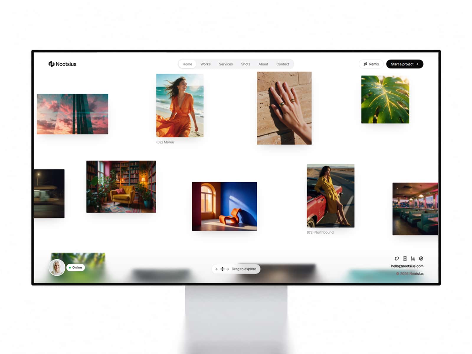
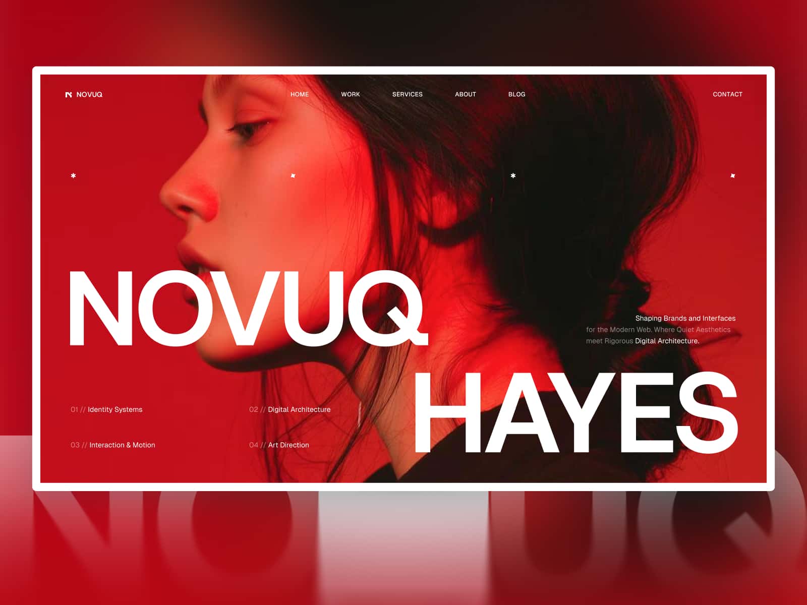
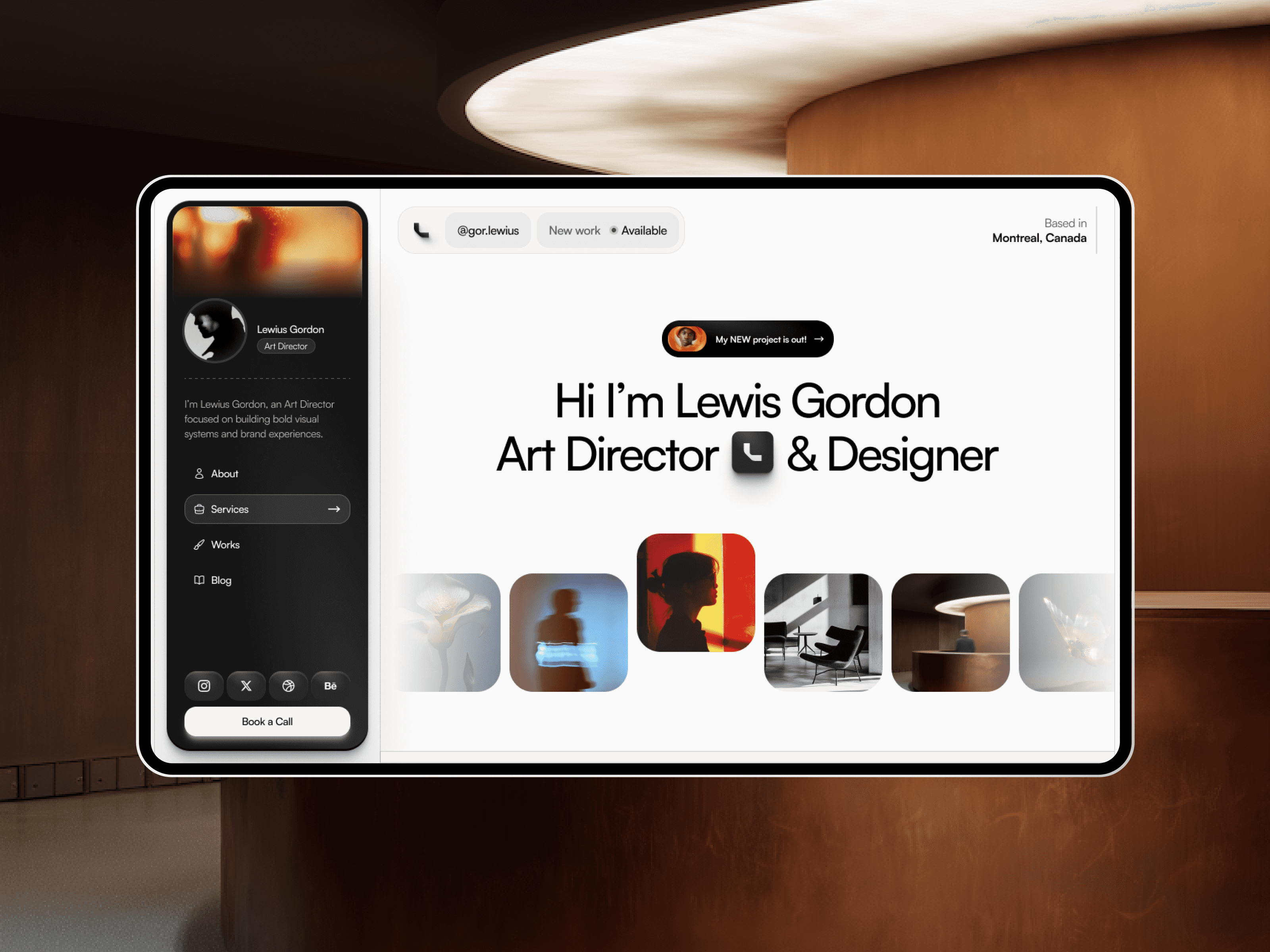
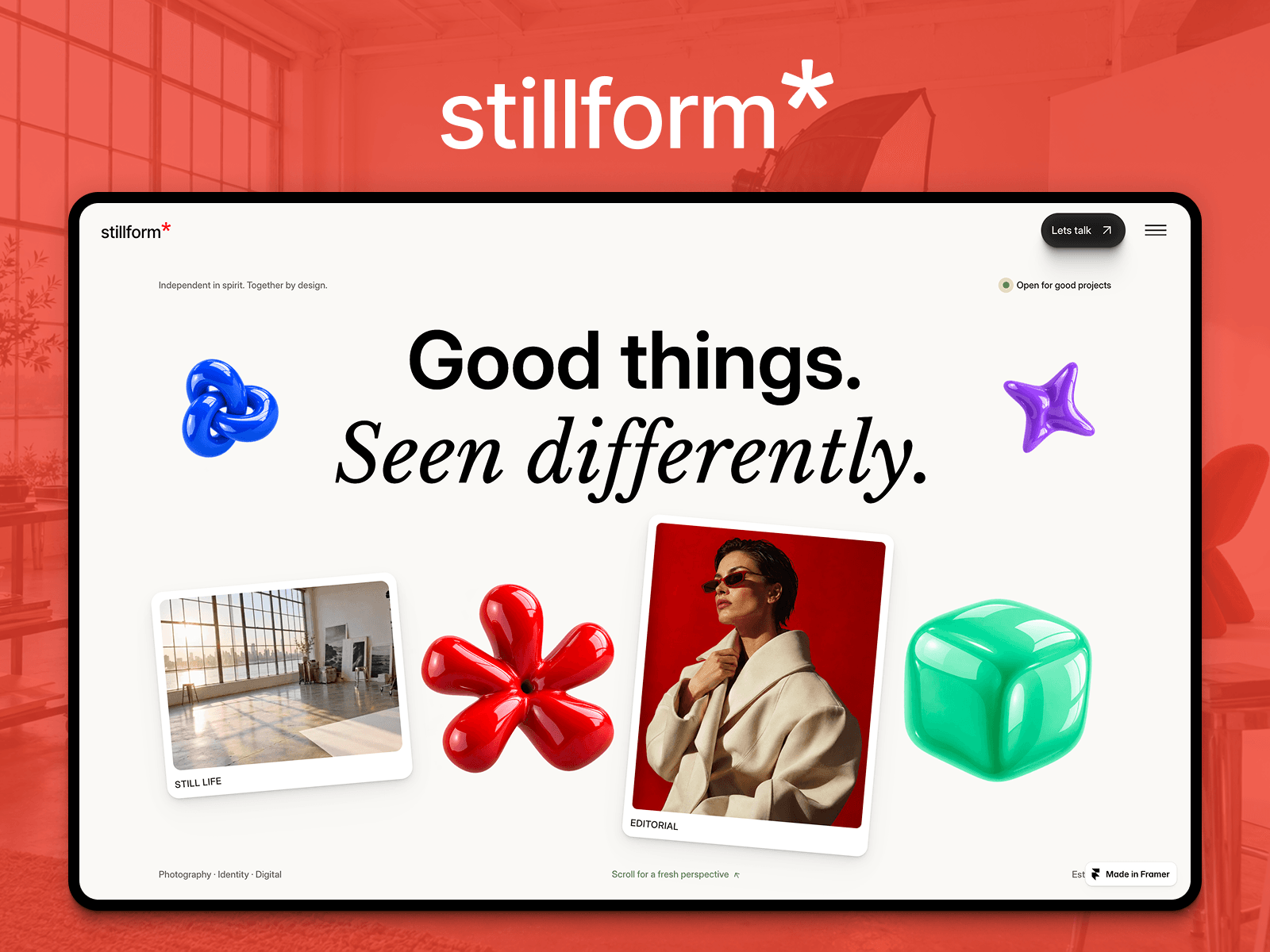
Stillform — a quiet, editorial portfolio for design studios.
Stillform is built for studios and independent designers who want the work to speak first. Generous whitespace, confident typography and restrained motion — a site that feels considered rather than loud.
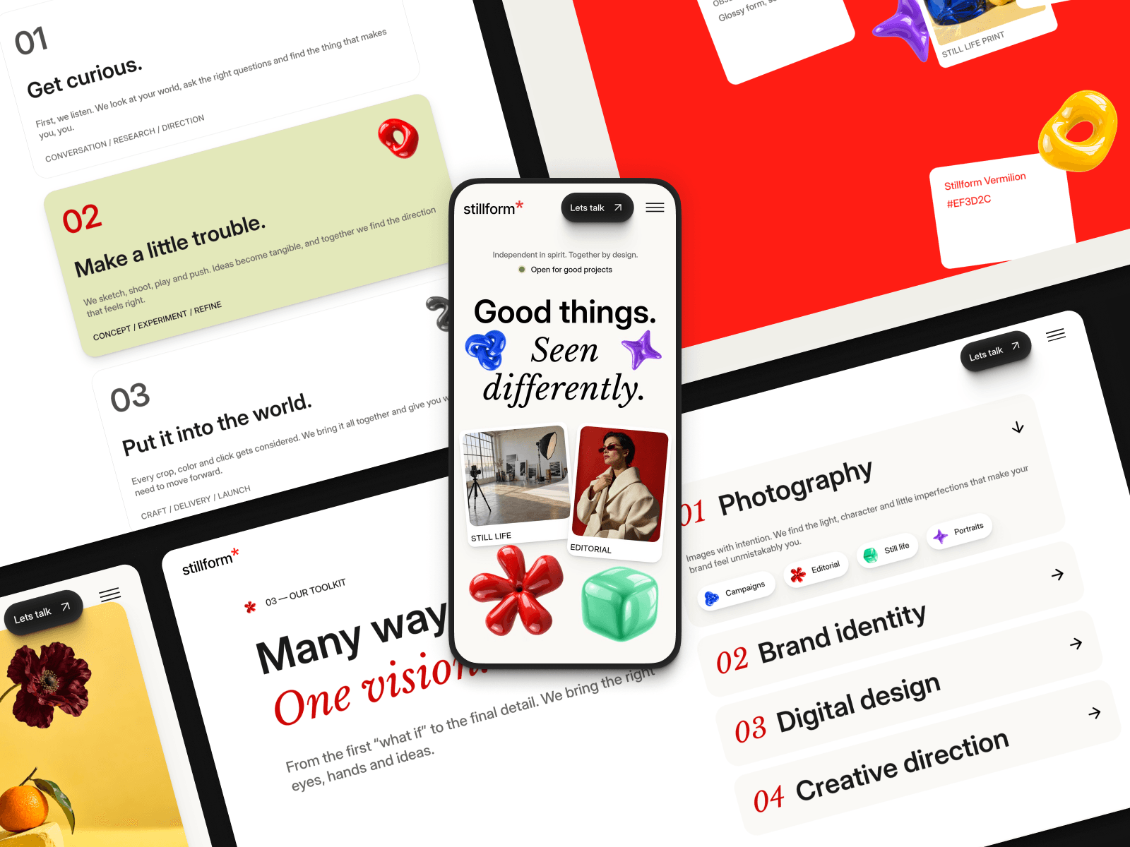
Every section is structured, named and responsive across three breakpoints (Desktop, Tablet, Phone), so you can swap in your own words and images and publish the same day.
Pages
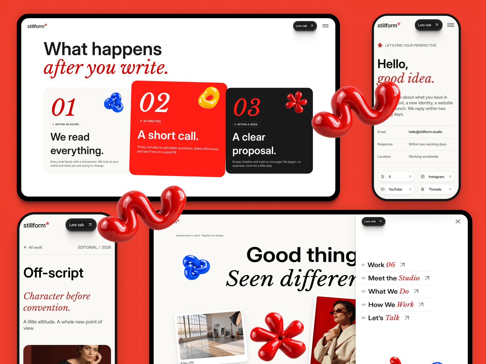
Home — hero, studio statement, selected work, services, studio, process, playground and FAQ
Works (CMS) — a collection for your case studies
Work detail — cover image with video overlay, sticky project facts, rich text, 5-slot gallery, testimonial quote and prev/next navigation
Contact — intro, info rows, social links, and a full contact form with service and budget fields
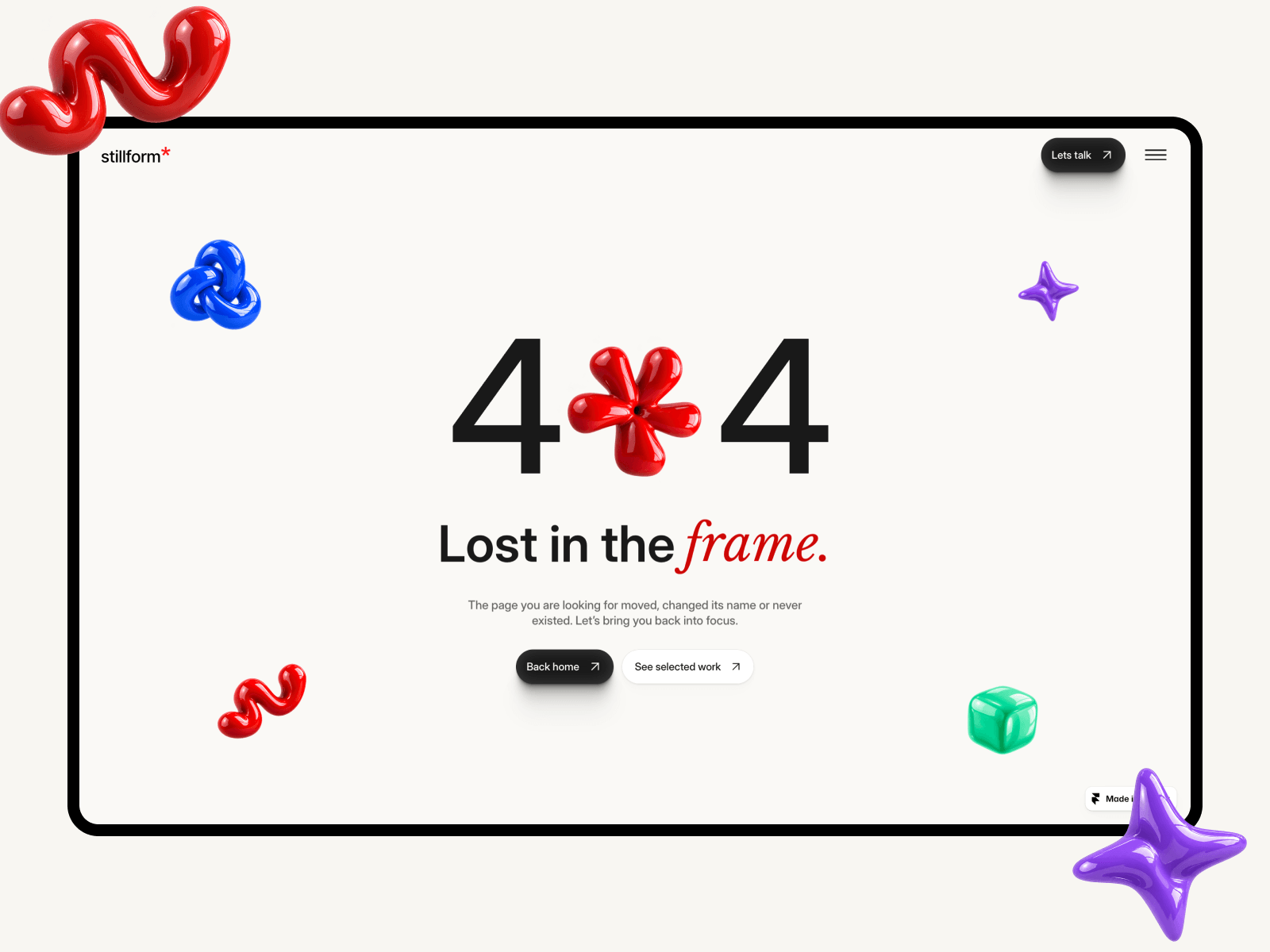
404 — a designed not-found page, not an afterthought
What's inside
CMS-driven case studies — add a project, the site builds the page
Custom code components: scroll parallax on images and a full-page ink curtain transition between pages
Contact form with a Submit Button component wired to every state (default, hover, pending, success, error)
Reusable components: footer with responsive variants, FAQ item, social button, secondary button
A unified motion system — appear effects tuned per element type, reduced-motion safe, and no text effects, so scrolling stays smooth
Accessibility and SEO pass: single H1 per page, correct heading hierarchy, alt text and ARIA labels
Framer style system throughout — Heading 1–6 and body styles plus color tokens, so a global change is one click
Make it yours
Change the color tokens and type styles once and the whole site follows. Replace the placeholder projects with your own, connect the form to your email, and you're live.