About Vortca Interiors
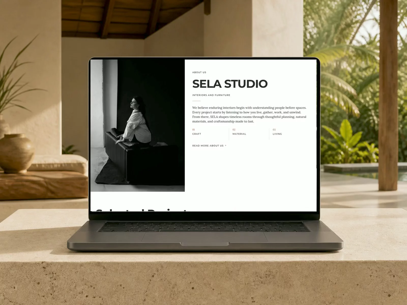
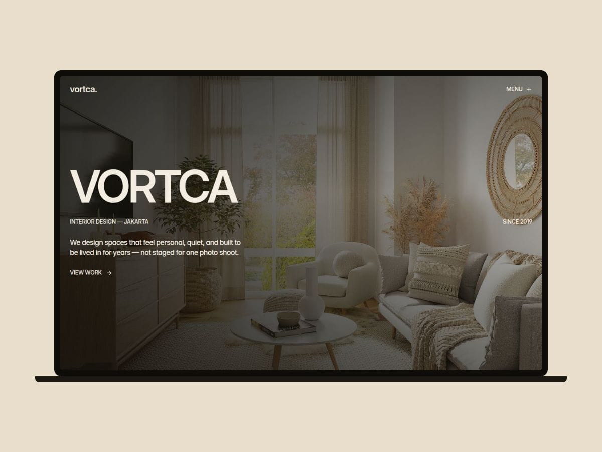
Vortca is an editorial portfolio for interior design studios — cream, quiet,
and built around the work rather than around the sales pitch.
Why most studio sites undersell the work:
• Project photos shrunk into small cards that hide the craft
• Case studies with no room for materials, process, or reasoning
• Services pages that read like a price list, not a point of view
• Templates so loud the interiors have to compete with the layout
Vortca fixes this with restraint: full-bleed photography, tight negative
tracking, and generous whitespace that lets the rooms carry the page.
What's inside:
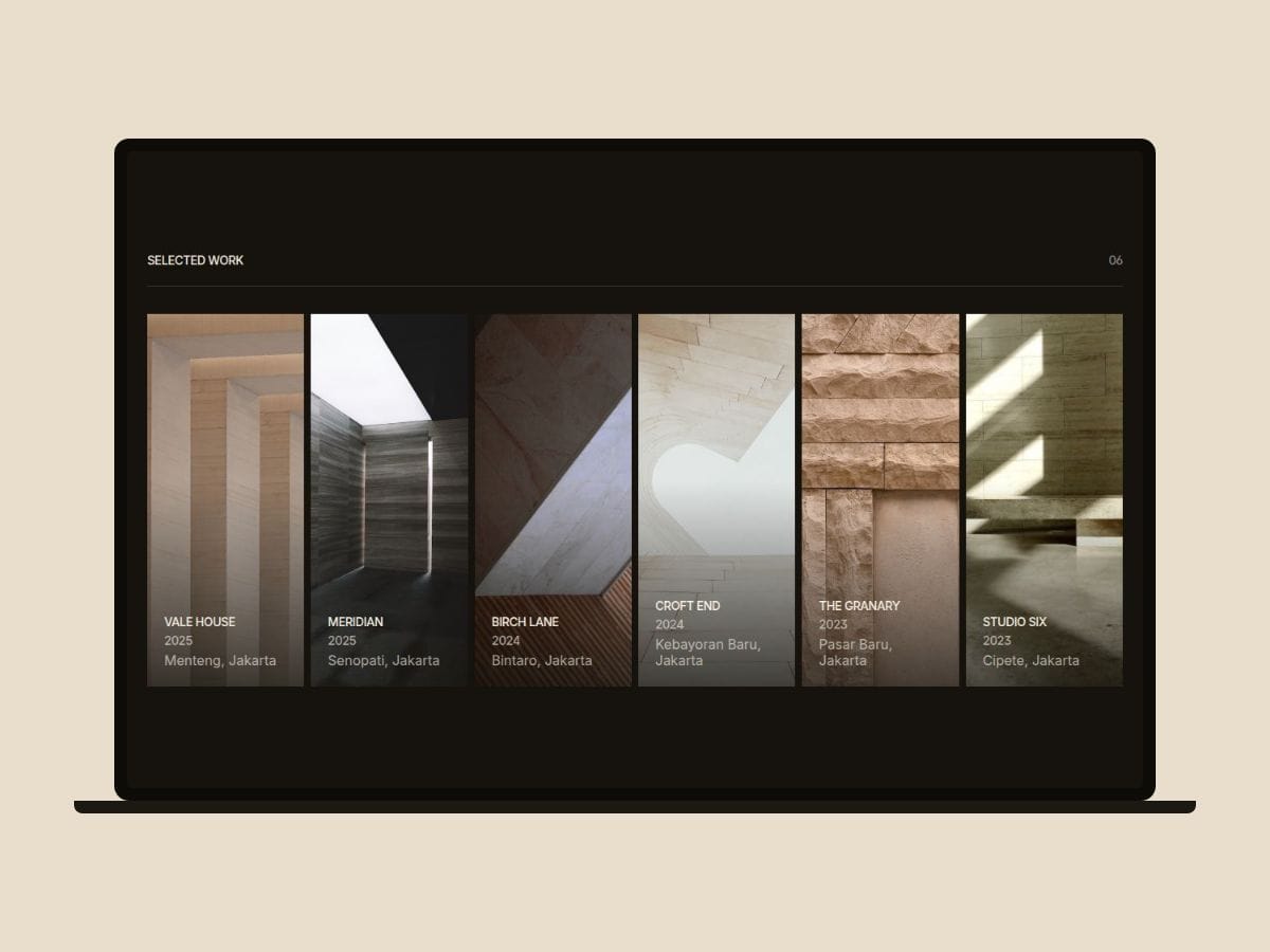
• Hover-accordion project row — tiles expand as the cursor moves across them
• CMS project pages with fact table, brief, gallery, and materials sections
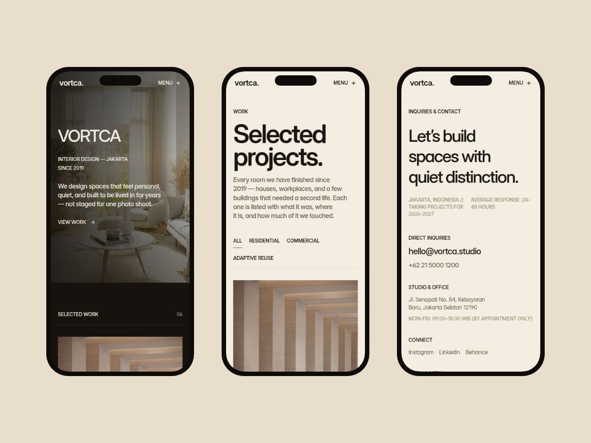
• Filterable work index with a working empty state
• Two-column about page with vertical image tickers
• Contact form with topic select, budget bands, and pending/success states
• Newsletter capture in the footer
• Designed 404 page
Built properly:
• Two CMS collections (Projects, Services) — no hardcoded content
• One layout template drives nav and footer across every page
• 11 colour tokens with full light and dark mode
• 9 text styles on a single variable font, responsive at three breakpoints
• Nav colour is a per-page variable — dark pages get a light nav automatically
About the animation:
Motion runs through one code component with four controls in the panel —
duration, rise distance, stagger, and tile expansion. GSAP loads from CDN
after first paint, so it never blocks your LCP. It honours
prefers-reduced-motion, and if the CDN is blocked the page still renders
in full, just without motion.
Perfect for:
• Interior design studios
• Architecture practices
• Furniture and product makers
• Photography studios
• Any small practice that sells on craft
For any questions: chandrasuraman05@gmail.com