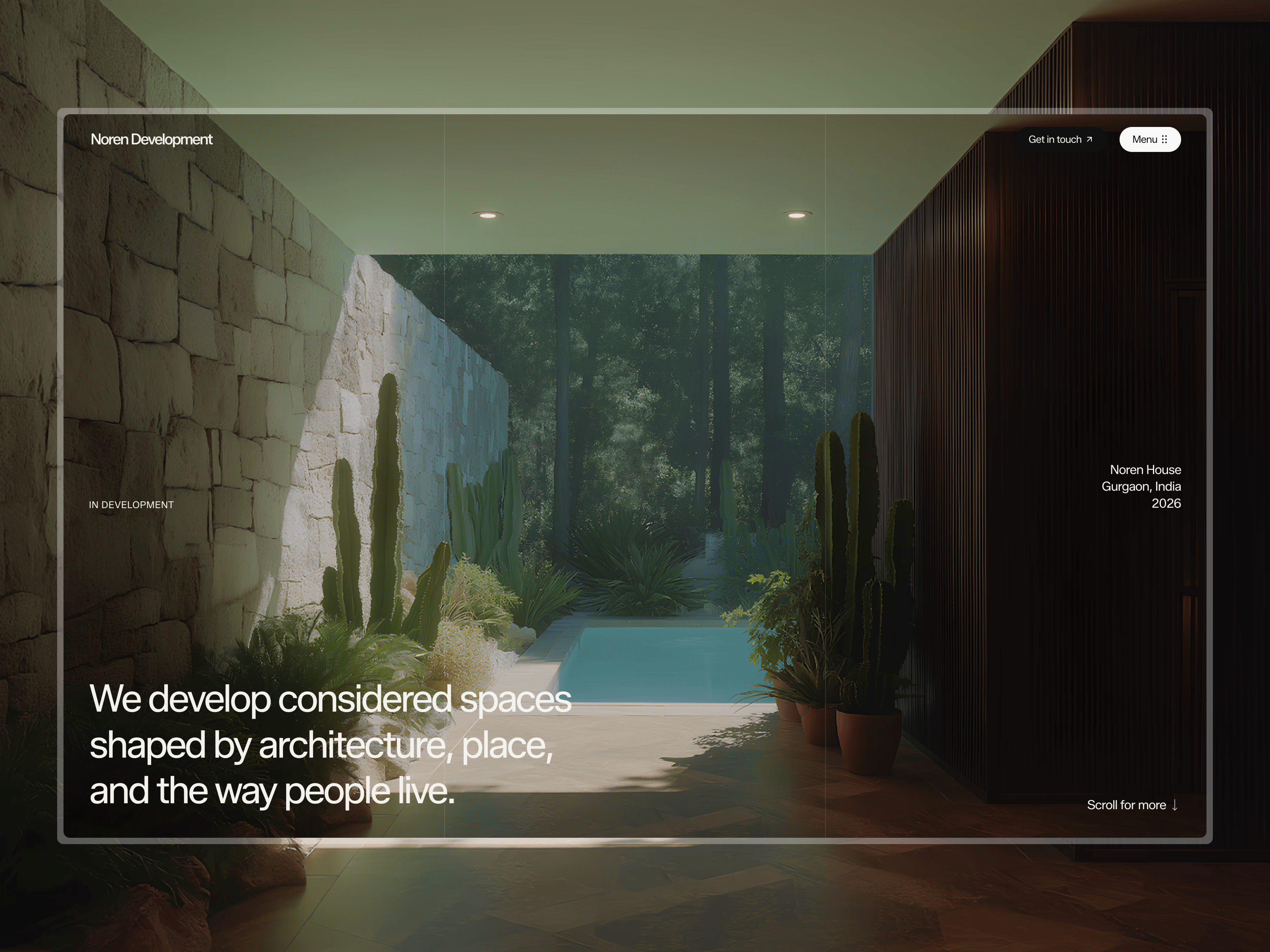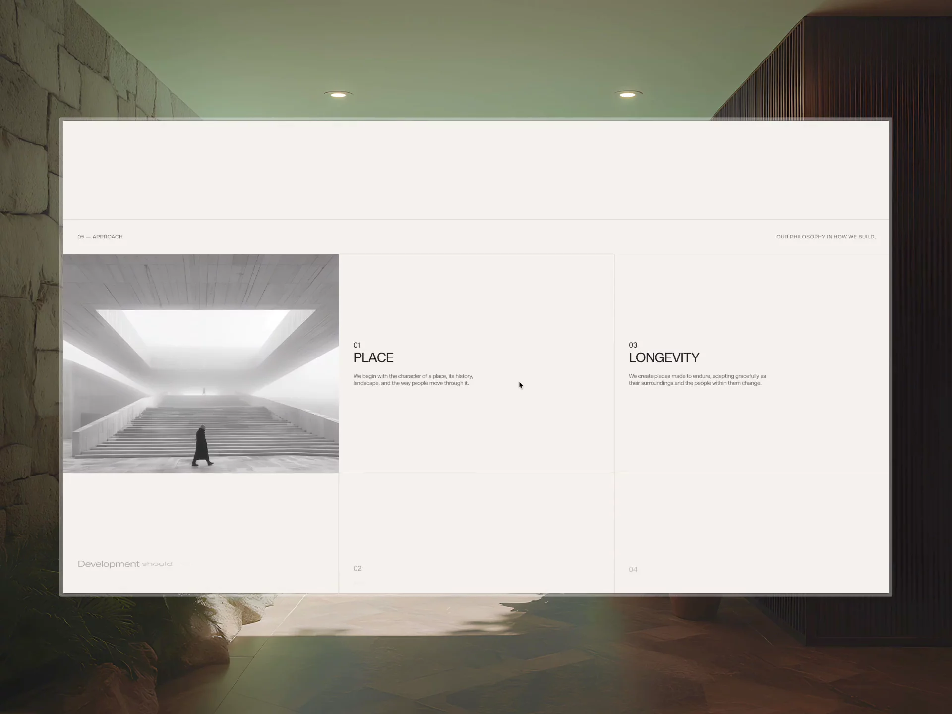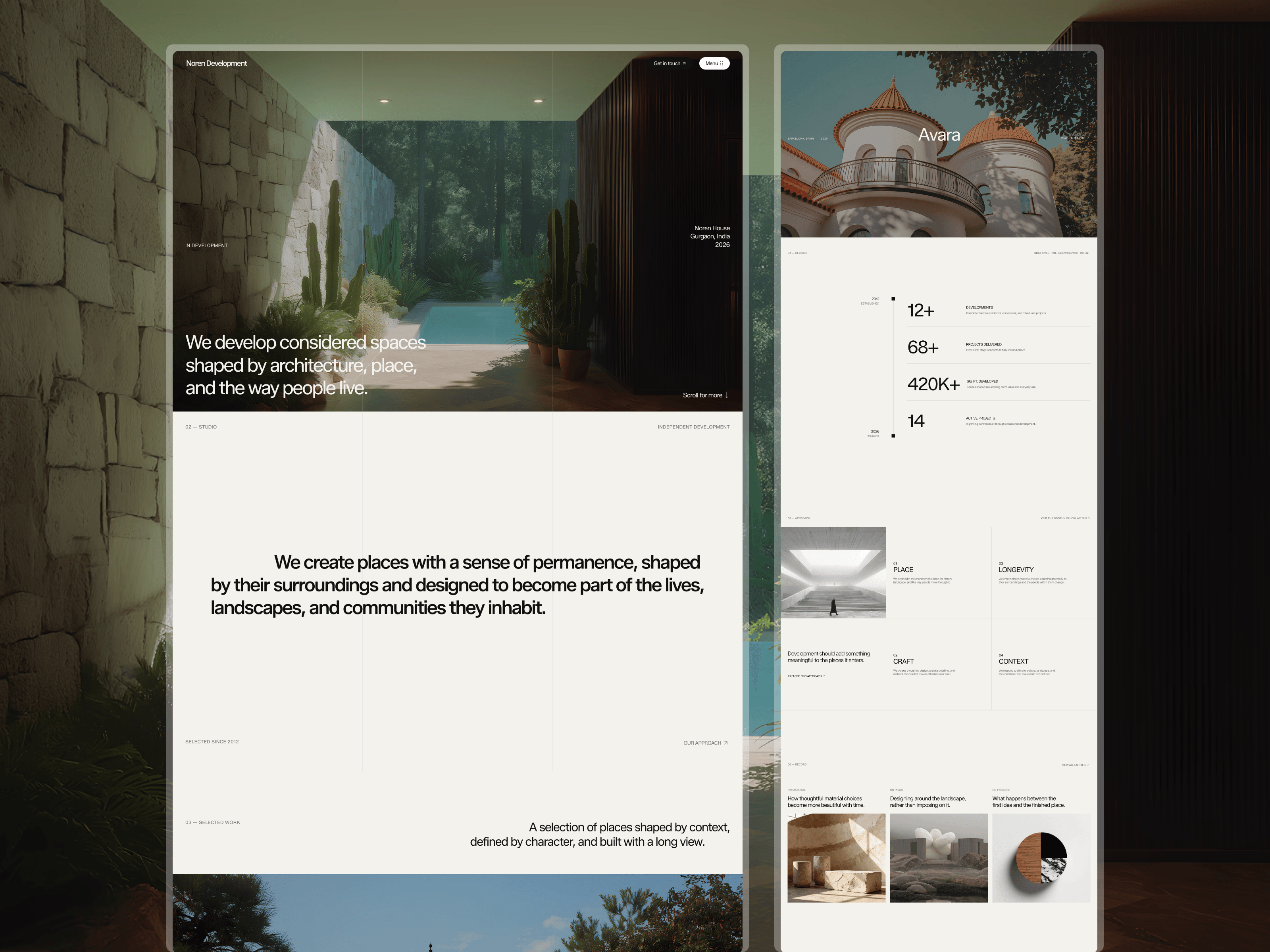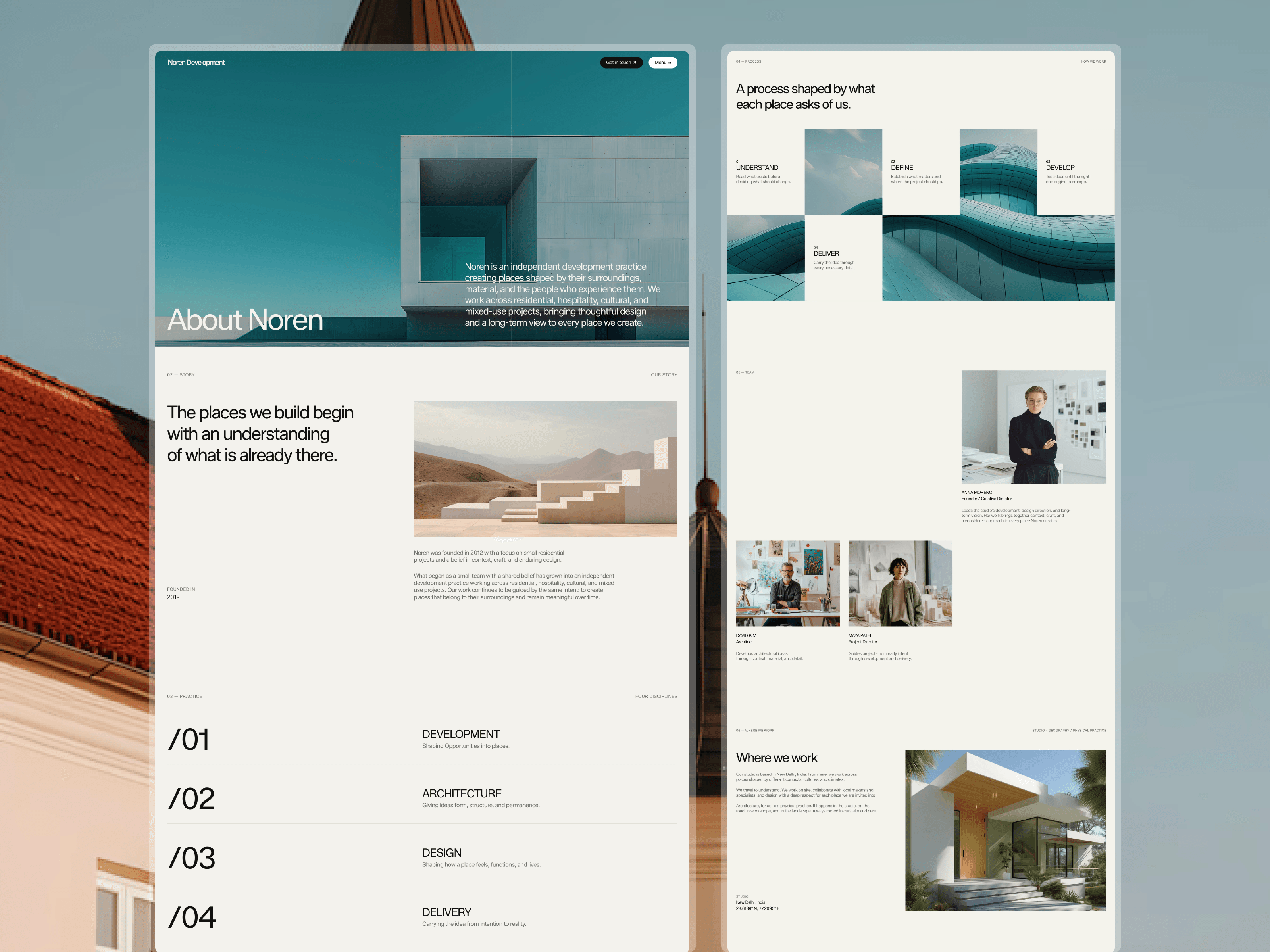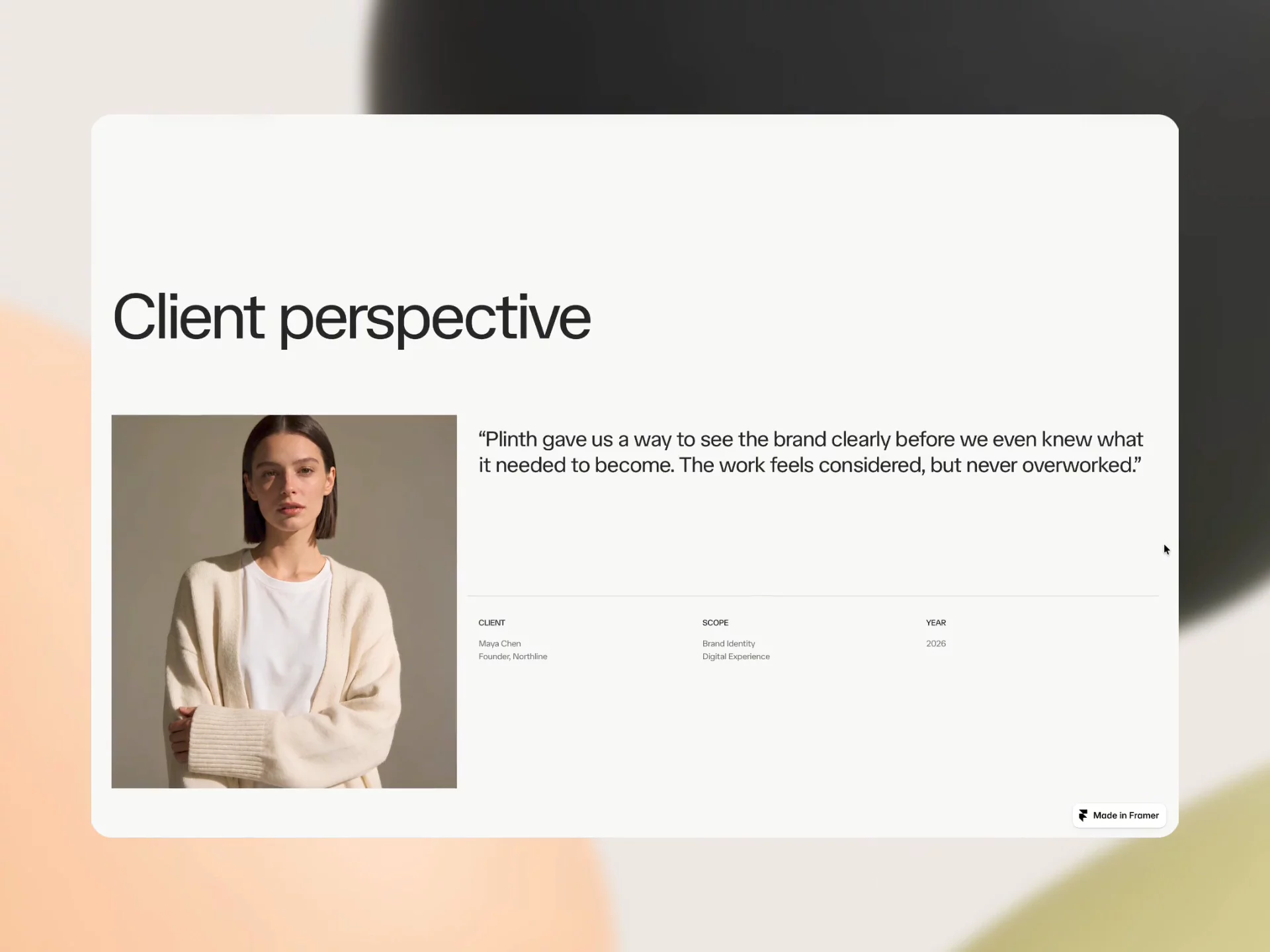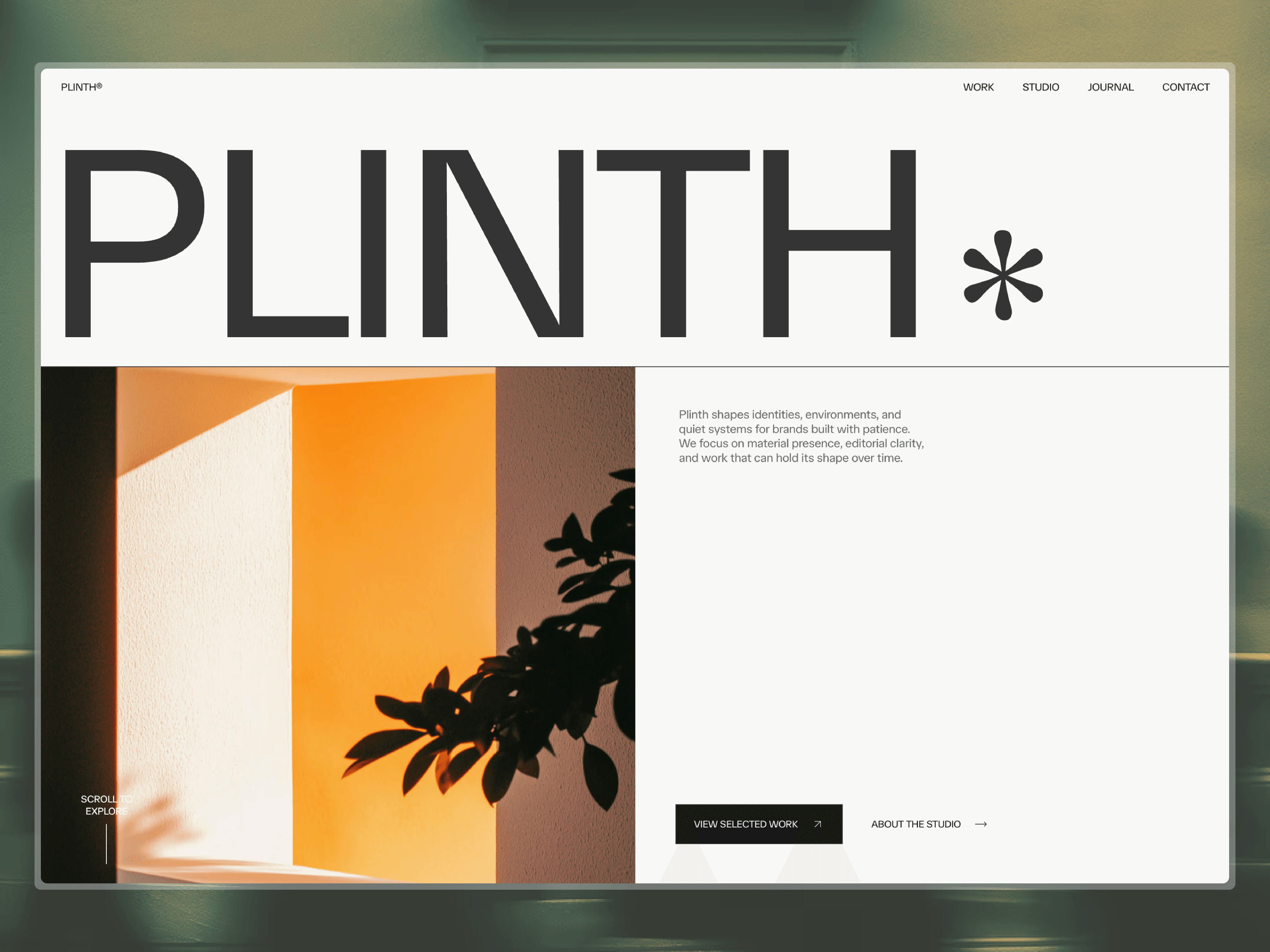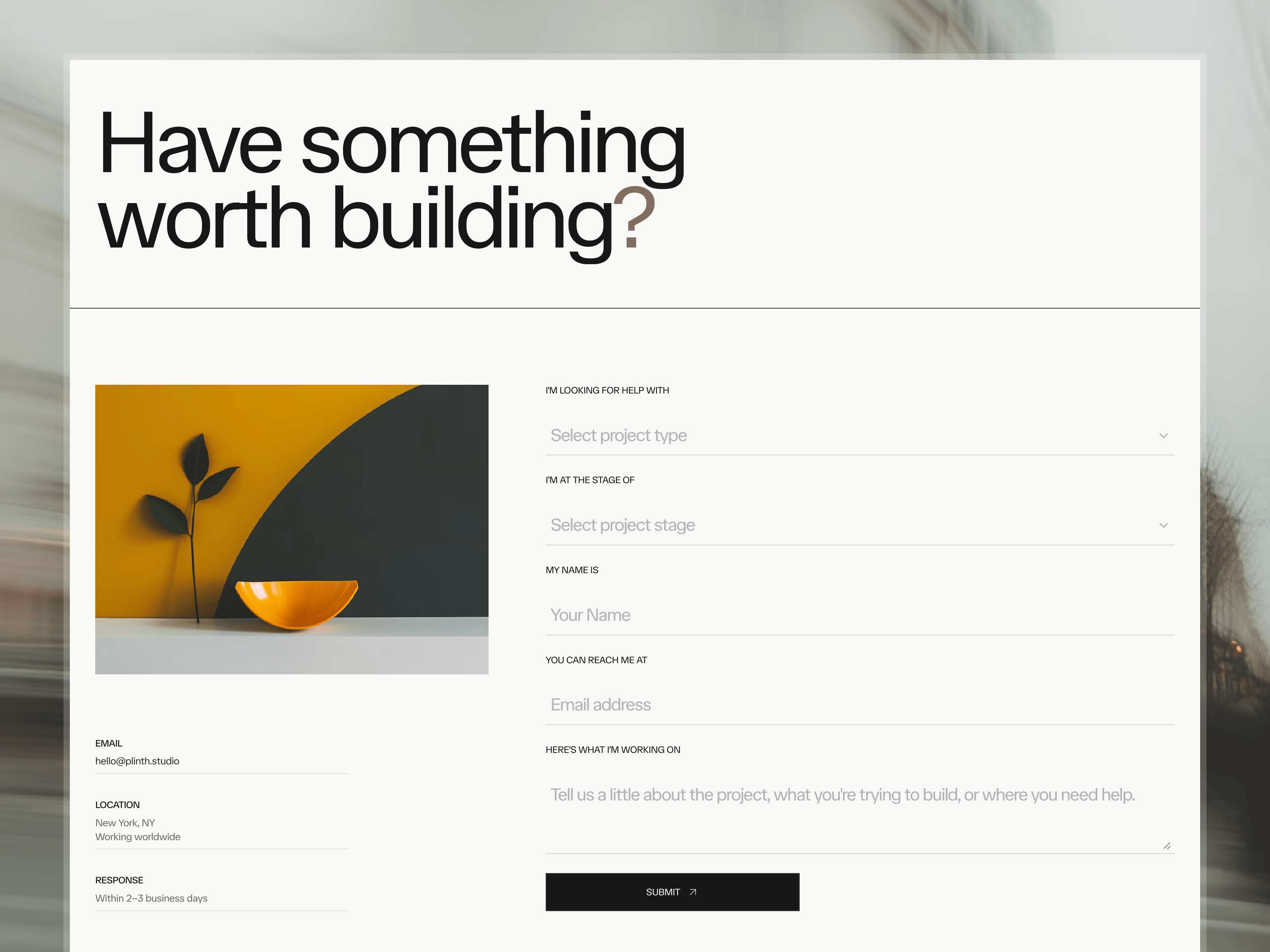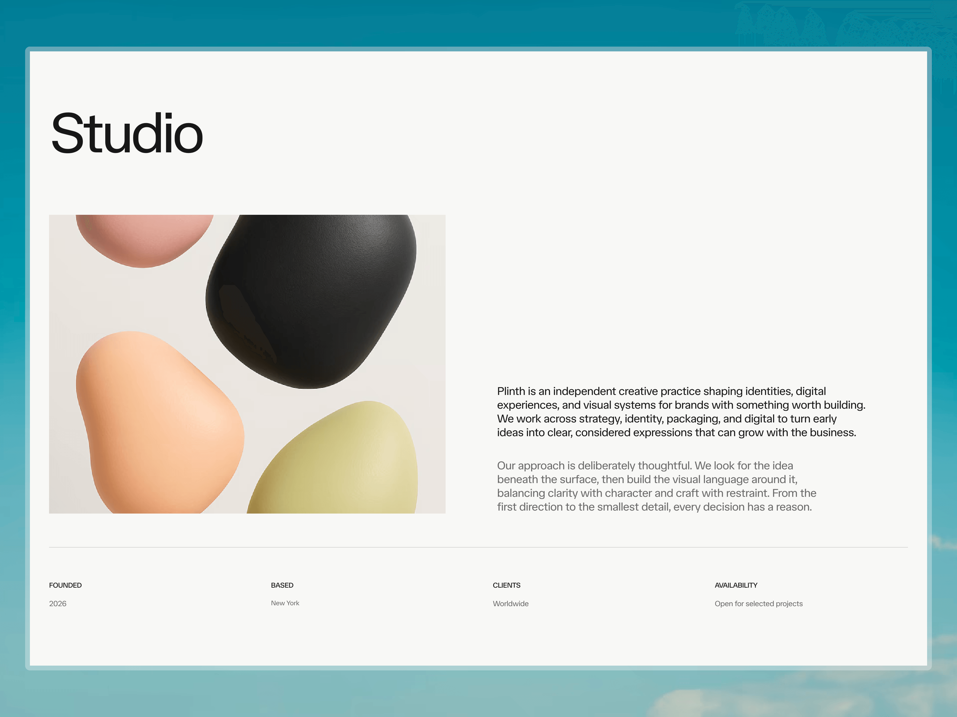
Same component, different states.
Transcript, notes, highlights, comments — kept the spacing and hierarchy identical across all four.
Anything look off?

Web Designer & Framer Developer | Building thoughtful websites for startups | Open for commissions
Same component, different states.
Transcript, notes, highlights, comments — kept the spacing and hierarchy identical across all four.
Anything look off?
The difference between a good website and a great one is components like this.
Anyone can build a landing page. Few sweat the details on screens like this.
V1 of the hero is coming together 🔸
One thing that’s helped me: don’t polish too early. This hero is all about structure first. Details come later.
Anything you’d tweak?
Working on something different for the next template. Been a while since I designed a product interface.
Been rewriting this section over and over.
Turns out it’s surprisingly hard to write about yourself than others😅
Finally locked the structure for the portfolio hero section 🔥
This is basically just a skeleton. Everything from here is refinement. Now I get to obsess over the tiny details for the next few days.
Been tweaking this profile card for my portfolio. Ended up making it a lot simpler than the first version.
Version 1 vs Version 2👇
Every project doesn’t deserve equal attention.
The homepage highlights a few selected pieces. Everything else lives inside an exploration gallery that expands as you browse.
Feels much calmer than throwing everything onto one long page.
Probably spent more time refining this button than anyone will ever notice. And that’s exactly the point.
The best interactions don’t ask for attention. They just make the interface feel better.
Been experimenting with a side-panel contact form for my portfolio.
Instead of sending people to a separate page, the conversation starts without breaking context. Small interaction, but it makes the experience feel much more intentional.
Making this project card interaction even smoother.
Most people won’t even notice what changed. They’ll just feel that it feels better.
First design after exams.
Spent an embarrassing amount of time on a footer… and I don’t regret it.
Really liking this boxed grid direction.
Most project pages become lists. I wanted this one to feel curated.
The challenge wasn’t displaying more work. It was making every project feel worth opening.
I didn’t want the journal to feel like a blog. I wanted it to feel like a collection of observations. Every entry reads more like a study than a post, with an index designed to encourage exploration instead of endless scrolling.
After weeks of refining, I’m excited to finally share Travertine.
An editorial Framer template crafted for architecture, interior design, and creative studios that value thoughtful presentation over visual excess.
Built around a publication-inspired approach, it combines projects, journals, and a material archive into a calm browsing experience where typography, imagery, and storytelling take center stage.
Designed with: • Editorial layouts • Powerful CMS collections • Responsive design • Smooth interactions • Reusable components • Easy customization
If you’re building a timeless portfolio rather than another generic agency website, I hope you’ll find it useful.
Available now ↓
The closer I get to shipping, the more I notice the tiny details. Still making small refinements to the hero a few hours before release.
A CMS page shouldn’t look like a CMS page. It should feel like part of the product, not the place where the design disappears.