Websites That Turn Traffic Into Paid Clients
The websites I keep coming back to all have one thing in common.
They don't try to impress you.
They make everything feel effortless.
The fastest way to get bored as a designer?
Keep making the same thing over and over again.
I'd rather experiment, fail occasionally, and discover something unexpected along the way.
One thing I always try to remember:
Users don't care how much work went into a website.
They care how easy it is to get what they came for.
That's what good UX looks like.
I've been noticing a trend with early-stage startups lately.
Instead of investing in a fully custom website from day one, many are launching with an AI-generated version first.
And honestly...
I don't think that's necessarily a bad idea.
If your goal is to validate an idea, collect feedback, and see whether the market actually wants what you're building, it can be a smart way to move faster without burning your budget.
The problem usually starts later.
I've seen founders spend hundreds or even thousands of dollars trying to force AI tools to produce something they were never meant to do.
Iteration after iteration. Credits. Subscriptions. More edits.
At some point, the "cheap" option isn't so cheap anymore.
The mistake isn't using AI.
The mistake is using the right tool at the wrong stage.
Sometimes an AI-generated website is exactly what you need.
Sometimes investing in a custom website will save you far more time and money in the long run.
The hard part is knowing when to make that transition.
That's why, before spending your budget either way, I'd recommend talking to someone who's been through both approaches.
The right decision depends much more on your stage than the tool itself.

I love websites that feel effortless.
Nothing is screaming for attention.
Everything just feels... right.
Turns out that's much harder to design than it looks.
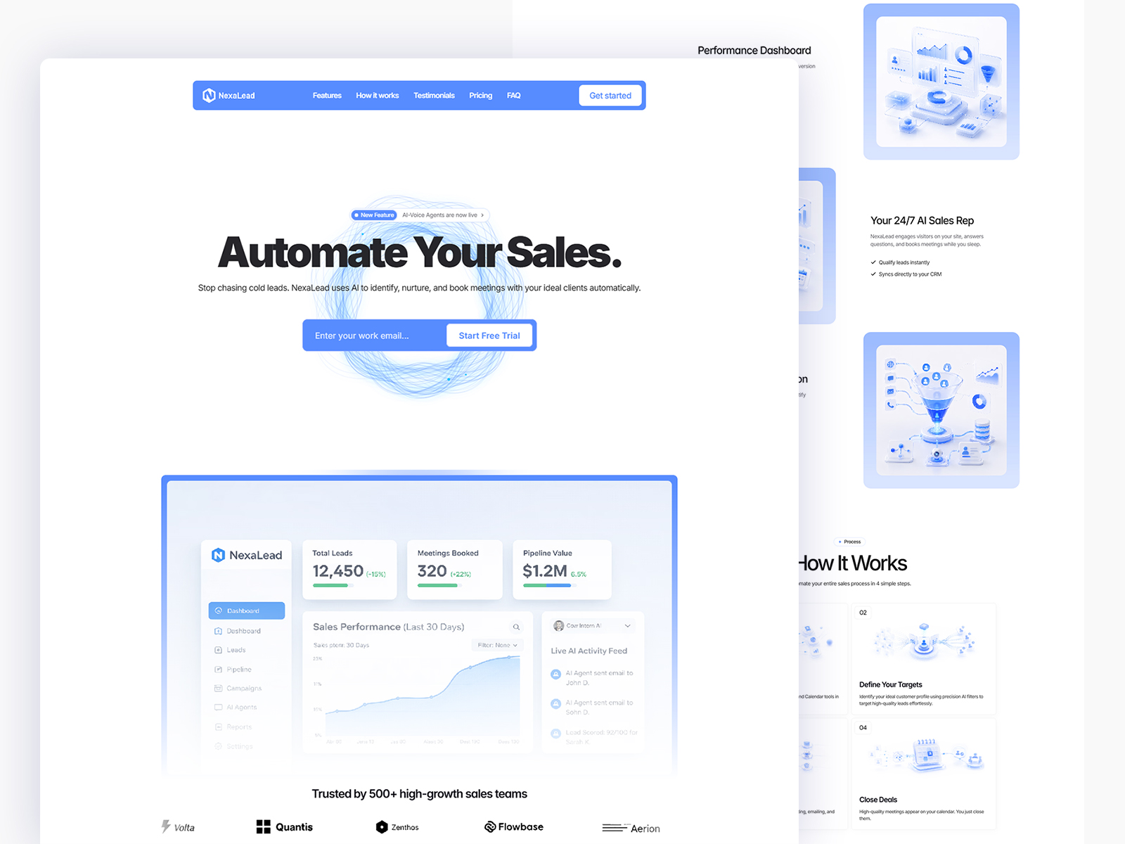
I don't really care if a website looks expensive.
I care if it makes the right person think:
"These are the people I want to work with."
That's a much harder thing to design.
For a long time, I wanted nothing to do with sales.
I just wanted to design.
My mindset was simple: "If my work is good enough, people will come."
It took me almost 6 years to realize that isn't how it works.
The better your work gets, the more important it becomes to explain its value.
Because clients don't buy your design.
They buy what they believe that design will do for their business.
Learning that completely changed the way I work.
Ironically, spending time on sales didn't make me less of a designer.
It made me a much more valuable one.
One thing I've learned: People don't buy from the business with the prettiest website.
They buy from the one that feels easier to trust.
That's why I try to spend far more time thinking about communication than.
Lumina is more than just a website template; it’s a strategic conversion tool designed specifically for modern dental practices. Whether you are a solo practitioner or a growing clinic, Lumina helps you build immediate trust and authority online.
I genuinely enjoy seeing how different people react to the same piece of work.
The comments are often more interesting than the design itself.
Everyone notices something different.
A question for Framer creators:
If you could only invest your time in one platform for the next 12 months...
Where would it be?
Framer Marketplace? Contra? X? LinkedIn?
Feels like the answer to this question is changing faster than ever.
What's your bet?
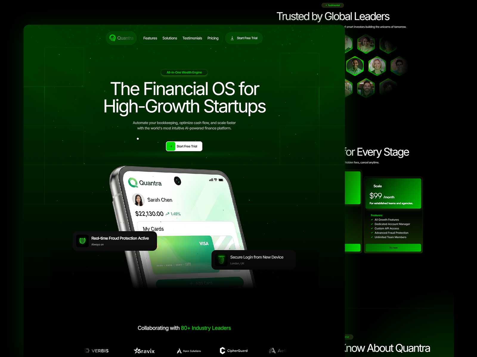
And finally... the new Quantra update is live. 🚀
One thing I enjoy about revisiting old work is realizing how much changes without anyone explicitly asking for it.
A spacing adjustment here. A smoother interaction there. A hundred tiny decisions that probably won't get noticed individually...
but definitely get felt as a whole.
Curious to know:
Can you spot the differences compared to the previous version?
Live preview: https://framer.link/RjAkdZA