A small thing I kept thinking about while designing Nexgrid
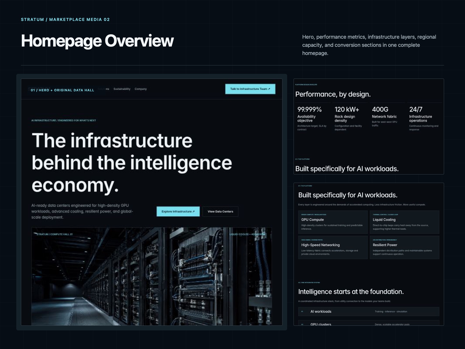
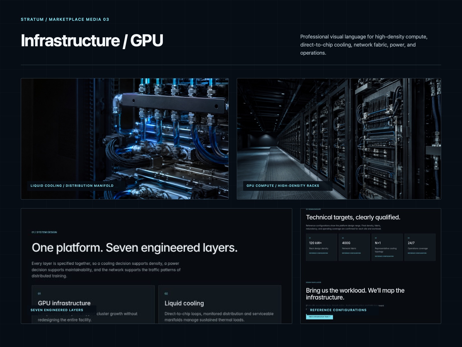
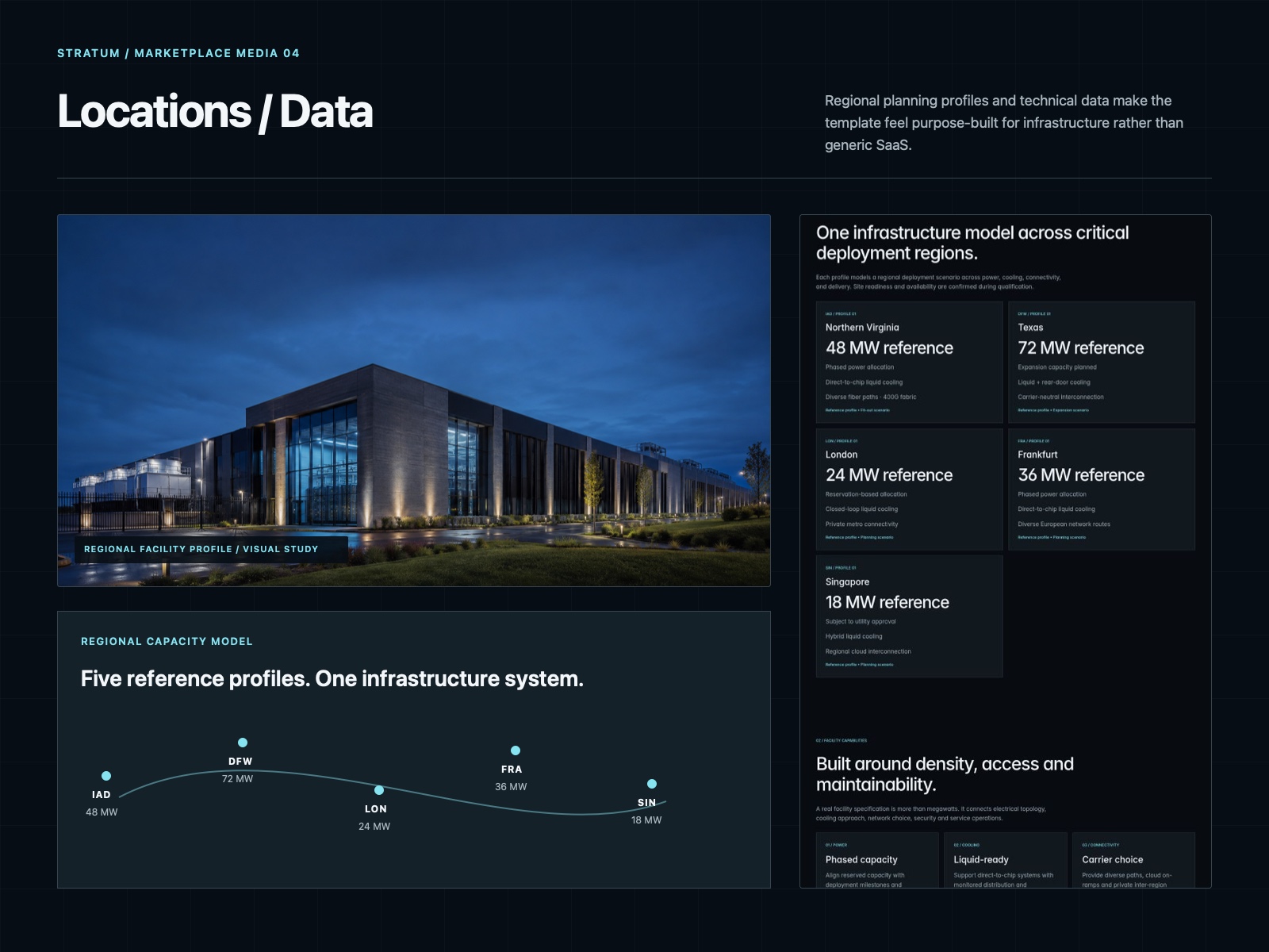
Most AI infrastructure websites have a lot to explain — GPUs, power, cooling, networking, locations, uptime, security…
The challenge wasn’t making it look “AI”.
It was figuring out how to show all of that without making the site feel like a technical document.
So for Nexgrid, I tried to keep the structure simple:
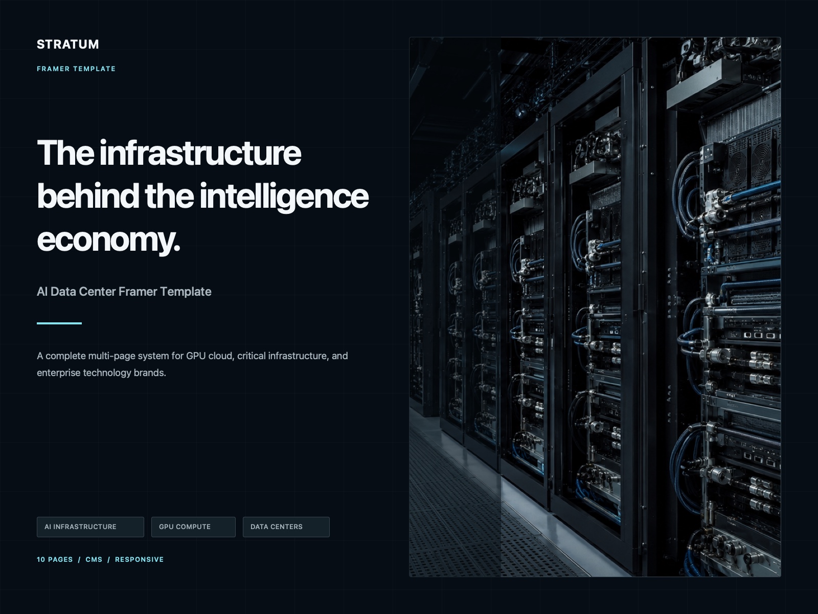
big numbers for scale, clear sections for infrastructure, real-world imagery for credibility, and just enough motion to keep it from feeling static.
I also avoided the usual purple-gradient / floating-card AI look because it didn’t really fit the subject.
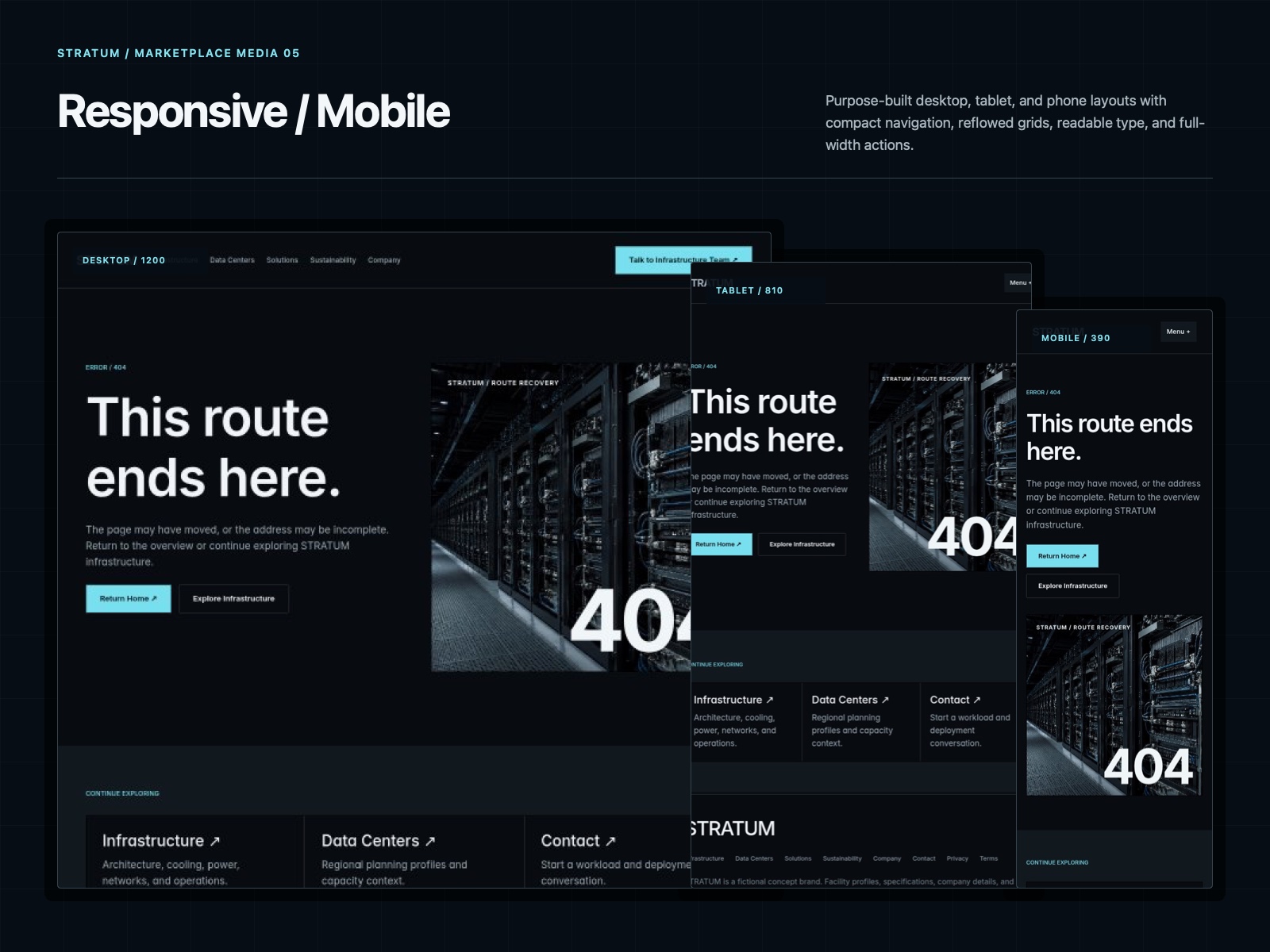
The end result feels more like an infrastructure company and less like a generic SaaS landing page.
Still experimenting with this direction, but I like where it’s going.