About ...je na to appka
Most websites in our field start with tools and services. We started with a question: what if the website worked the way we do?
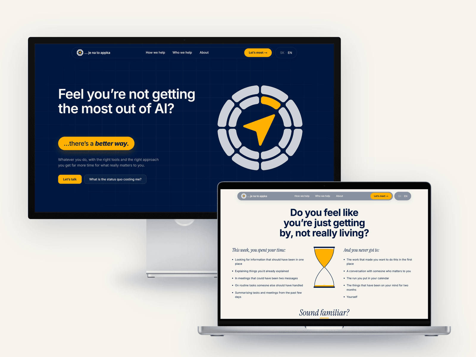
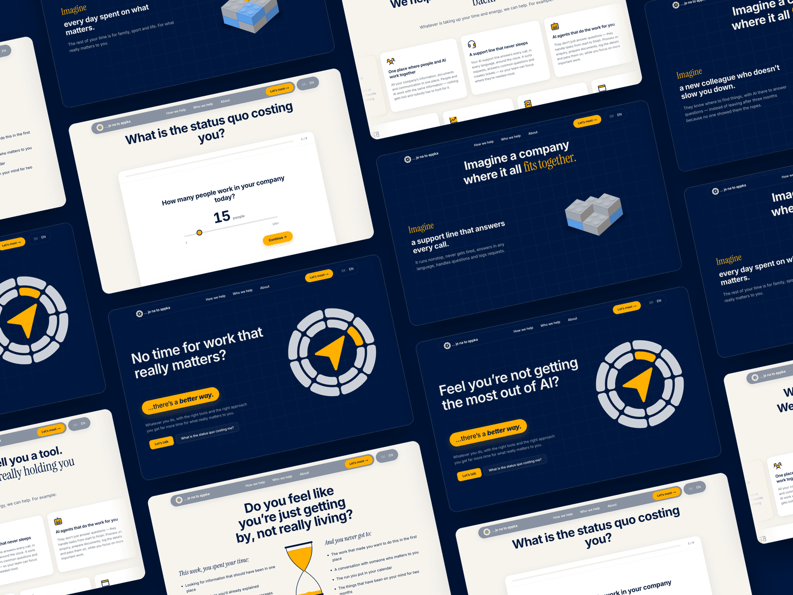
So it begins with people, not technology. The homepage opens with everyday frustrations visitors recognize in seconds, and instead of telling them what they need, a short calculator lets them discover what the status quo is costing them.
The site then follows one simple path: why we exist, how we think, who we help. No industries, no feature lists, just people who bake bread, write code or run a company and believe things can be done better.
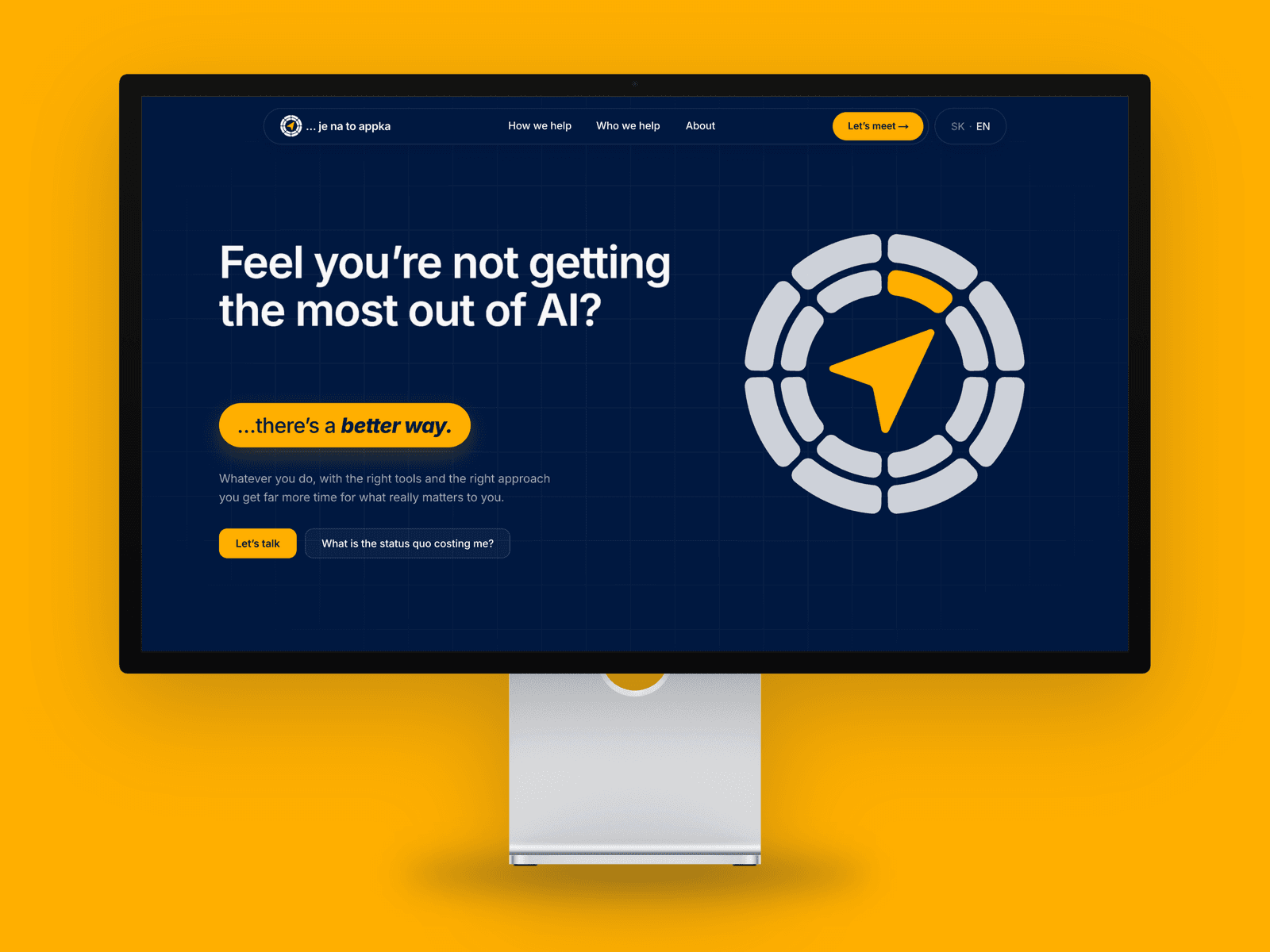
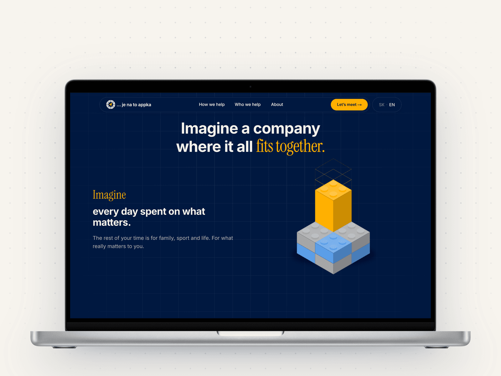
Our own principle "complex inside, simple to use" shaped the design: calm, spacious, one navy, one yellow, nothing that doesn't need to be there.
Built in Framer.