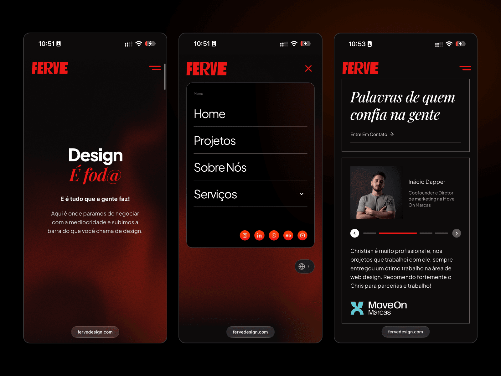
About Ferve Design
A living, warm, and bold agency website
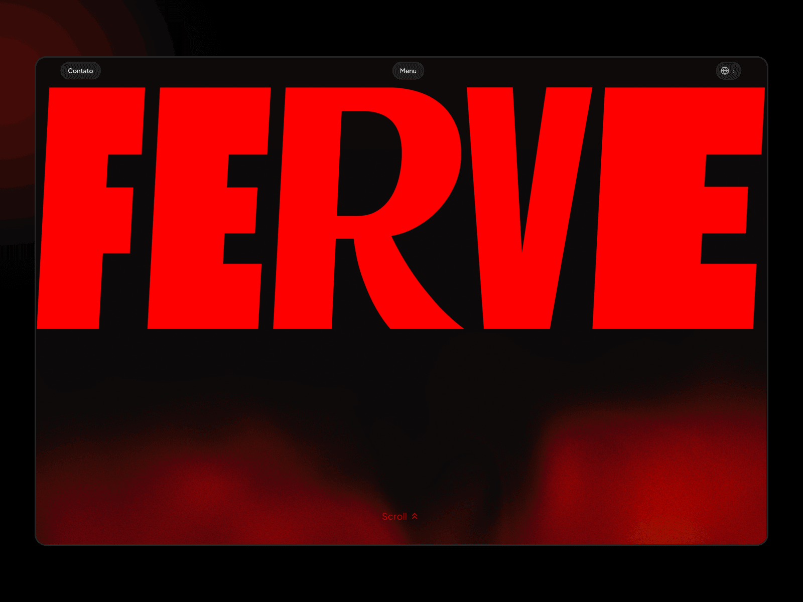
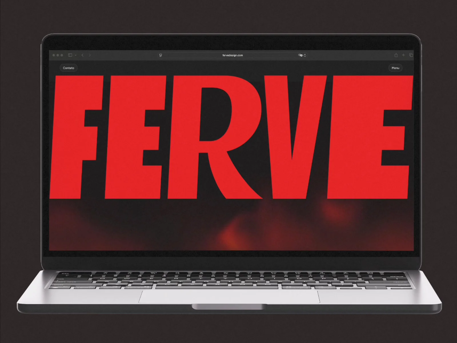
The homepage opens on an oversized red wordmark in a heavy condensed display face, over a near-black canvas where a slow red ember glow drifts and pulses like something coming to a boil. The idea was a site that feels alive and hot to the touch, with a Latin warmth instead of the cold, sterile polish of most agency sites.
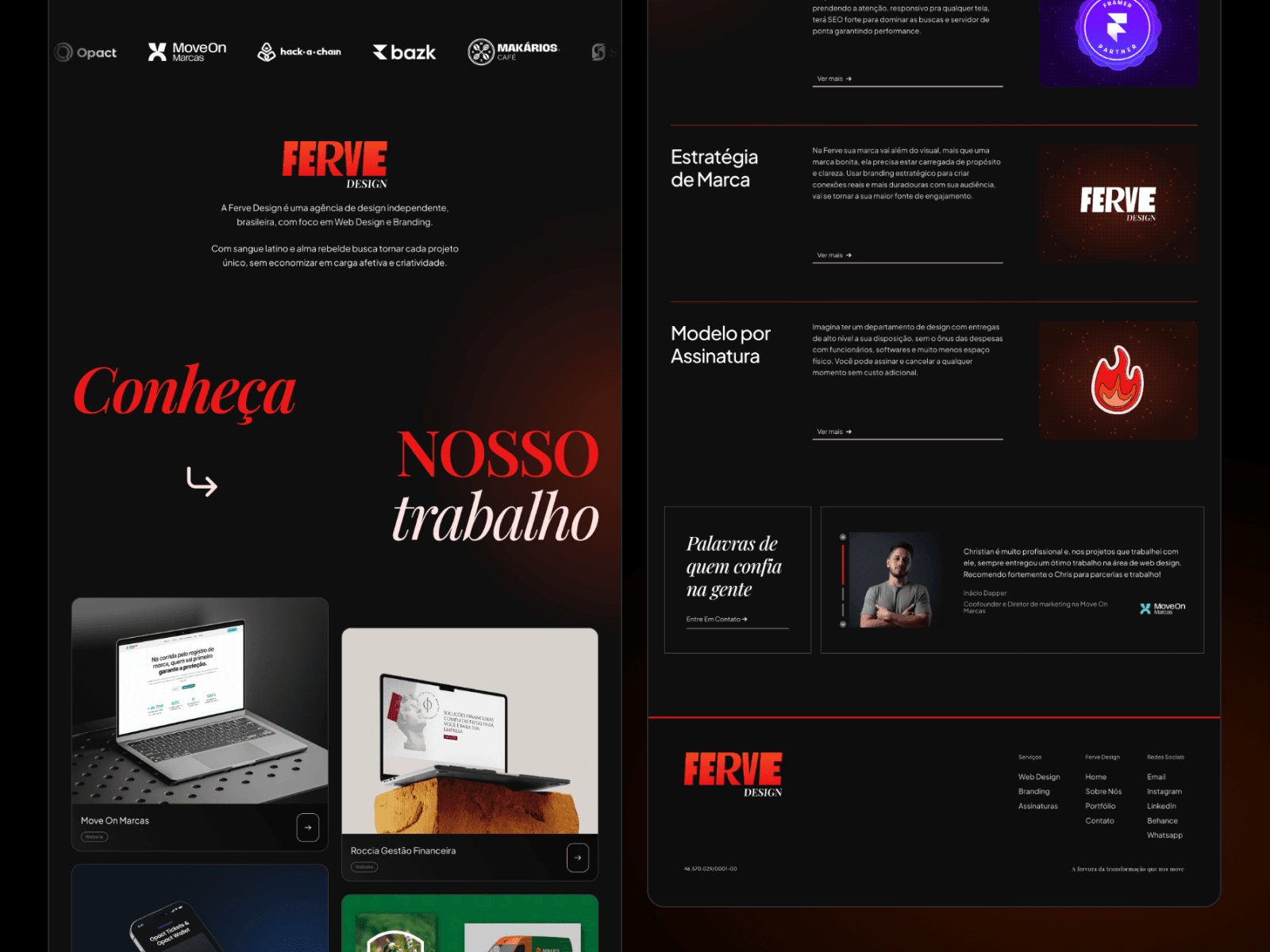
That heat runs through every layer. As you scroll, the wordmark gives way to the header logo and the hero resolves into a typographic duet: a clean grotesk paired with a high-contrast serif italic, in red. Below it, a horizontal strip of project mockups leads into a staggered project grid, a client logo row, and a services list with hairline red dividers that reveals media on interaction.
The About page is driven by scroll. Headlines and manifesto text light up word by word as you read, a circular text badge wraps the logo, and a sticky portrait holds its place while the copy changes beside it.
On mobile, the layout recomposes instead of shrinking. The hamburger morphs into a close icon, opening a card-style menu with hairline-divided links, an expandable Services submenu and a row of social buttons.
Red on black, three typographic voices, and motion that guides the reading while keeping the page feeling alive.