About Hexagon navigation
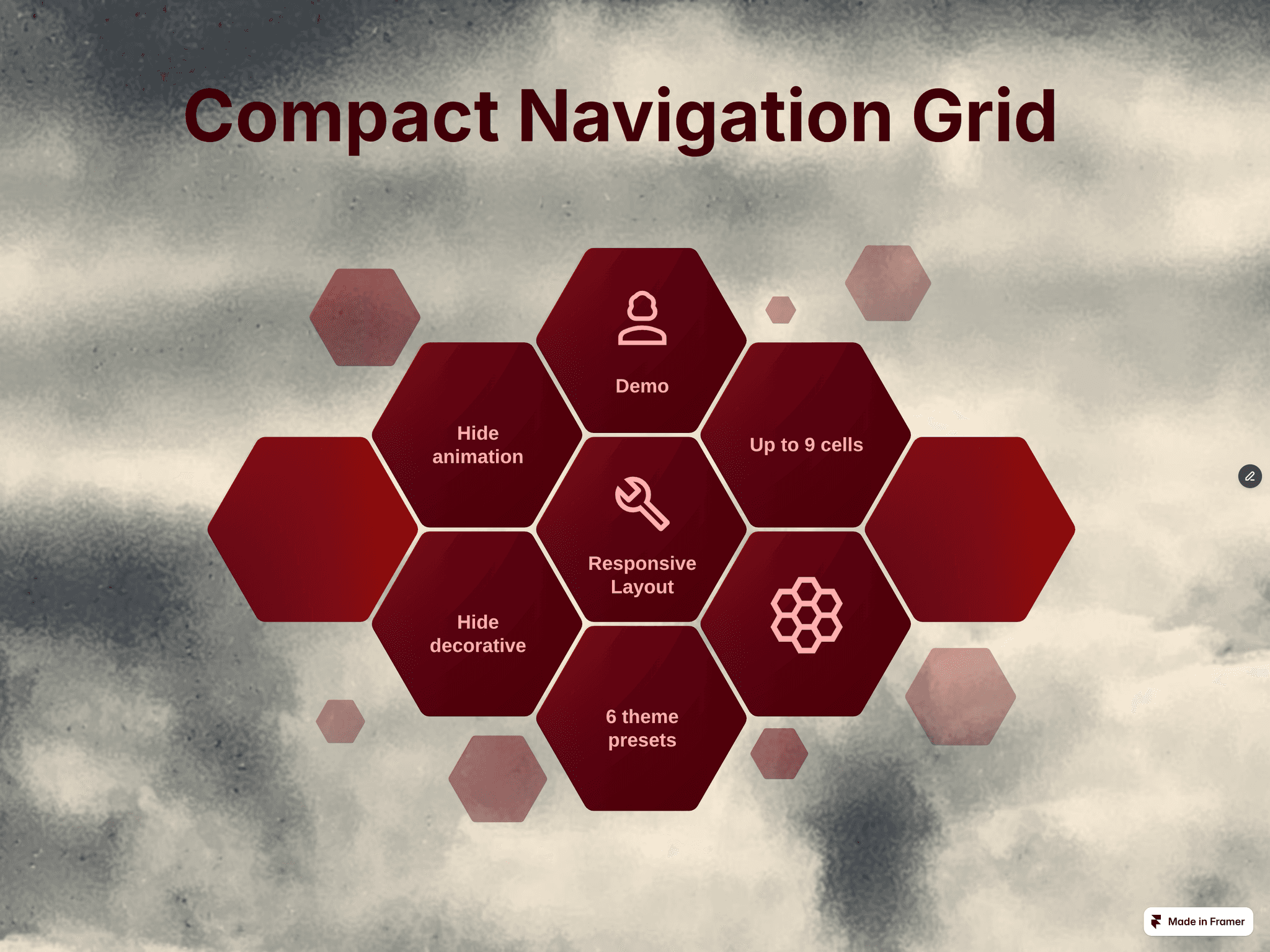
Hexagon Navigation Grid
Key Features:
Flexible Layout Control: Seamlessly choose between two core configurations - Desktop or Mobile. Plus, get full control over your layout with a built-in toggle to hide all decorative cells instantly for a cleaner, compact setup.
No-Code Customization: Change icons, colors, font sizes, text, and destination links directly from the Framer properties panel. You get all the power of custom React code without ever opening a code editor.
Up to 9 Dynamic Items: Easily scale your navigation to display up to 9 interactive content cells.
Futuristic Visuals: Built-in advanced SVG filters for depth, lighting, and smooth responsive animations.
Seamless Navigation: Fully integrated with custom anchor links for smooth scrolling or external page redirection (
blankorself).100% Mobile Responsive: Features dedicated layout logic that perfectly rearranges the hexagonal grid for flawless smartphone viewing.
What's Included?
Ready-to-use component link for instant import into your projects.
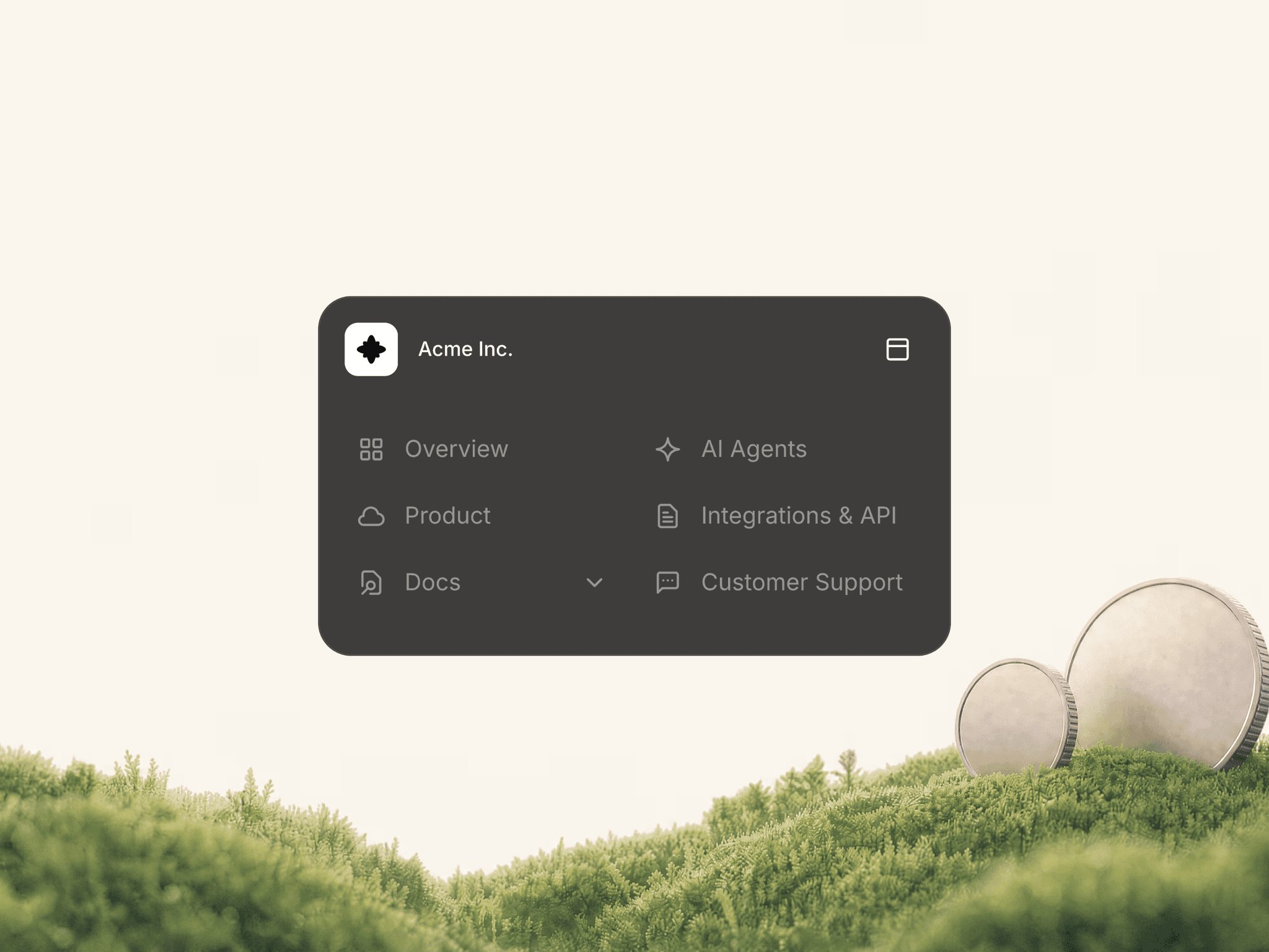
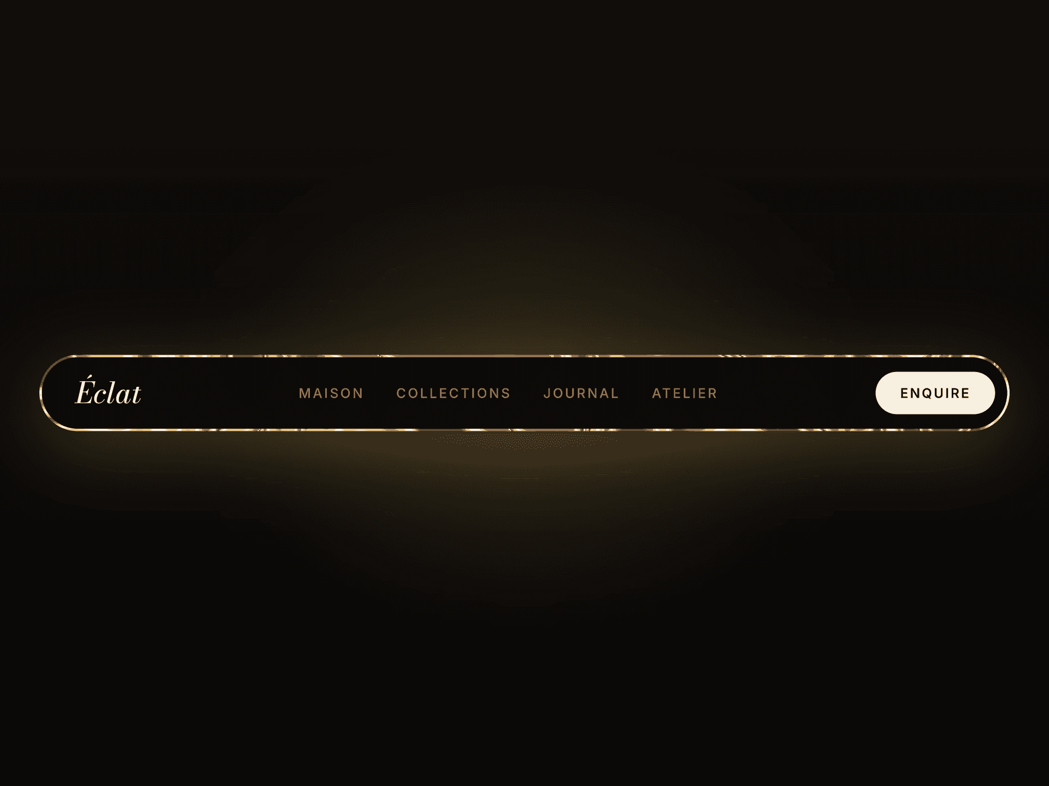
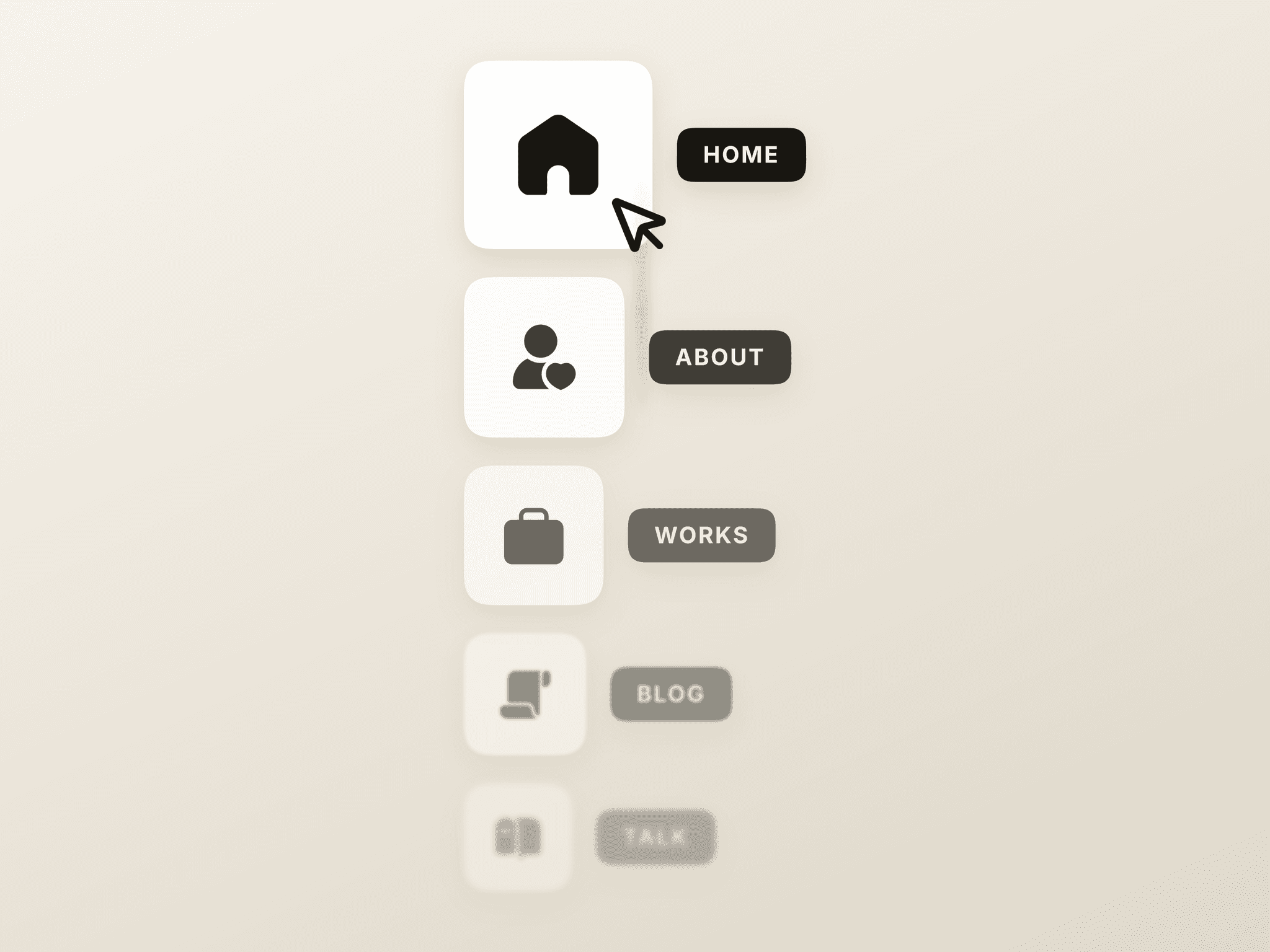
6 style presets (including Cyber-Noir, Smoke Neon, and Rainbow Lines).
Full custom code under the hood, completely isolated and production-ready.
Bring a modern, sophisticated, and futuristic feel to your digital products with Hexagon Navigation Grid. Perfect for designers, developers, and creators!