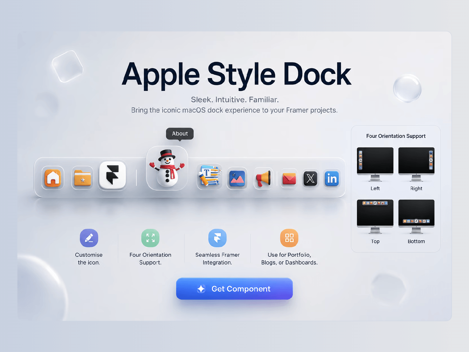
Apple-style dock navigation component is a sleek, premium, and highly interactive navigation dock designed for modern web applications, creative portfolios, or personal websites. Drawing inspiration from macOS-style docks, it blends contemporary glassmorphism with playful, high-fidelity 3D and flat iconography to create an intuitive and engaging user experience.
The #1 ❣ feature is that the dock navigation can be positioned in all 4 directions: TOP, BOTTOM, LEFT, RIGHT, with proper label and active indicator directions.
Dynamic Magnification Effect: The dock features a smooth, fisheye-style hover expansion. When a user hovers over an item, the target icon scales up fluidly and elevates above the dock's baseline, providing instant visual feedback.
Clean Tooltips: Elegant, minimalist text tooltips appear seamlessly above the active icon upon hover, ensuring clarity without cluttering the interface.
Sleek Glassmorphism Base: The container is a dark, translucent floating bar with heavily rounded corners, a subtle inner border highlight, and soft drop shadows that give it a distinct sense of depth and separation from the background.
Smart Layout Segmentation: Subtle vertical divider lines elegantly categorize the navigation workflow into logical sections (Core Navigation, Content/Interactions, and Communication/Socials).
Active page Indicator.
Ideal Use Cases
This component is perfect for creative developers, UI/UX designers, portfolio pages, dashboards, and modern SaaS platforms looking to replace traditional, rigid top-navigation bars with a tactile, desktop-class interface that rewards user interaction.