About Arrows Hand And Icon
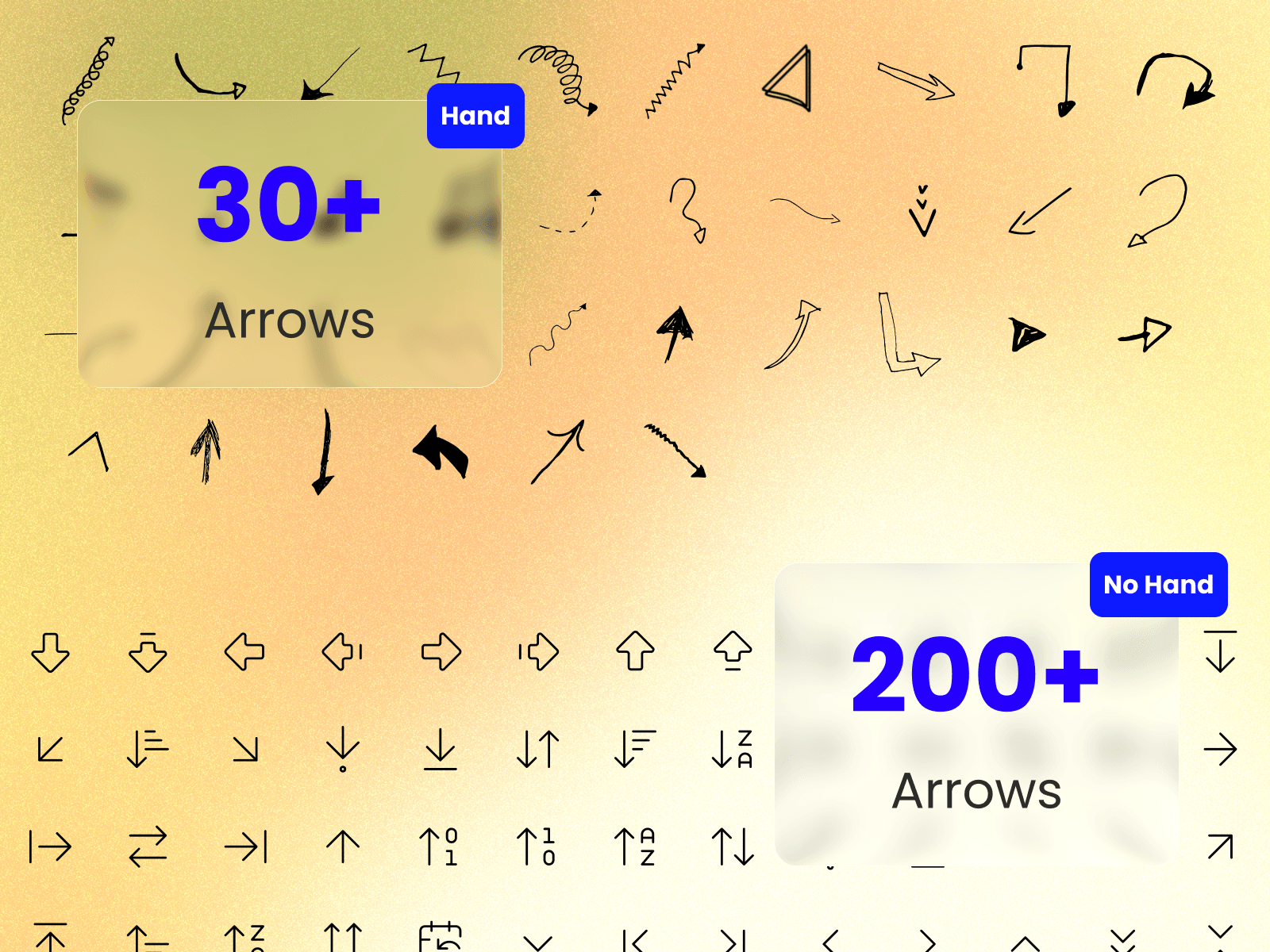
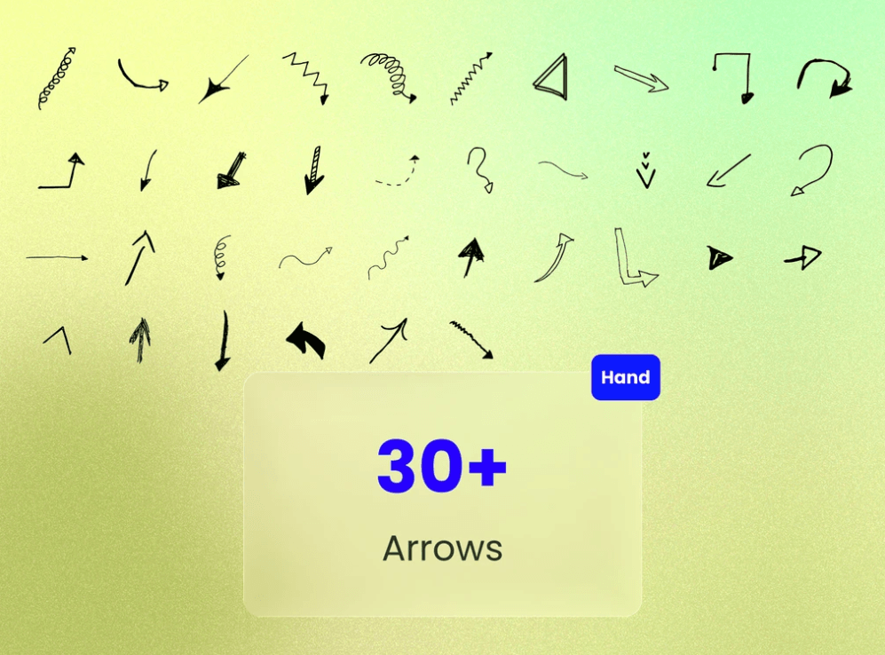
Hand-Drawn Series (30+ Icons)
An expressive set of handcrafted, sketch-style arrows built to add personality, visual emphasis, and human touch to graphics, presentations, and interactive layouts.
Style Aesthetics: Loose stroke textures, variable linework, organic curves, and custom doodle aesthetics.
Variations Included:
Spiral loops and swirl gestures
Zig-zag dynamic movement paths
Dotted and dashed trajectory lines
Bold filled tips and cross-hatched focal pointers
Curved annotation and callback arrows
Best Used For: Landing page annotations, hero section callouts, onboarding guides, creative portfolios, and informal UX wireframing.
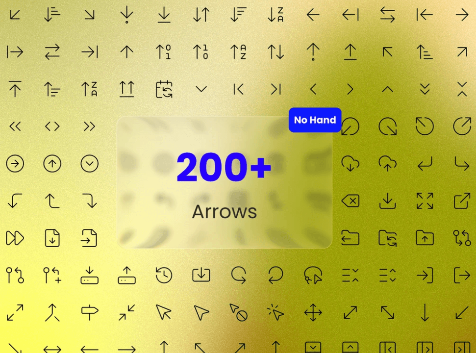
System UI Series (200+ Icons)
A high-precision, geometric icon set crafted for modern software interfaces, app navigation, and structured web design.
Style Aesthetics: Pixel-aligned vector lines, uniform stroke widths, and consistent geometric proportions.
Variations Included:
Cardinal & Ordinal Directional Pointers (Up, Down, Left, Right, Diagonal)
Interface Controls (Expand, Collapse, Return, Outbound)
Data Sorting Indicators (Alphabetical A-Z, Numeric 0-1, Ascending/Descending)
Alignment & Shift Arrows (Tab line anchors, swap indicators, dual-direction vectors)
Minimal Chevrons & Carets
Best Used For: Web app navigation, dashboard controls, data tables, drop-down menus, button components, and design system utility libraries.
Key Features
Dual-Aesthetic Flexibility: Switch seamlessly between relaxed, humanized graphics and formal, structured interface elements.
Vector Precision: Crisp scaling across high-DPI displays without quality loss.
Fully Customizable: Compatible with stroke width adjustments, custom color fills, and seamless integration into Framer components or Figma UI kits.
Need help?
Have questions, need custom features, or want to share feedback? Reach out anytime at karimsaif010@gmail.com or on X @Karim Saif .