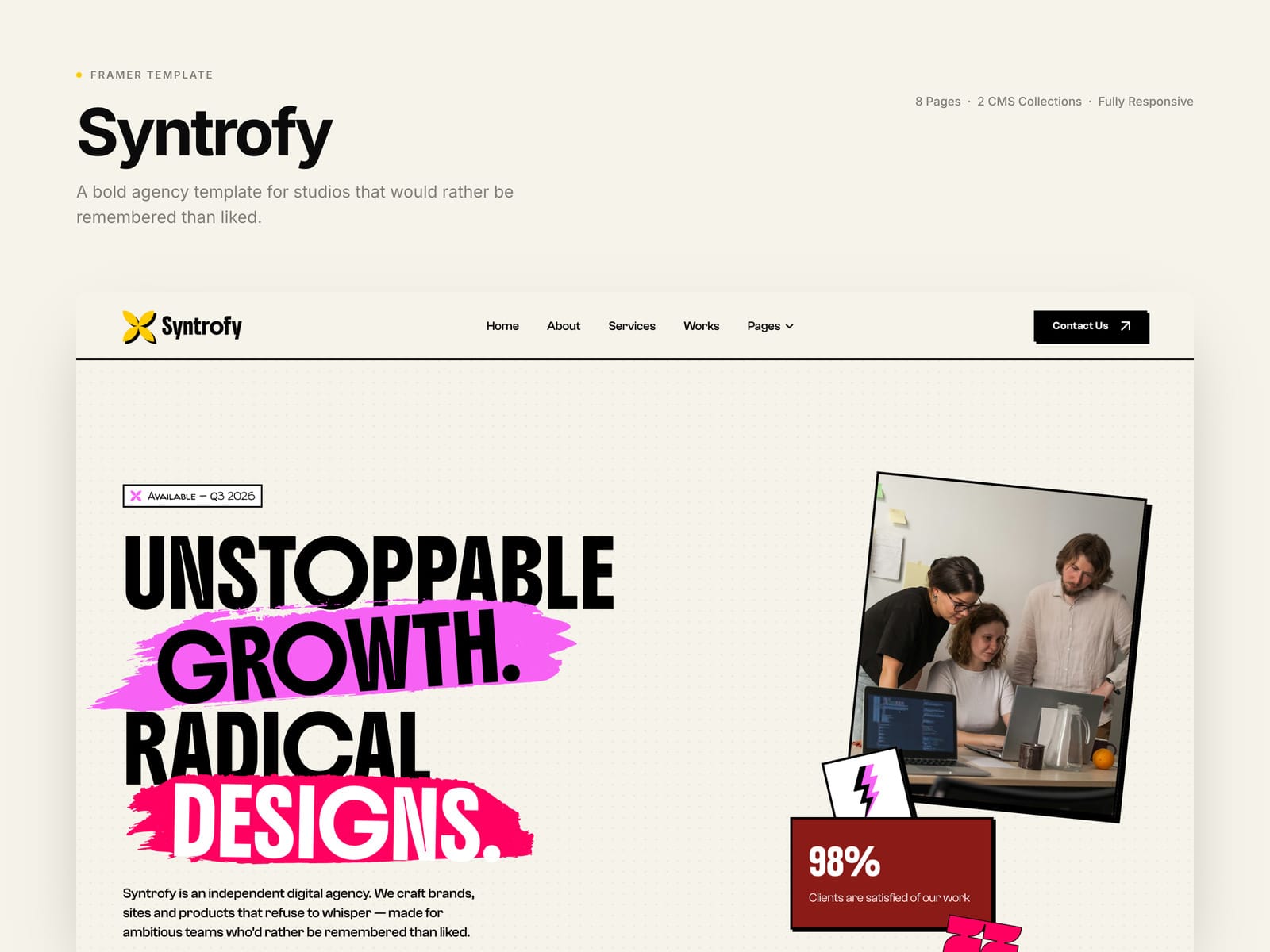
Most agency templates are quiet. Syntrofy is not.
I just released it on the Framer Marketplace — a neo-brutalist template for creative studios and design agencies. Hard black borders, zero corner radius, offset shadows that sit on the page like stickers.
But the part I’d want you to actually go and try is the motion.
→ The hero cards are physically draggable. Throw one and it stays where you left it.
→ Blocks in the About and Services sections fall and settle under gravity.
→ The portfolio and testimonial galleries are scrubbed by scroll position rather than triggered by it, so they track your wheel exactly — forwards and backwards.
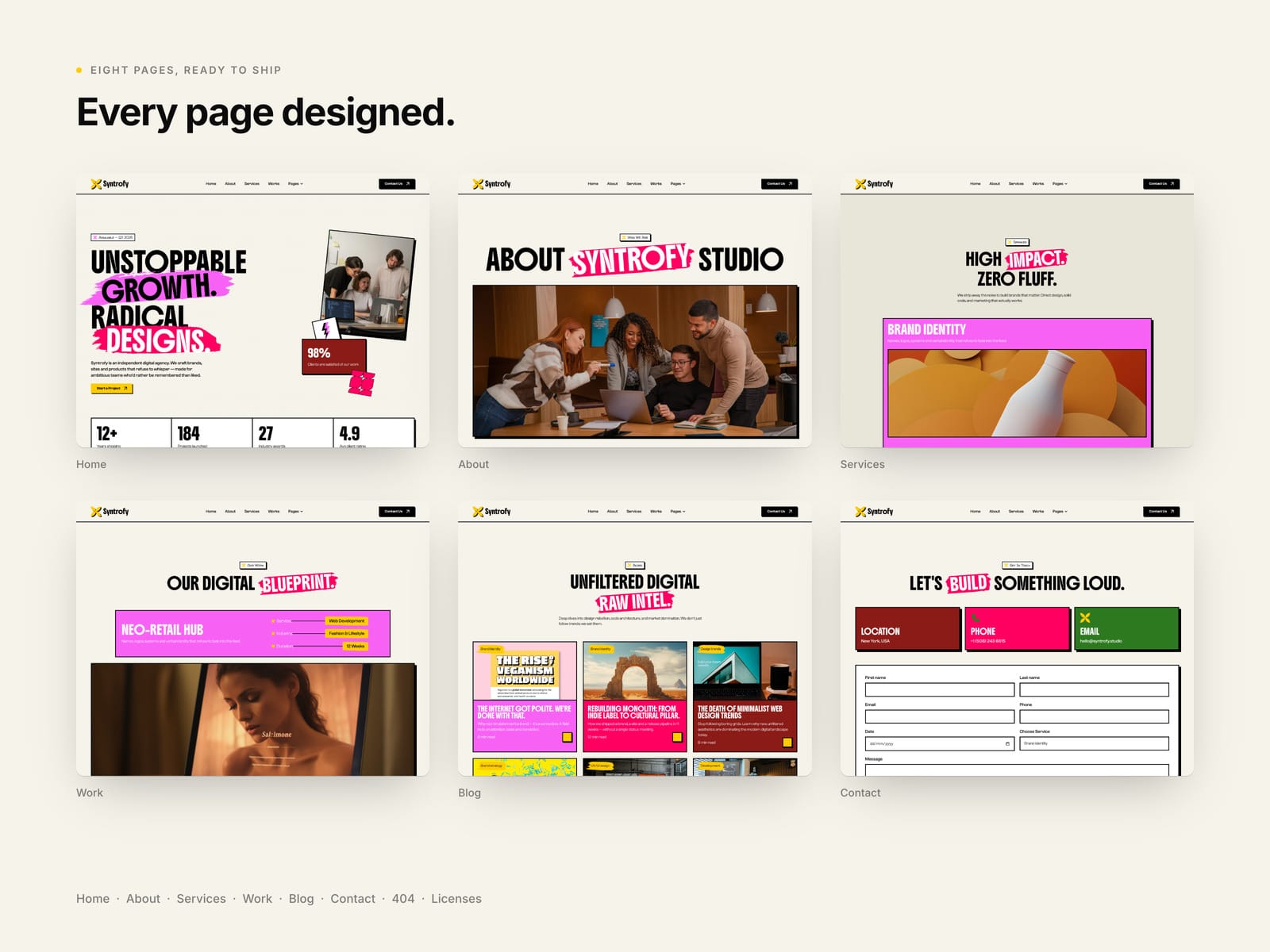
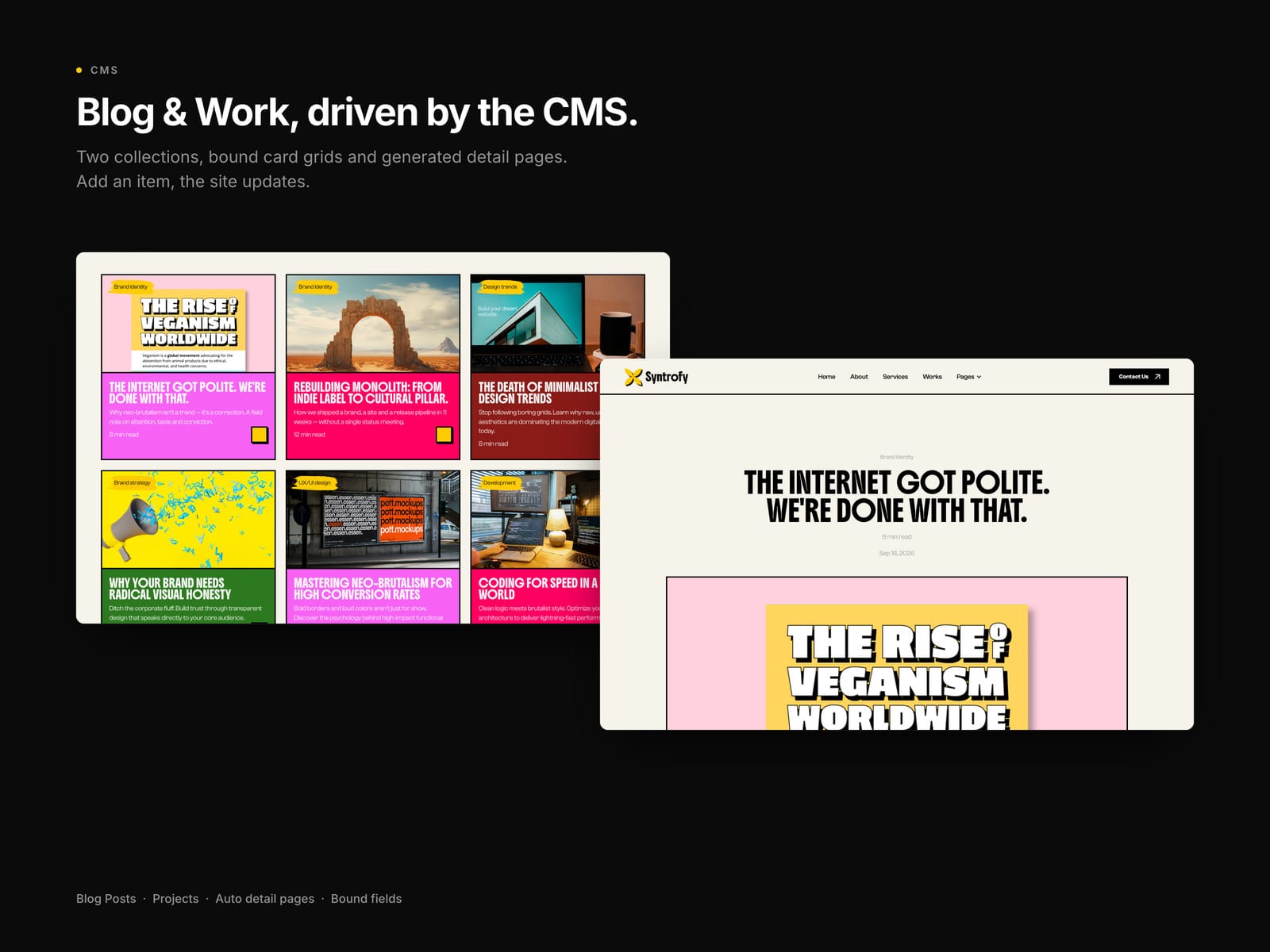
Underneath that: ten page templates, two CMS collections wired end to end (add an item and the card, its accent colour, the detail page and the link all generate themselves), and six sections shipped as reusable components.
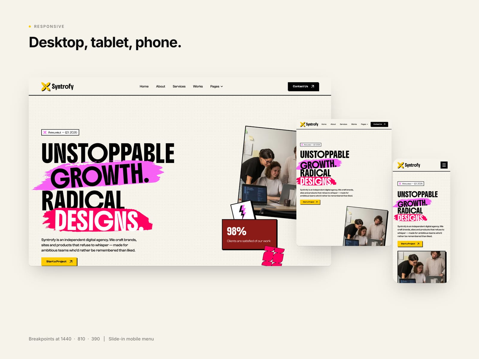
One detail I’m oddly proud of — the responsive behaviour is a continuous ramp rather than three fixed breakpoints. Section spacing scales smoothly from 1440 all the way down to 390, instead of collapsing the moment you cross 810. Every page audited at all three widths, zero horizontal overflow.
All three typefaces are native to Framer, so there’s nothing to upload and nothing to license.
Live demo: https://syntrofy.framer.website
#framer #webdesign #nocode #neobrutalism