Oritec 2.0: a cleaner, calmer AI SaaS template
I just shipped a big update to Oritec, my Framer template for AI products, workflow tools and operations platforms. I rebuilt the whole template around a more minimal, high-end look.
What's new
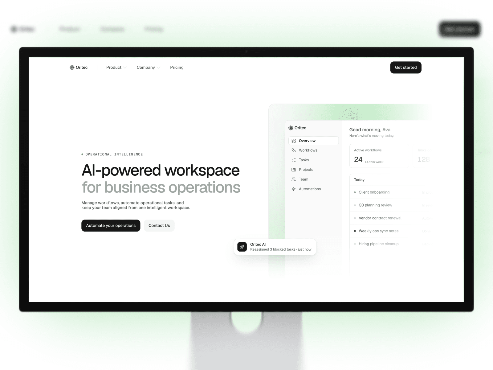
- New hero: a split layout with a product dashboard built entirely in Framer. You can edit every number, task and status, with no screenshots to replace.
- Refined visual style: monospace section labels, two-tone headlines, hairline dividers and soft surfaces, with one accent colour you can change across the whole site in a single click.
- Motion throughout: headlines that blur in word by word, cards that fade up in sequence, pulsing status dots, growing chart bars and subtle hover lifts.
- Every page updated: Home, Pricing, About, Blog, blog articles, Changelog, Contact, Legal and 404 now share the same style.
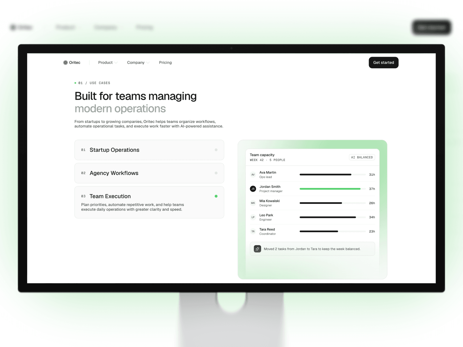
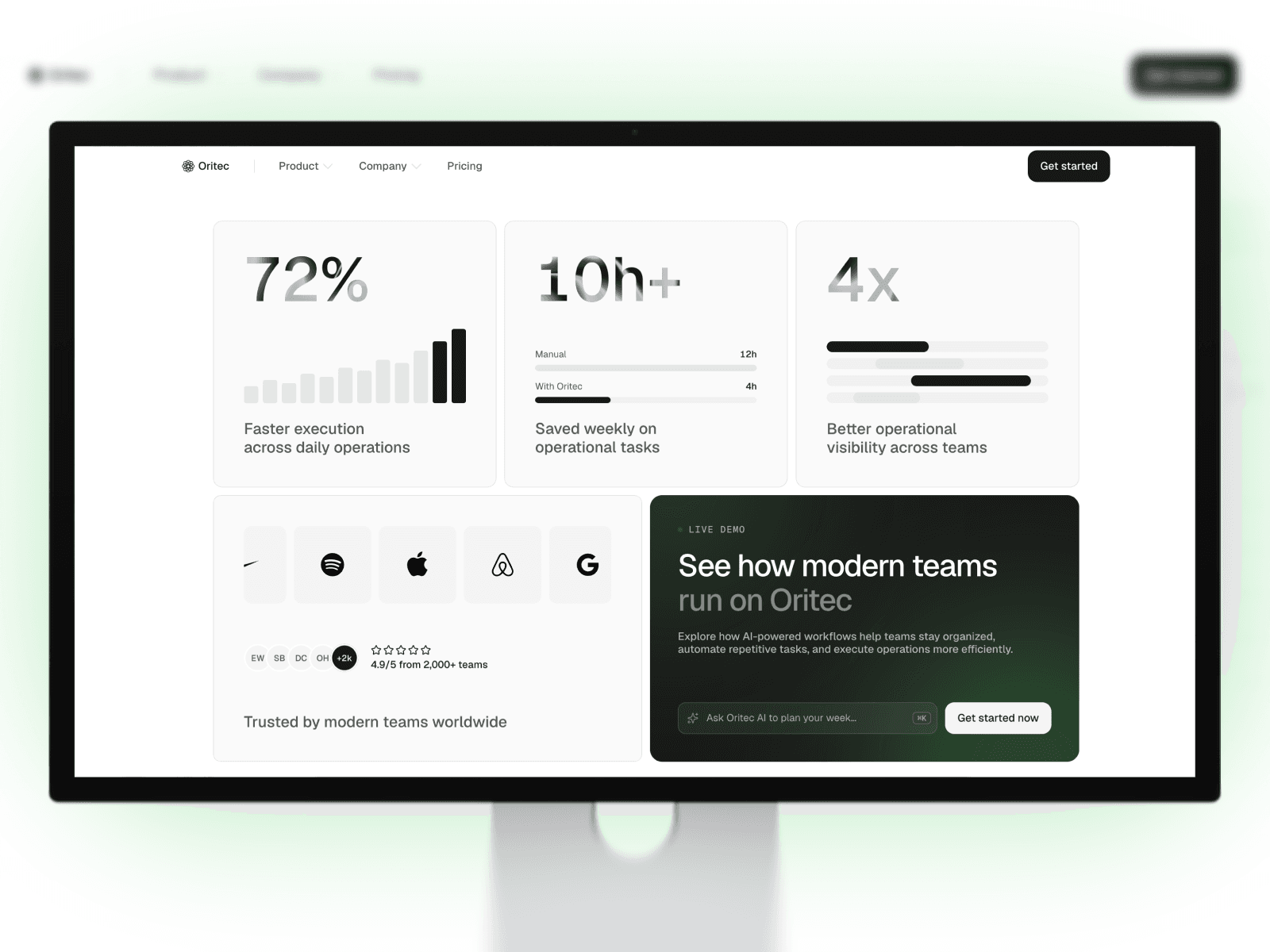
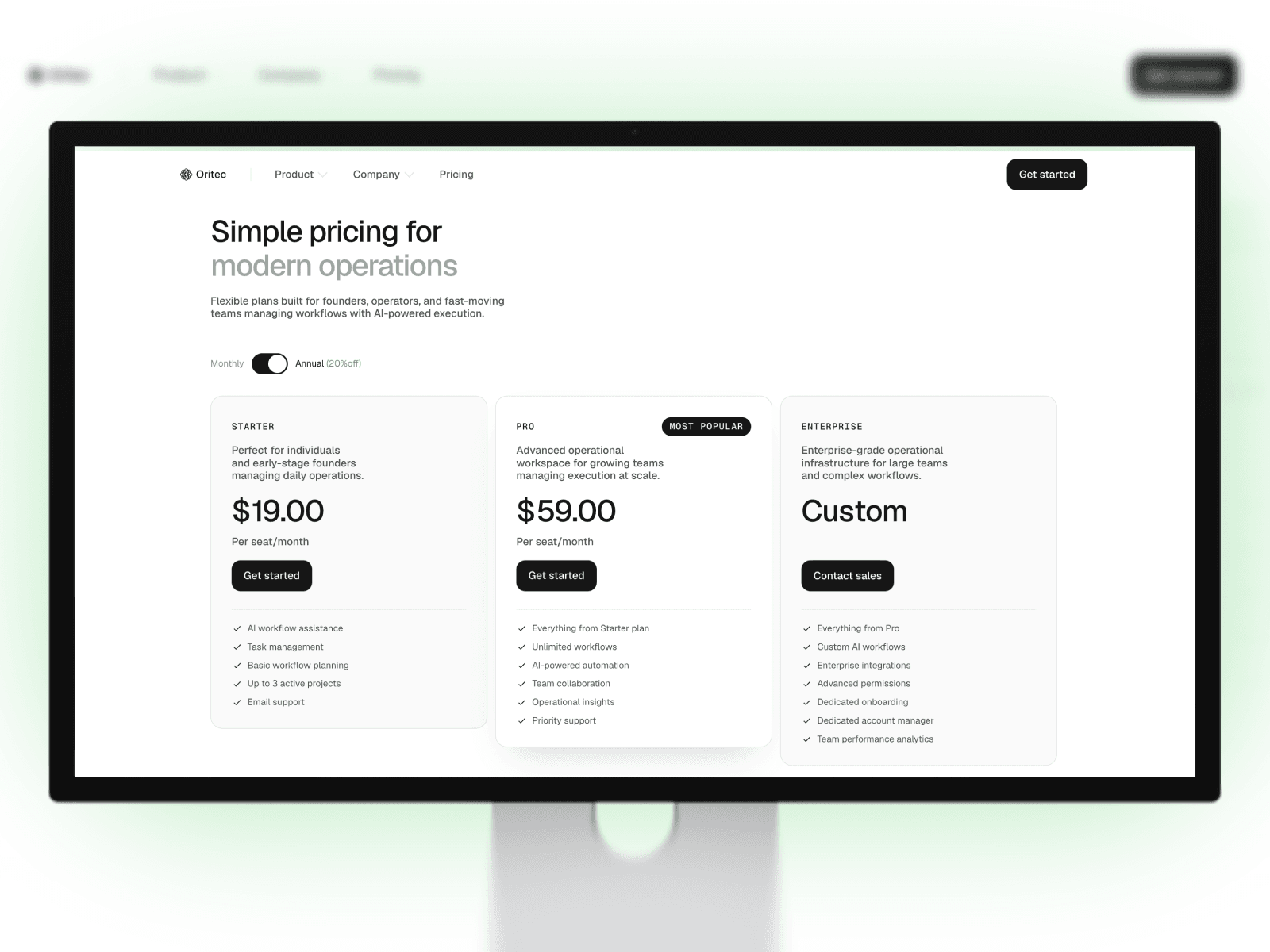
- New components: use case panels, stat cards (bars, comparison and timeline), a reminder stack, a pricing table with monthly/annual toggle, a FAQ help card and an AI command bar in the call-to-action section.
- New navigation and footer: featured cards in the dropdown menus, a numbered full-screen mobile menu, and a footer with a newsletter form (success and loading states) and a system-status pill.
- Better on big screens: the hero dashboard now fades out softly at the edge on wide displays.
Fixes
- Blog article page titles now use the site name
- Typo and text-wrapping fixes on the Pricing and Changelog pages
- Cleaner form placeholders on the Contact page
If you already own Oritec, you can remix the latest version from the marketplace. Feedback and questions are very welcome.