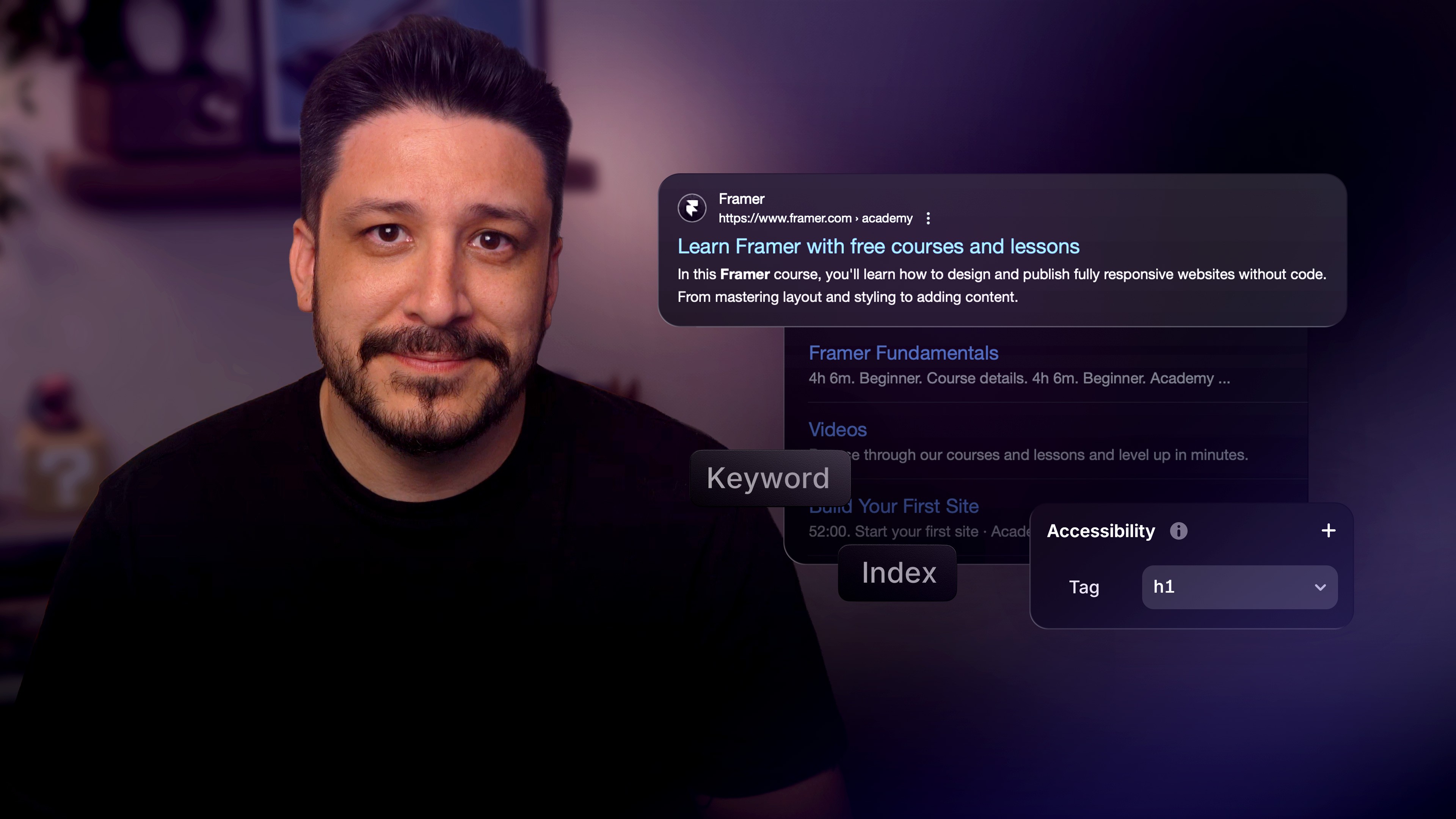
Auto Sizing Basics

Auto sizing is a powerful feature that allows elements to be sized based on their contents.

The simplest example for auto sizing is a button. If you draw a simple Frame with some text and change the width and height from Fixed to Fit Content, the button will start to resize based on the size of the text.

Another common way to use auto sizing is for text blocks where you only auto size the width or height:

You can use these in many combinations to create every possible design that responds to size changes. It's important to note that all auto sizing is based on Stacks, using Flexbox under the hood.

Supercharge your business site.
  • 99.99% uptime

  • Dedicated IP address

  • Unlimited pages

  • Proxy support

  • Custom onboarding

  • Unlimited viewers

  • Invoicing

  • Custom terms

  • Security reports

  • Single sign-on

  • Canonical URL

  • User roles

  • Office hours

  • Performance audit

  • SEO audit

  • Advanced DDoS protection

  • Custom agreements

Framer UI