About 3D Tilt on Flip card
About this Component
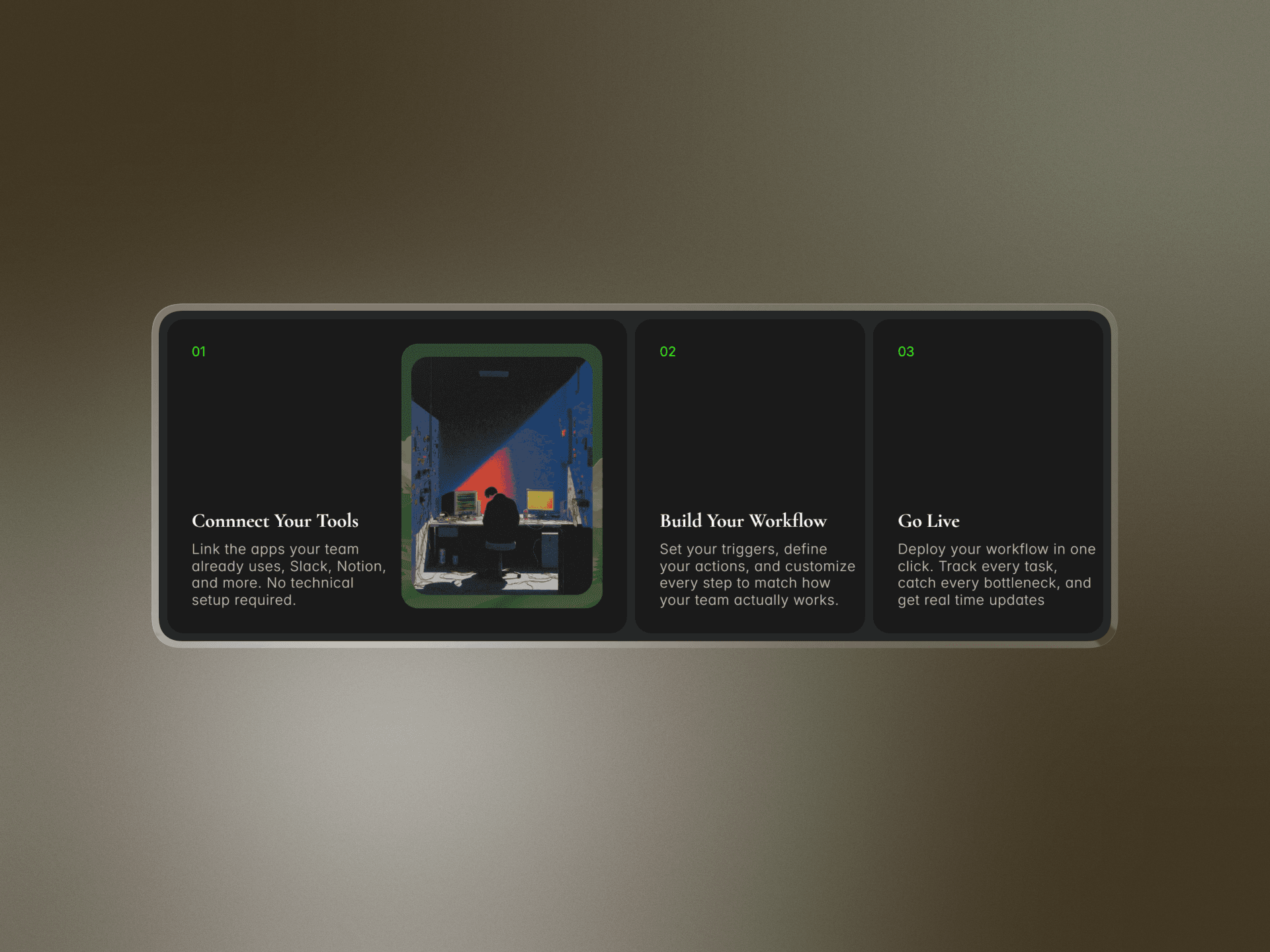
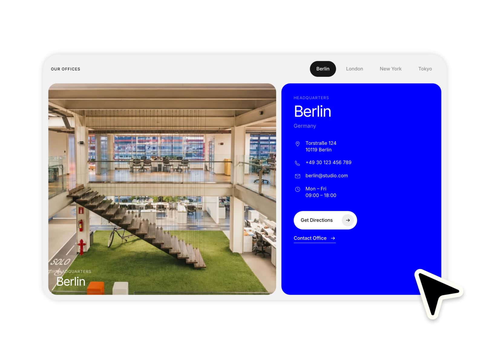
A sleek, interactive 3D card that tilts on hover and flips on tap - bringing depth, motion, and delight to any layout. The front showcases your image, while the back reveals custom text content. Fine-tune every detail with built-in controls for tilt strength, max width, shimmer effects, and more. No code required.
Features
Smooth 3D tilt effect on hover
Tap-to-flip with front (image) and back (text) sides
Adjustable tilt strength and sensitivity
Customizable max width for responsive layouts
Built-in shimmer/glare overlay effect
Fully controlled via Framer properties - no code needed
Lightweight and performant
These are the functionalities you will get inside the component:
Use Cases
Product cards with image + description reveal
Portfolio project showcases
Team member or profile cards
Feature highlights on landing pages
Interactive image galleries
Premium service or pricing displays
Built For
Designers who want tactile, eye-catching card interactions
Developers looking for a drop-in, customizable Framer component
Marketers building high-engagement landing pages
How to Use
Drag the component onto your Framer canvas
Set your front image and back text content
Adjust tilt strength, max width, and shimmer settings via properties
Preview the hover tilt and tap flip interactions
Publish - your interactive card is live!