About Circle Expand Card
About This Component
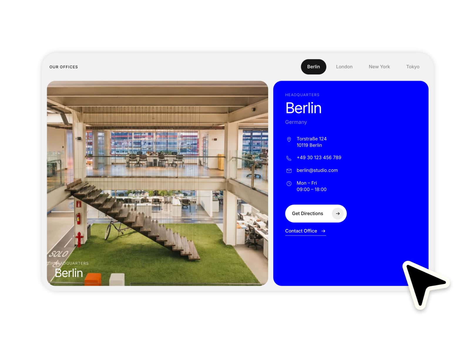
Circle Expand Card is an interactive media card designed to create bold hover interactions with smooth expanding circle animations.
When hovering the card, the icon background grows dynamically to fill the entire card, creating a fluid transition between the default and hover states. Combined with animated text colors, overlays, and customizable layouts, the result feels modern, playful, and highly interactive.
The component supports flexible text positioning, custom icons, adjustable overlays, and responsive media backgrounds, making it ideal for portfolios, featured content, navigation cards, case studies, or creative landing pages.
Layout & Content
Choose between 5 built-in layouts:
Title Bottom Left — category at the top left, icon at the top right, title and subtitle aligned bottom-left
Title Bottom Right — category at the top left, icon at the top right, title and subtitle aligned bottom-right
Title Top Left — category at the bottom left, icon at the bottom right, title and subtitle aligned top-left
Title Top Right — category at the bottom left, icon at the bottom right, title and subtitle aligned top-right
Title Centered — category at the top left, icon at the top right, title and subtitle perfectly centered