About Switching Tabs Card
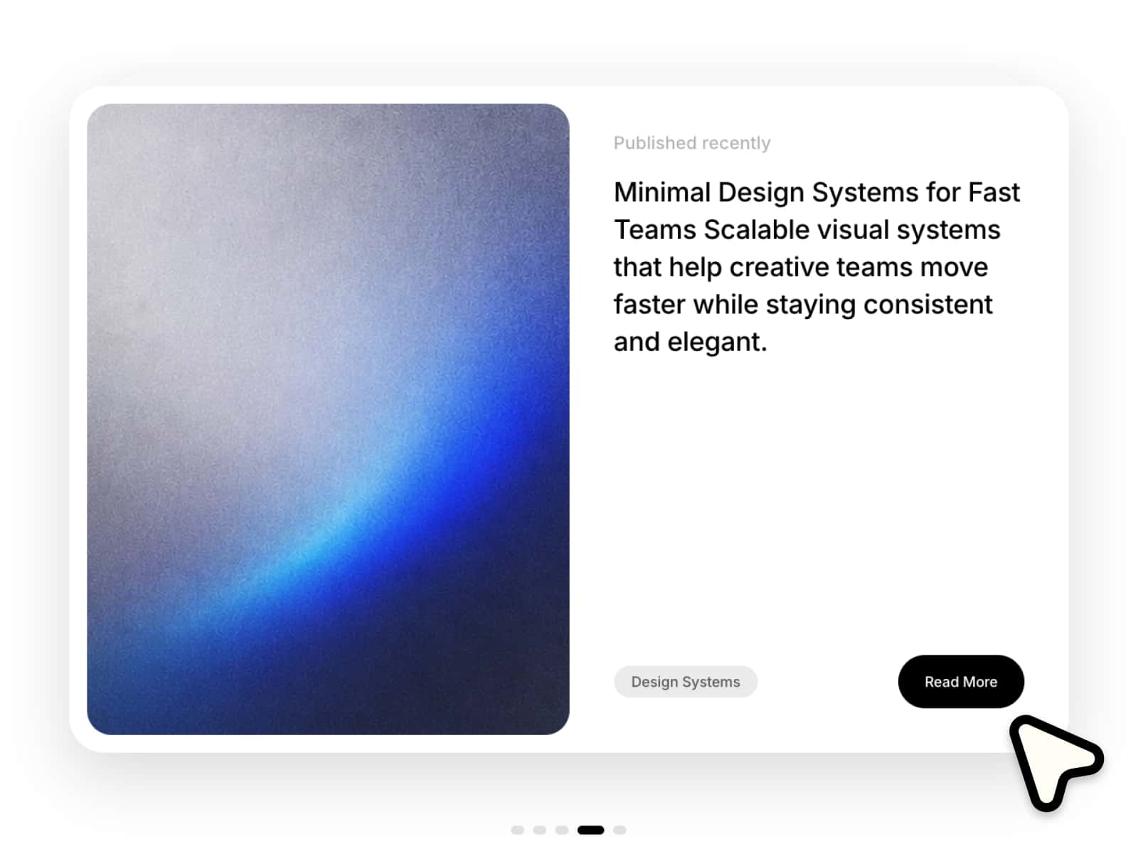
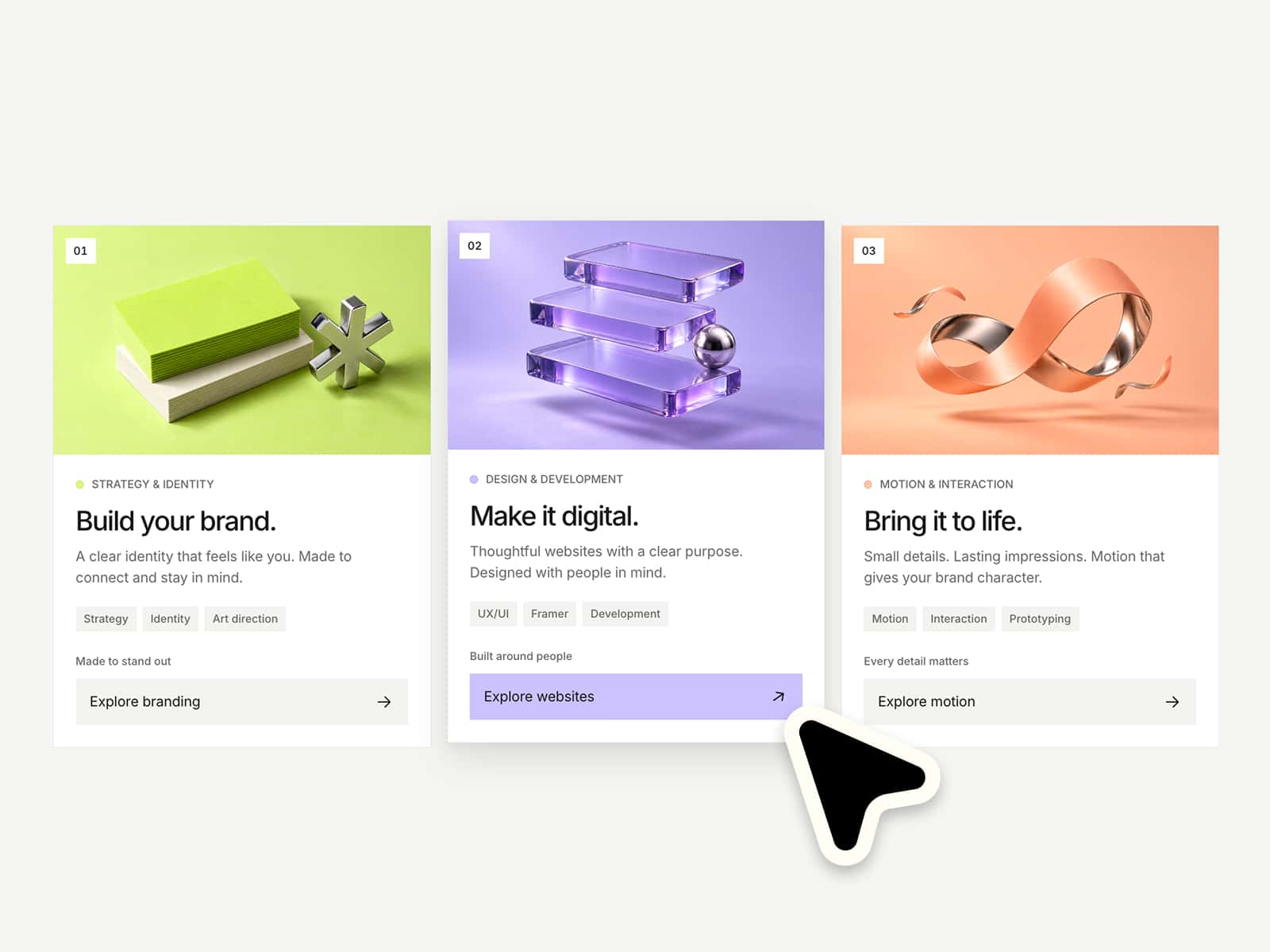
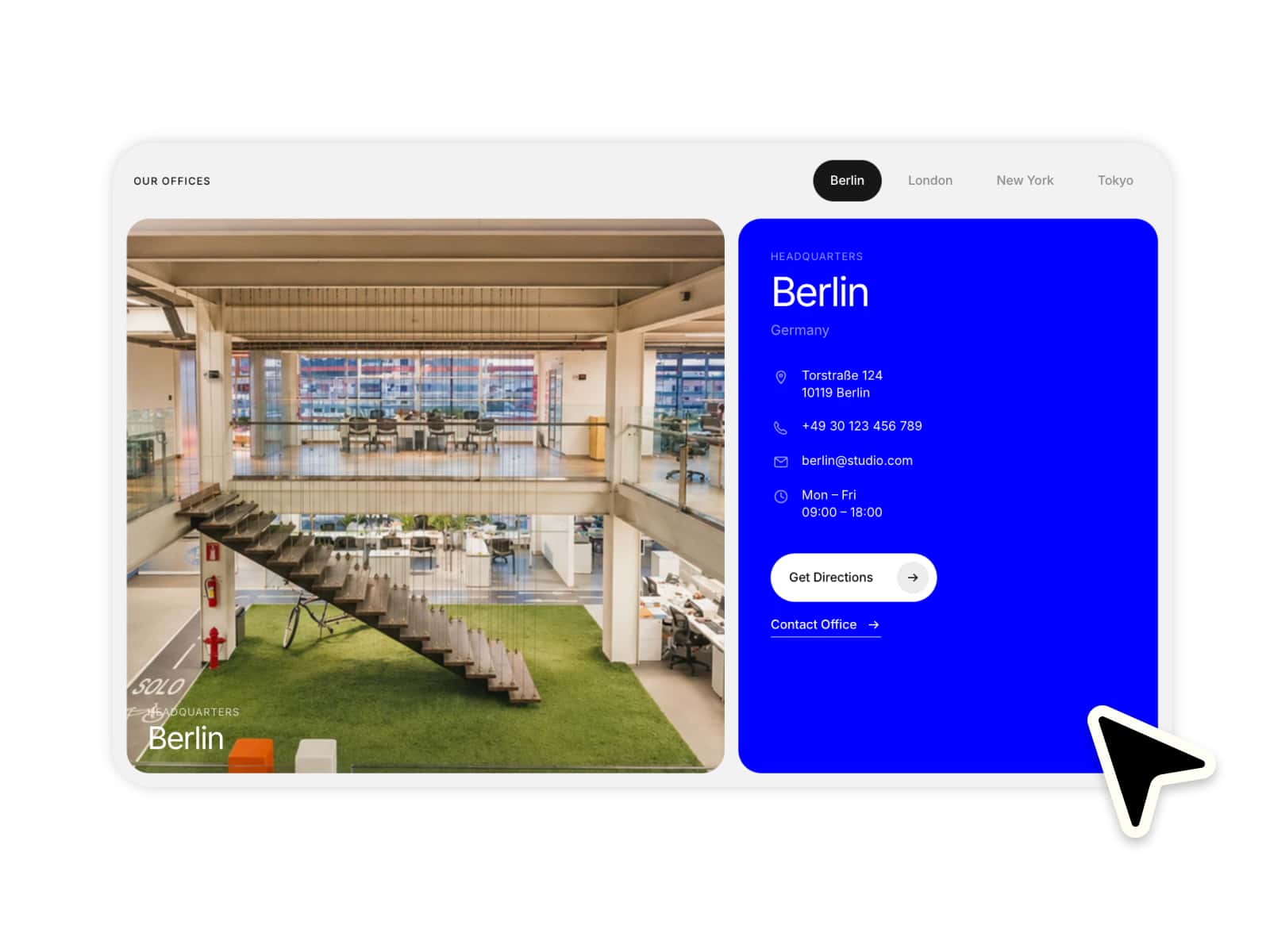
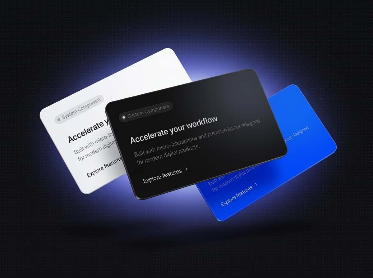
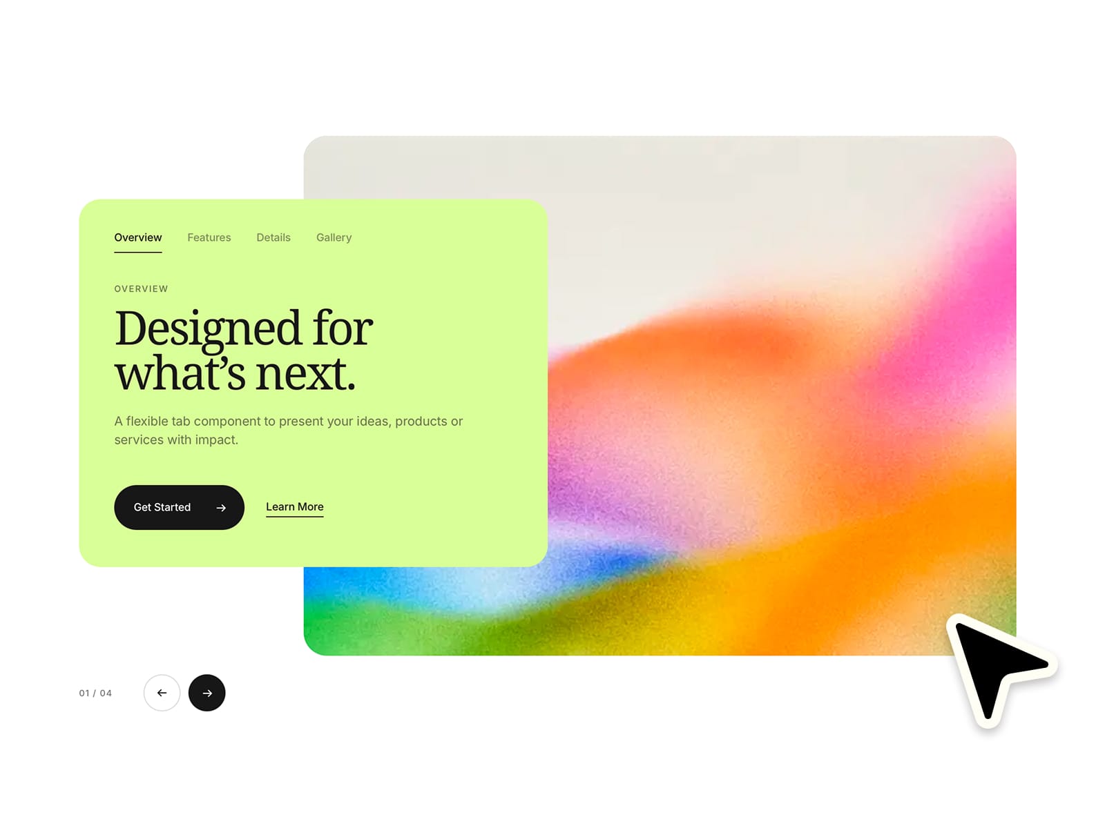
✦ Put the visual first. Create bold, image-led tab sections with an overlapping content card, smooth transitions and a clean editorial layout. Each tab can have its own image, eyebrow, title, description and CTAs, while the structure stays perfectly aligned as content changes. Make it completely your own with flexible controls for layout, styling and motion :)
⚙ What you can customize
Easily adapt every part of the component to match your own brand and style.
Images ✦ Tab labels ✦ Eyebrows ✦ Titles ✦ Descriptions ✦ Primary CTA labels ✦ Secondary CTA labels ✦ Links ✦ Open in new tab ✦ Full card link ✦ Card background ✦ Text colors ✦ Active & inactive tab colors ✦ Button colors ✦ Navigation colors ✦ Image overlay ✦ Grain intensity ✦ Card width ✦ Image width ✦ Image height ✦ Card radius ✦ Image radius ✦ Animation speed ✦ Image zoom ✦ Typography
🎯 Perfect for
Feature showcases ✦ Product highlights ✦ Service presentations ✦ Portfolio sections ✦ Case studies ✦ Editorial layouts ✦ Landing pages ✦ Brand storytelling
📱 Responsive by default
The layout automatically adapts to the component's width across Desktop, Tablet and Mobile. The overlapping composition is preserved where possible, while the image and content reorganize cleanly on smaller screens.
🖱 Included interactions
Animated tab switching ✦ Synchronized image transitions ✦ Smooth text transitions ✦ Subtle image zoom ✦ Previous & next navigation ✦ Active tab indicator ✦ Clickable full card ✦ Independent CTA links ✦ Optional new-tab links ✦ Responsive tab scrolling
🔗 Live Preview
https://flexibleaccordion.framer.website
––––––––
❤ Thank you so much for your support! I genuinely appreciate every download. I hope you have fun customizing this component and making it your own. Happy building!