About Stacked Flow
✦ Add depth and motion to every story.
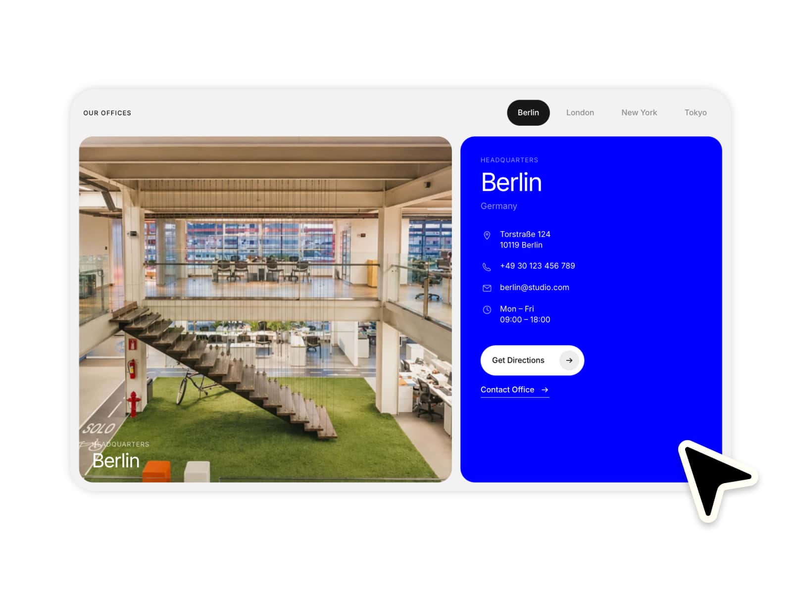
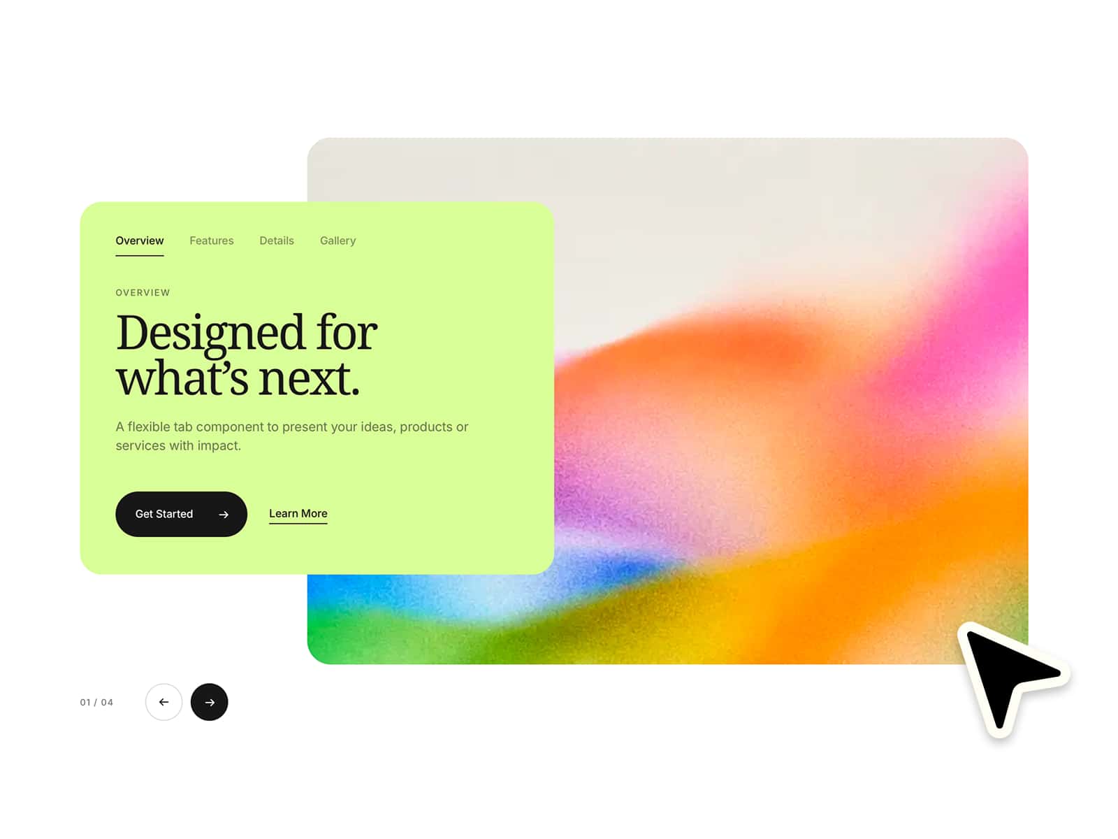
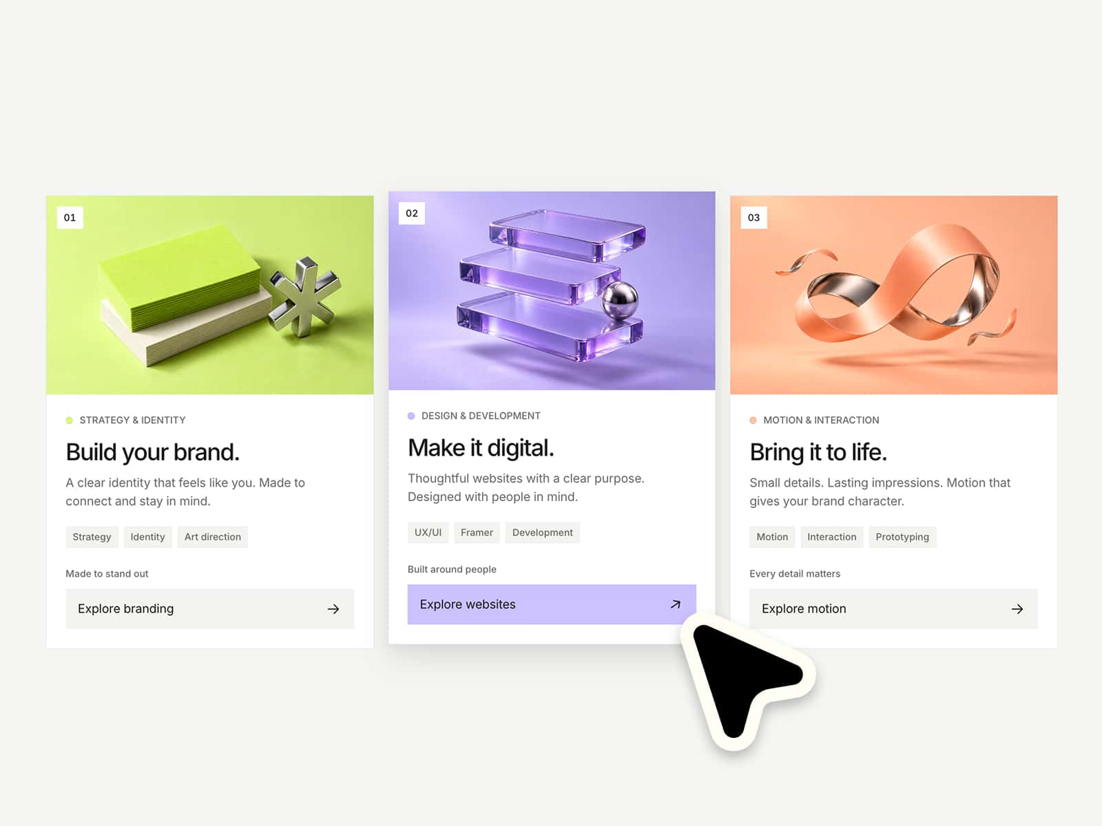
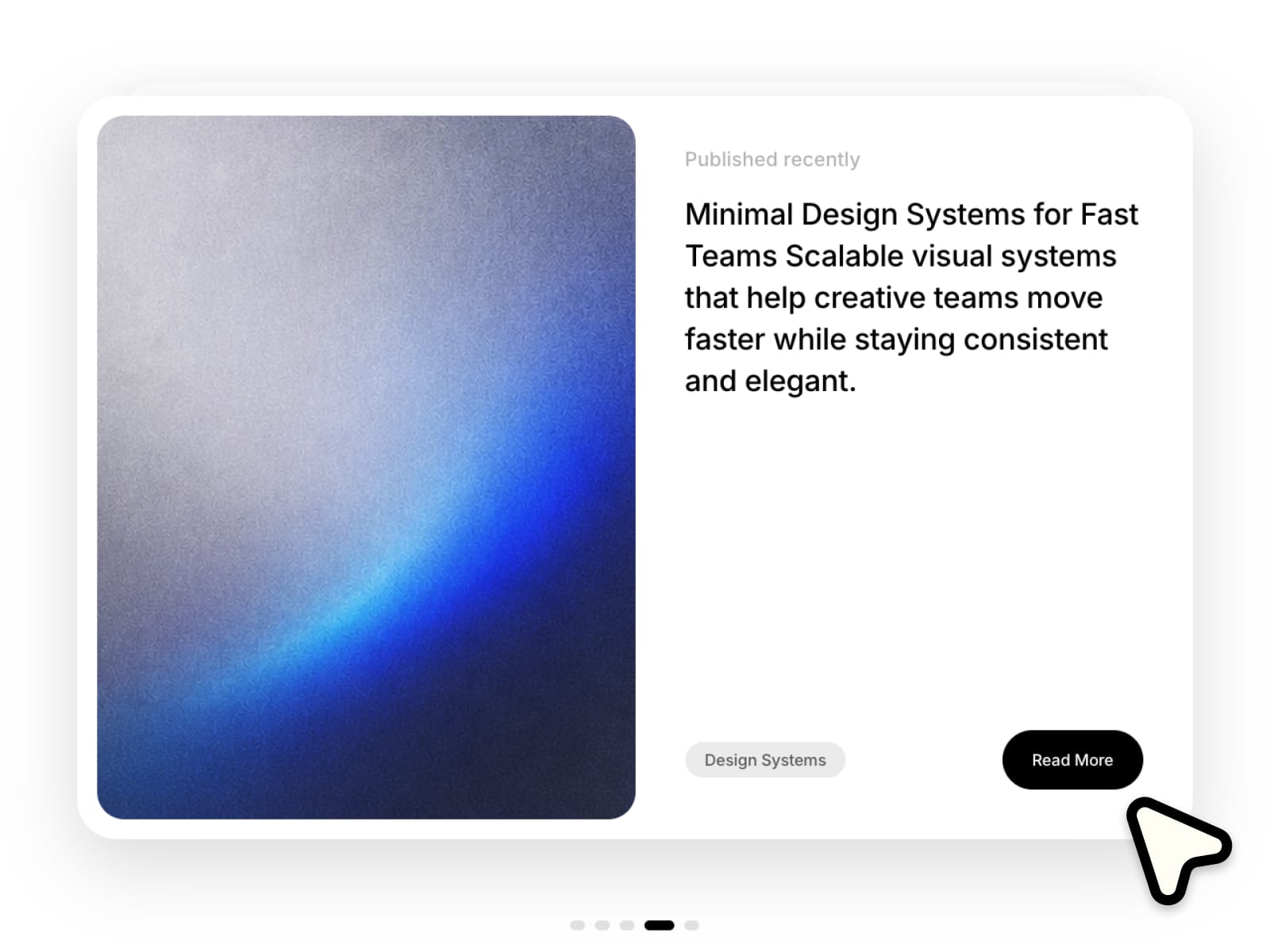
Create beautiful stacked card layouts with smooth animations, layered depth and natural interactions. Fully responsive, easy to customize and ready to use in seconds. Make it completely your own with flexible controls for layout, styling and motion :)
⚙ What you can customize
Easily adapt every part of the component to match your own brand and style.
Images ✦ Titles ✦ Subtitles ✦ Descriptions ✦ Card width ✦ Card height ✦ Card spacing ✦ Stack offset ✦ Mobile sizing ✦ Border radius ✦ Active scale ✦ Inactive scale ✦ Depth intensity ✦ Animation speed ✦ Scroll sensitivity ✦ Background color ✦ Text colors ✦ Typography
🎯 Perfect for
Creative portfolios ✦ Agency presentations ✦ Editorial storytelling ✦ Featured case studies ✦ Fashion campaigns ✦ Product showcases ✦ Landing pages ✦ Brand storytelling ✦ Content highlights ✦ Project previews
📱 Responsive by default
Optimized layouts for Desktop, Tablet and Mobile with smooth animations and touch-friendly interactions.
🖱 Included interactions
Layered scaling ✦ Smooth transitions ✦ Scroll interactions ✦ Touch navigation ✦ Depth animations ✦ Responsive layouts
🔗 Live Preview
https://bisque-potential-446779.framer.app/
––––––––
❤ Thank you so much for your support! I genuinely appreciate every download. I hope you have fun customizing this component and making it your own. Happy building!