About Accordion Panels
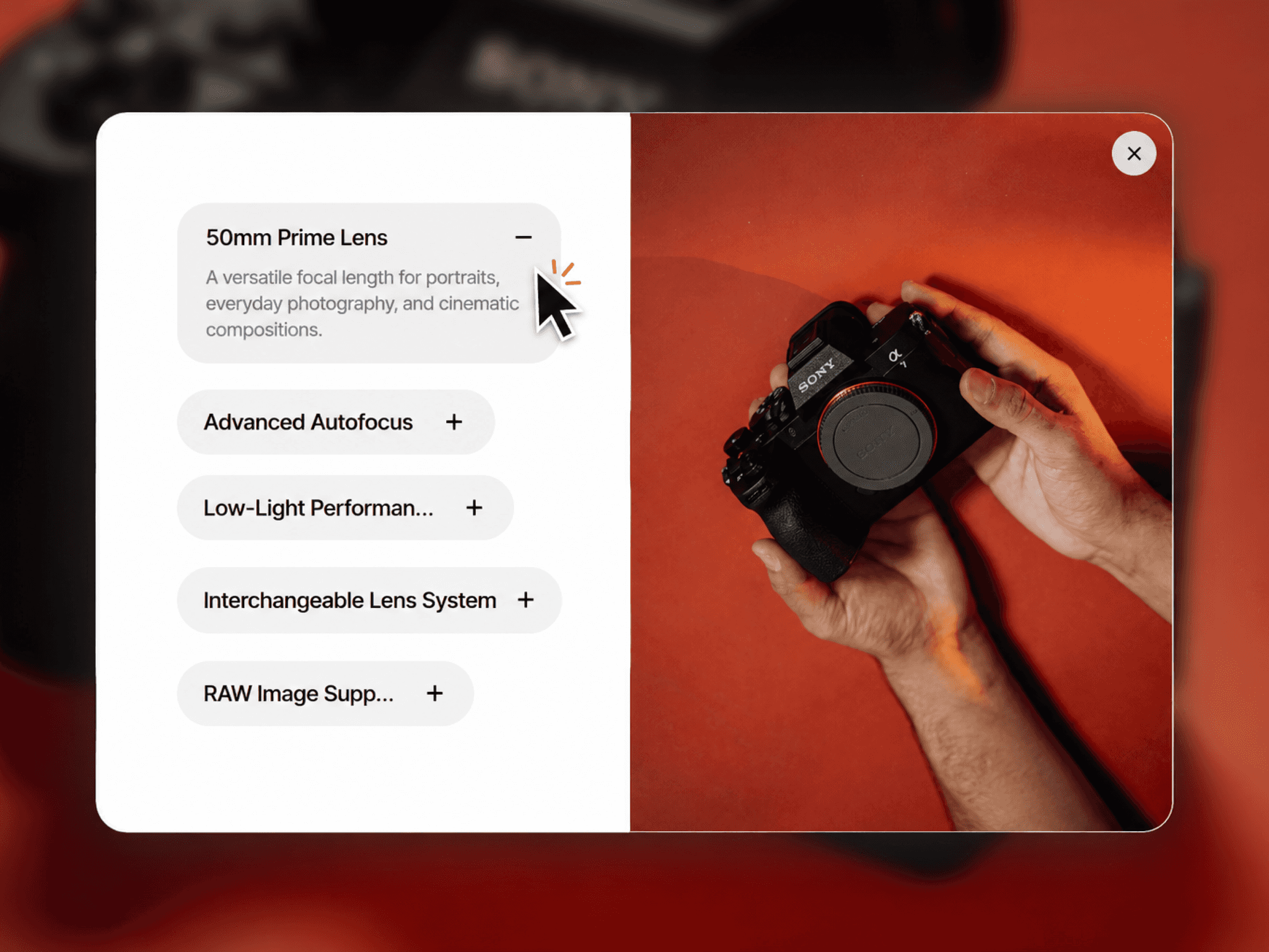
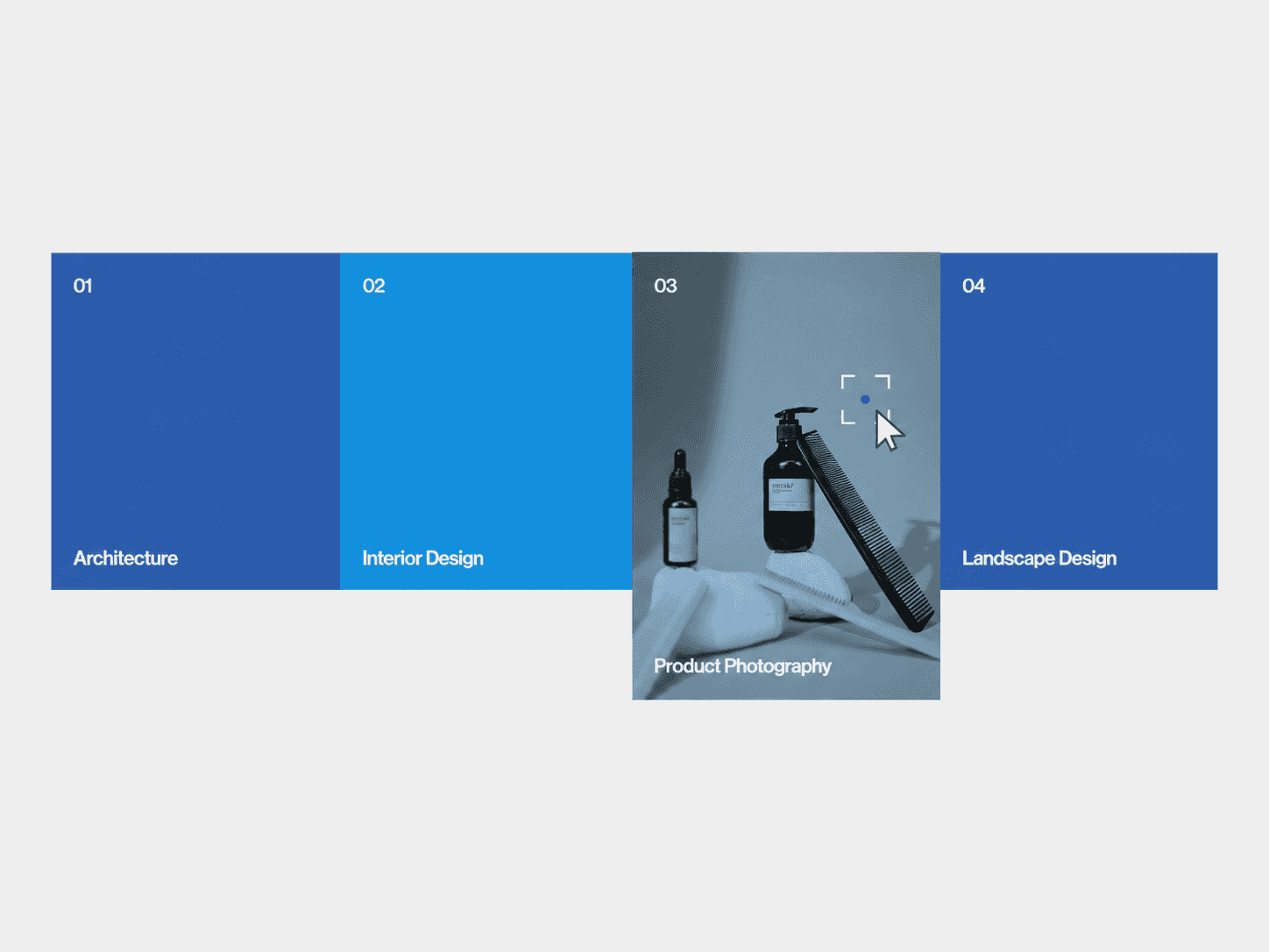
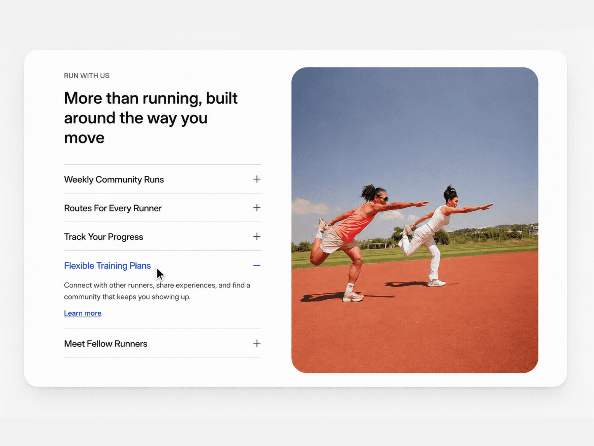
An interactive accordion panel component with pill-shaped strips. One panel stays expanded while the others collapse into slim strips with rotated labels. Visitors click any strip to smoothly expand it, and the content slides in from whichever side they clicked.
What you get
Full source code (.tsx), ready to paste
Framer remix link with the demo project
README with step-by-step setup
Free lifetime updates
Support within 24 hours
Customizable
Panels: label, title, description, image, background color, text color (add as many panels as you need)
Layout: default active panel, gap between panels, collapsed strip size, content padding, open panel corner radius, description max width, mobile breakpoint
Image: size, aspect ratio, corner radius, and gap between image and text
Fonts: separate font controls for the collapsed label, heading, and description
Animation: Framer's Transition control (spring, tween and more) plus a content delay to time the content and label fade
How it works
Remix or paste the code into Framer
Drag the component onto your canvas
Edit your panels, images, colors, and styles directly in the properties panel
Good to know
Code component for Framer, not a standalone download
No external libraries to install
The collapsed pill shape is automatic, so strips always keep perfectly round ends
Images are optional per panel, and panels without one simply show text
Fully responsive: panels sit side by side on desktop and stack vertically on mobile
Keyboard accessible: Tab to a panel and press Enter or Space to open it
Animation and interactions run seamlessly in Preview and on the published site (the canvas shows a static renderer view)
License: Unlimited personal and client projects. No resale or redistribution.
Refunds: Not working? Email us first and we'll fix it within 24 hours.
Questions? support@russetsupply.com