About Aisol Catalogue Nav
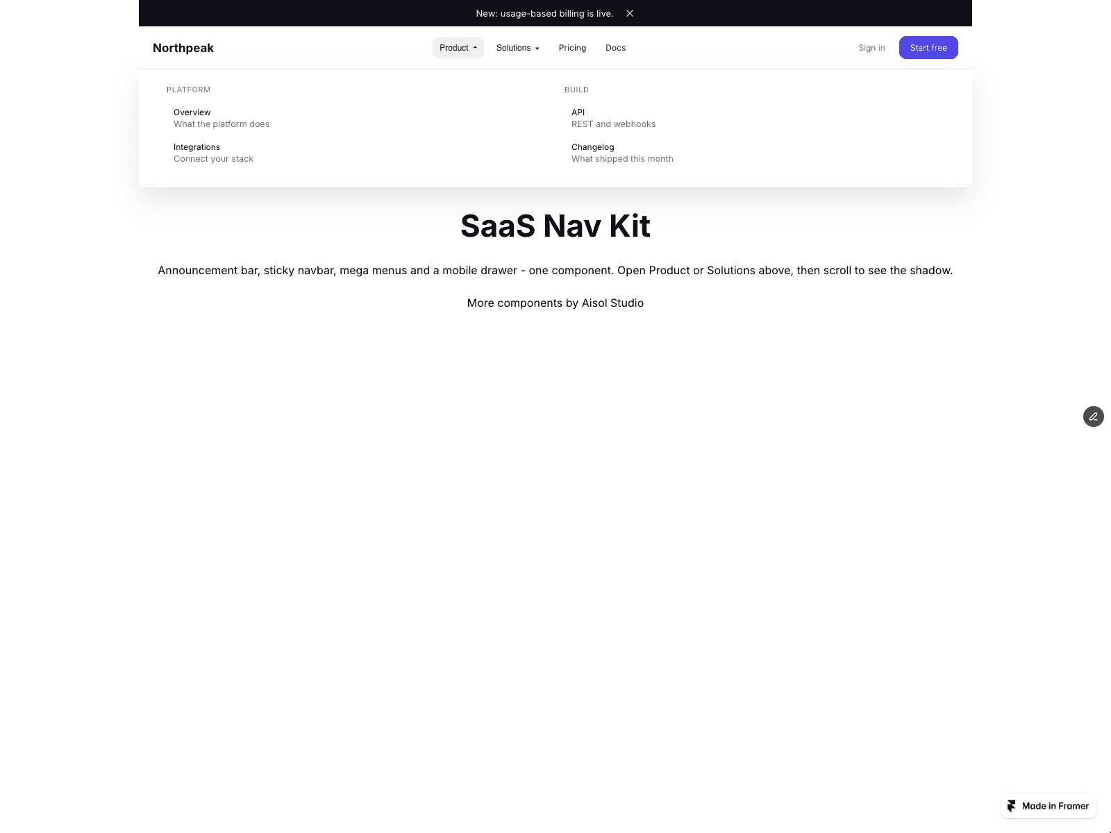
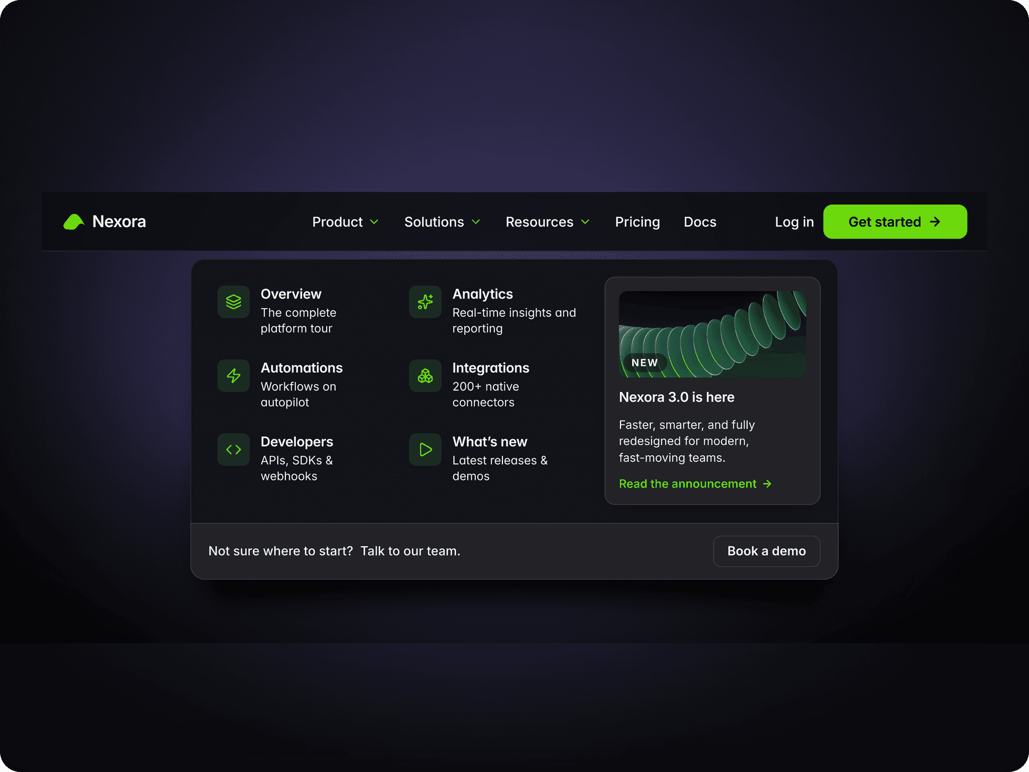
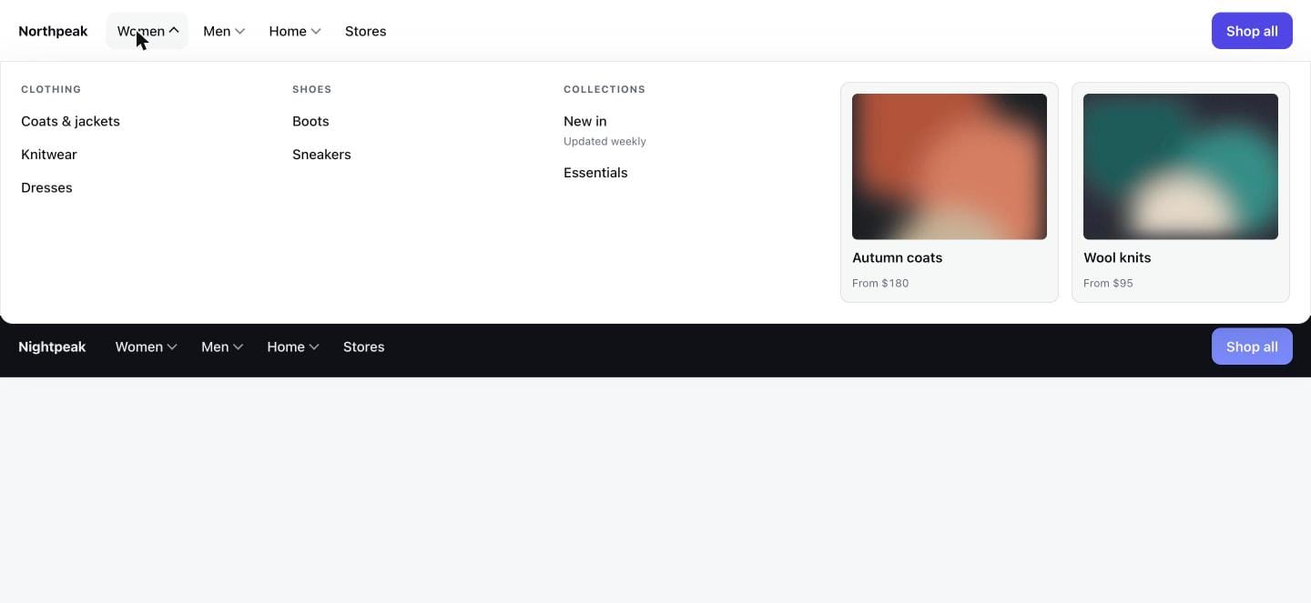
Build a catalogue menu from a CMS collection in three steps. Drop a Collection List into the Links (CMS) slot and turn off its Pagination (Load more / Infinite). Name the item's text layers Title, Category and Description, and optionally add an Image and a link. Publish: every CMS item becomes a link in the CMS menu, in one column per Category.
Top-level menus open a wide panel with link columns, featured cards and an optional Promo frame. On small screens the bar becomes a drawer that drills down one level at a time.
CMS menu: the component reads the list and shows every item, so the list's own Load more button is not shown. Columns follow the order categories first appear; items without a Category share a column with no heading. Links keep their address and new-tab setting. Layer names can be changed in the panel.
No CMS? Leave the slot empty and type Top level, Menu links and Featured cards. Links and cards join a menu when their Item key matches its Key. Demo cards use colour blocks; add your own images in Cards.
Mobile below is applied from the first paint for values in 10 px steps; other typed values switch right after the page loads.
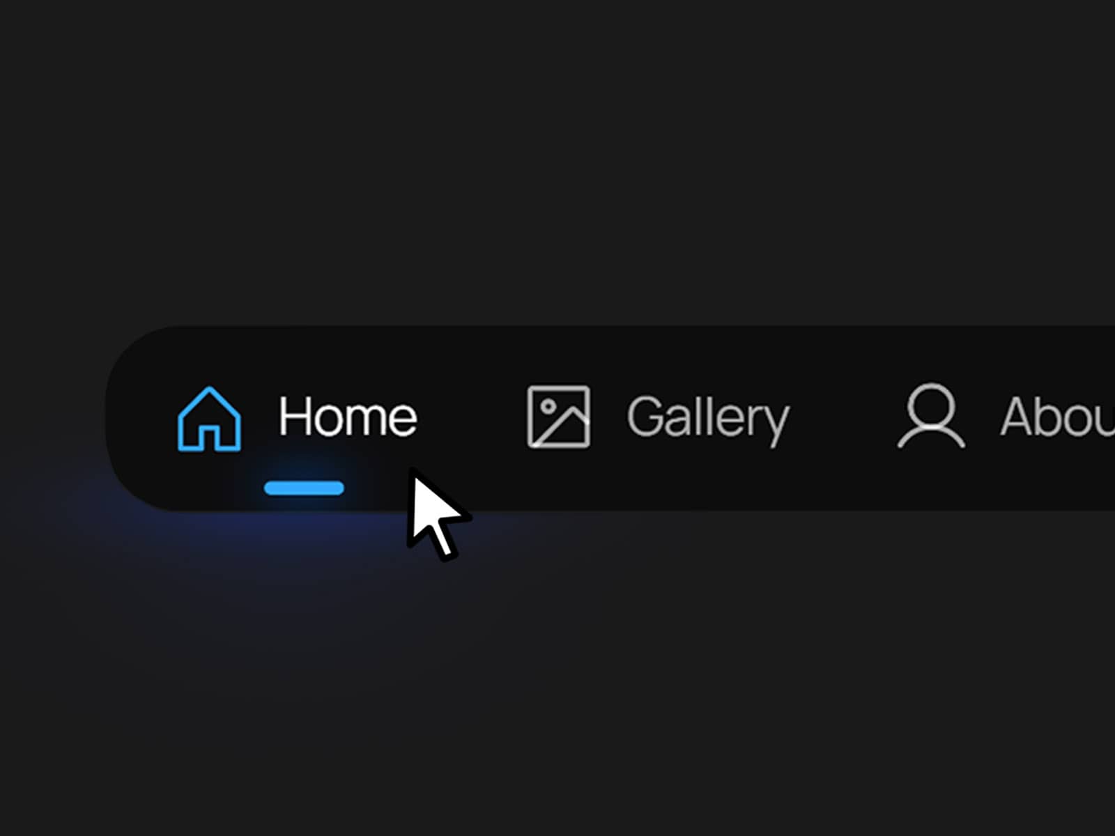
Keyboard: Arrow Down opens a menu, Up and Down walk its own links, Left and Right move along the bar, Escape closes and returns focus. Links inside your Promo layer are reached with Tab. Opens on hover or click. Reduced motion is respected.
The canvas shows the closed bar; open menus in Preview or on the published site.