About Animated Tooltip Pro
Animated Tooltip: Hover & Tap Popover with Auto-Aligned Arrow
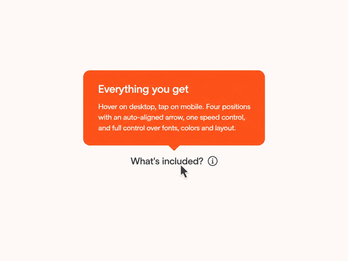
A clean info tooltip that fades and slides in on hover. It opens on tap for mobile and tablet. Add it next to any label, price or feature, pick which side it opens on, and the arrow lines up on its own. Match the look to your brand with a few colors, fonts and a single speed control.
What you get
Full source code (.tsx), ready to paste
Framer remix link with the demo project
README with step-by-step setup
Free lifetime updates
Support within 24 hours
Customizable
Content: trigger text, heading and body text
Fonts: trigger font, heading font and body font, each with its own size, weight and line height
Colors: popup background, heading, body, icon and trigger text
Layout: position (top, bottom, left or right), max width, radius, outer padding, heading-to-body gap, icon size and icon gap
Motion: one speed control that scales the whole animation together
How it works
Remix or paste the code into Framer
Drag the component onto your canvas
Edit the text, colors, fonts and layout directly in the properties panel
Good to know
Code component for Framer, not a standalone download
No external libraries to install
Opens on hover with a mouse and on tap for touch devices. Tapping anywhere else closes it
The arrow always sits at the center of the popup and points at the trigger, whichever side you choose
The popup renders above the page, so parent frames and other layers never clip it
Works with keyboard focus, and respects reduced-motion settings
License: Unlimited personal and client projects. No resale or redistribution.
Refunds: Not working? Email us first and we’ll fix it within 24 hours.
Questions? support@russetsupply.com