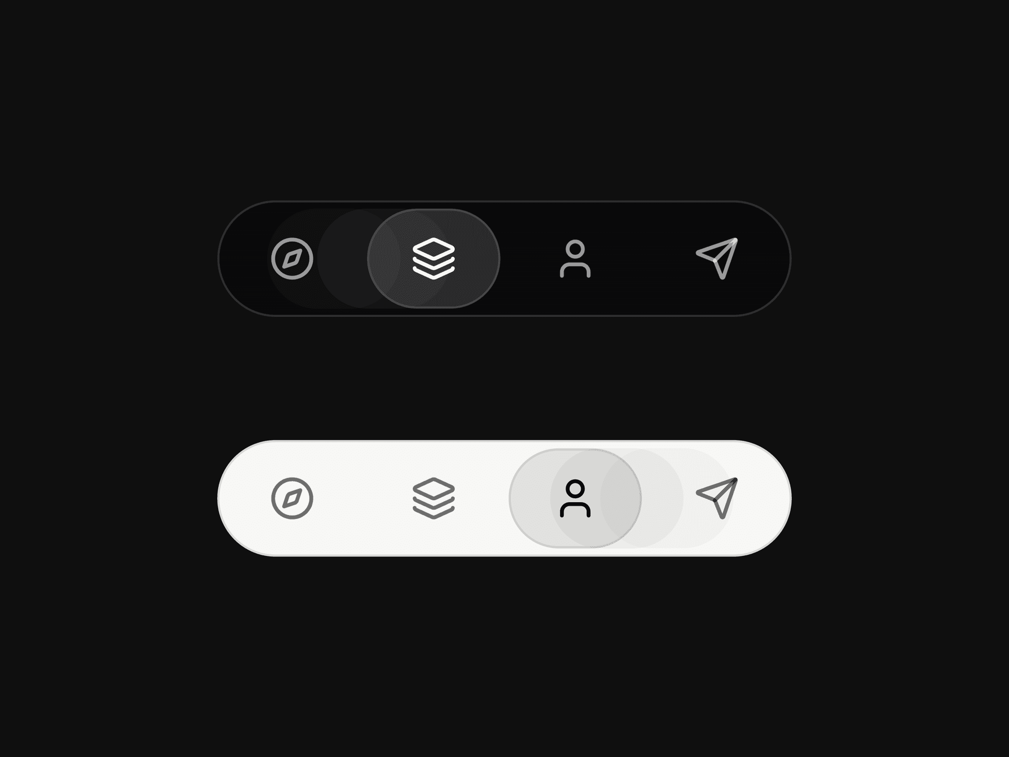
About AppleMenuTooltipCard
About
The Apple Menu Tooltip Card brings the sleek, fluid interaction of macOS style menus directly into your Framer projects. It is a highly polished component designed to look and feel like native Apple UI, making it the perfect choice for navigation bars, profile menus, or interactive dashboards that require a premium touch.
What it does
This component provides a versatile tooltip or dropdown that can be triggered by either a hover or a tap. It features smooth spring animations for opening and closing, along with built-in scaling effects that react when users interact with individual items. It intelligently handles various content types, including icons, text, separators, and even specialized "destructive" menu items for a complete app-like experience.
What you can customize
Interactions: Choose between hover or tap triggers, and set the default state to open or closed.
Anchor Styling: Customize the anchor label, size, colors, and shadow to perfectly match your trigger button or icon.
Menu Layout: Total control over the menu appearance, including backdrop blur, opacity, item height, padding, and corner radius.
Animation & Feel: Fine-tune the spring physics using stiffness and damping sliders, and adjust hover scales and insets for a tactile, responsive feel.
Colors & Typography: Full control over text, icon, and background colors, plus font selection and tooltip width to suit your brand.
Great for
Navigation bars and sidebars
User profile and settings menus
Interactive feature tooltips
Minimalist landing pages
Building web apps with a native software feel
Share your buildIf you ship something cool with it, post it on X and tag me @Dulajweb, or send it over. I’d love to see what you create.
Need help?Questions or feedback? Reach me anytime: dulajdilshan766@gmail.com or on X @Dulajweb