About Brand Pillars
Turn your services into a story.
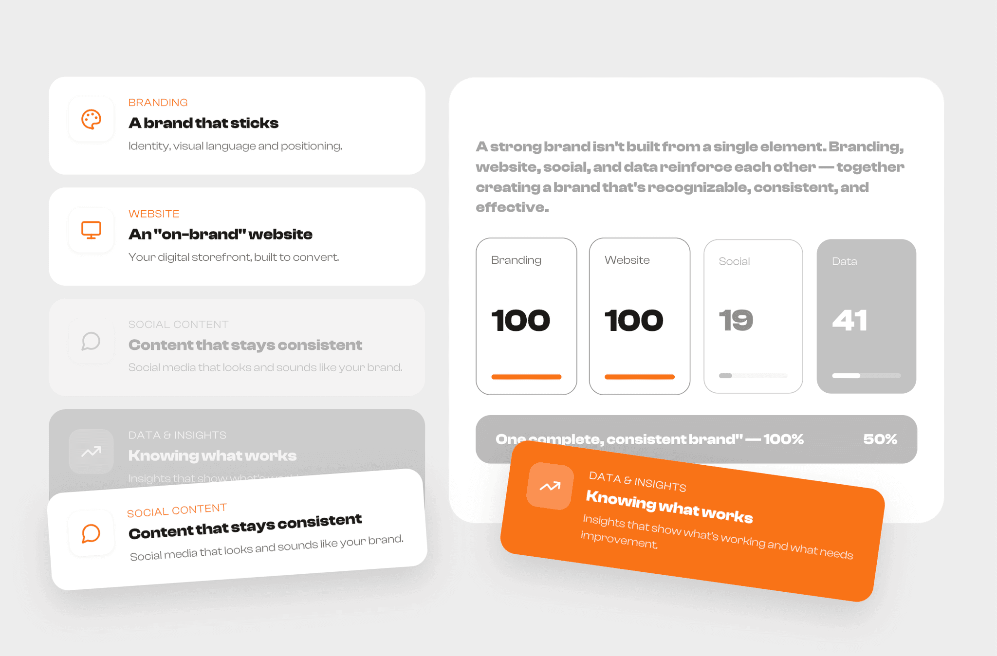
Brand Pillars is a two-panel Framer component built for agencies, studios, and consultants who sell more than one service and want to show how those services work together. The left panel lists your four (or more) offerings as expandable feature cards with icon, title, and description. The right panel visualizes them as a synchronized scorecard — each pillar fills to 100%, culminating in a highlighted summary bar and a call-to-action button.
It's the perfect "why work with us" section for a homepage, services page, or pitch deck landing page: it explains what you do and why the parts add up to something bigger, without a wall of text.
Use it for:
Agency / studio service overviews
SaaS feature-bundle sections
"Why us" or "How it works" homepage sections
Pitch decks and sales landing pages
Key Features
Fully responsive two-column layout (stacks on mobile)
4 feature cards with icon, eyebrow label, title, and description — easily duplicated for more/fewer pillars
Animated progress bars / score cards that fill on scroll or load
Active-state highlighting — one card can be visually emphasized (e.g. the current focus / featured pillar)
Built-in CTA button with icon, linkable to any page or external URL
Theme-driven styling — colors, radius, and fonts pull from Framer's design tokens / your Brand Kit for one-click restyling
No code required — every text, icon, number, and color is an editable Framer property
Two ready-made variants: Desktop split-layout and stacked single-column mobile layout