About Carousely
Carousely – Smooth, Modern Card Carousel
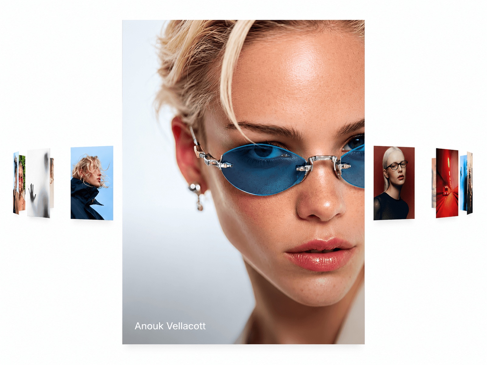
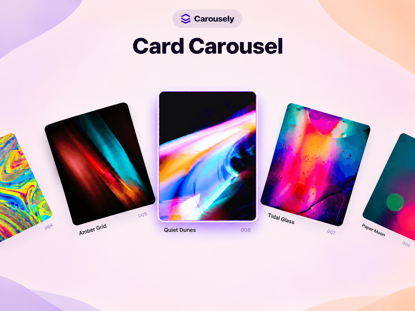
Create stunning, interactive card carousels with Carousely, a customizable Framer component designed to showcase your content with style. Its elegant arc layout, smooth drag interactions, and dynamic card scaling help you create engaging visual experiences that feel modern and polished.
Customization Options
Carousely comes with a wide range of customization controls to help you create the perfect card carousel for your website.
Content & Items
Items: Add and manage the cards displayed in your carousel.
Caption: Show or hide card captions.
Index: Display or hide card numbering.
Card Design
Card Width: Adjust the width of each card.
Card Height: Control the height of each card.
Card Radius: Customize the corner roundness.
Shadow: Enable or disable card shadows.
Arc & Layout
Arc Radius: Adjust the curvature of the carousel.
Card Angle: Control the rotation angle of each card.
Y Offset: Adjust the vertical position of the carousel.
Visible Sides: Set how many side cards remain visible.
Side Scale: Control the size of the surrounding cards.
Effects & Responsiveness
Parallax: Enable or disable the parallax movement effect.
Auto Scale: Automatically shrink cards on narrower screens.
Typography & Colors
Font: Choose your preferred typography.
Title Color: Customize card title colors.
Index Color: Change the index number color.
Navigation & Interaction
Drag Speed: Control the carousel dragging speed.
Wheel: Choose vertical, horizontal, or combined wheel navigation.
Autoplay: Enable or disable automatic carousel movement.
On Click: Choose what happens when a card is clicked.
Preview Settings
Overlay: Customize the preview overlay background color.
Overlay Blur: Adjust the background blur intensity.
Preview Text: Change the preview text color.