About Cinematic GlowToggle
Visual Design This component is designed with a premium, "dark mode" aesthetic suitable for dashboards or cinematic interfaces. It features a translucent, frosted-glass container (backdrop-blur) with subtle borders. When active, the switch emits a neon glow (simulated via text-shadows and vibrant color fills), while the toggle thumb features a "gloss" highlight to mimic a physical, glass-like material.
Animation Physics The toggle movement utilizes a spring physics model (stiffness: 500, damping: 30) rather than a linear transition. This gives the switch a snappy, tactile feel. Colors transition smoothly over 300ms to ensure the glow effects don't feel jarring when switching states.
Customization & Tech
Zero Dependencies: Built entirely with internal CSS-in-JS objects, requiring no Tailwind or external CSS files.
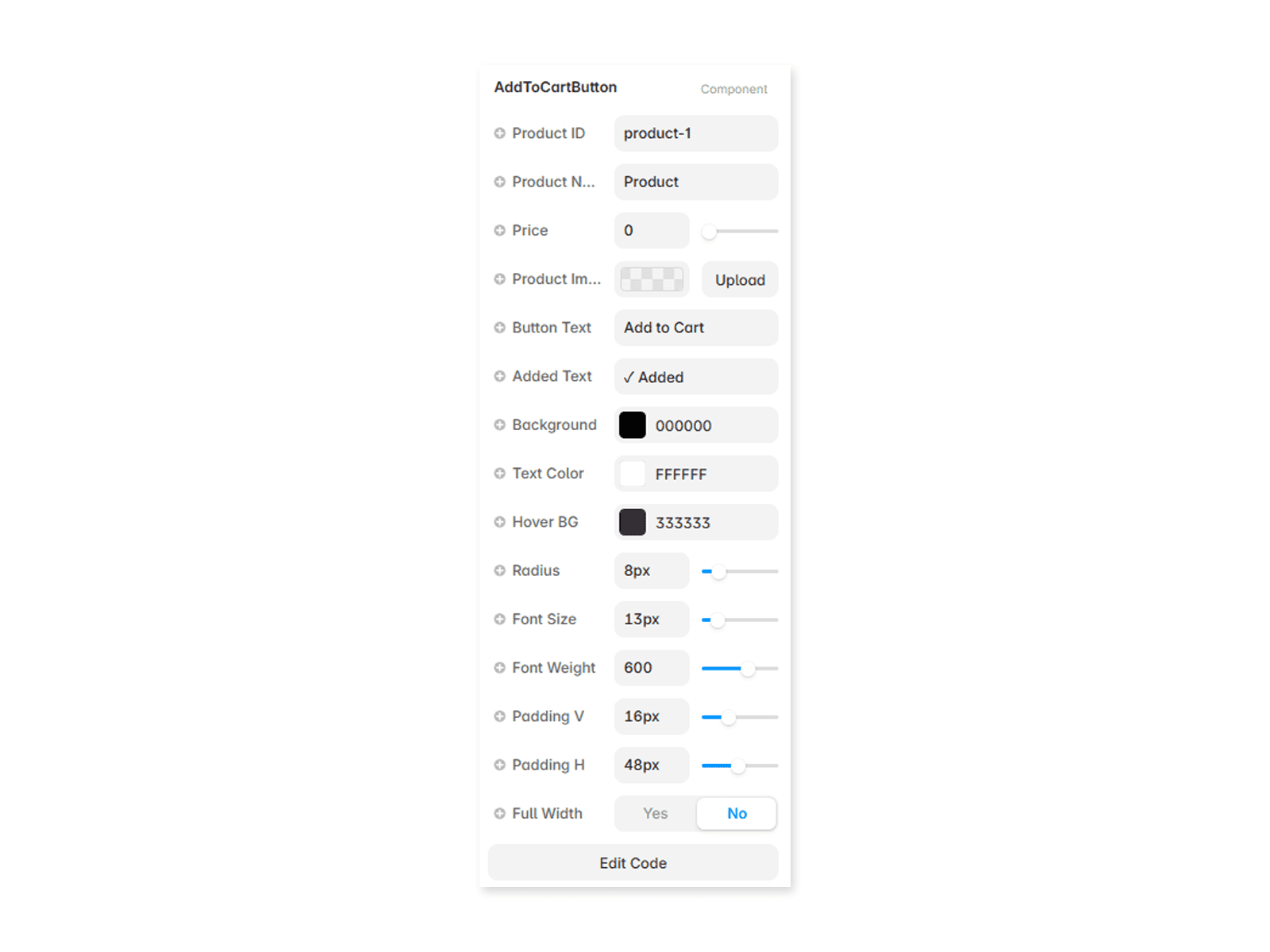
Framer Controls: Includes addPropertyControls integration, allowing you to edit the initial state, ON/OFF accent colors, track colors, and thumb colors directly from the Framer sidebar.
Interactive: Fully functional state management ensures the toggle responds instantly to user clicks within the prototype.
Best Use Cases
Dark-themed landing pages.
"Pro" mode feature toggles.
Settings panels in media-heavy applications.