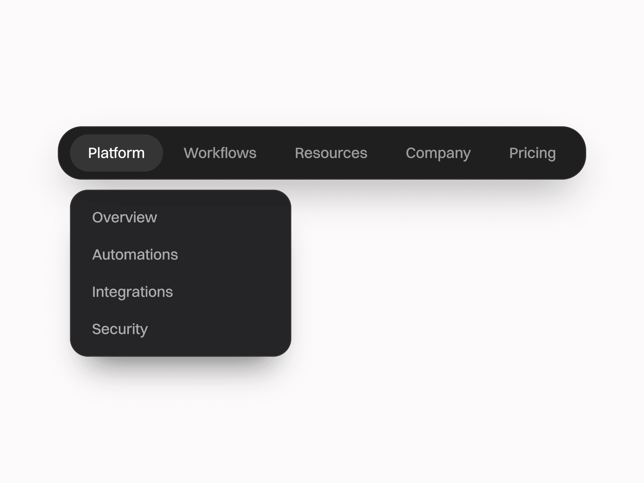
About Clickable Burger
A lightweight icon component built for toggling navigation menus with smooth motion and easy customization.
Key Features:
Toggle behavior: Seamlessly switches between hamburger (closed) and X (open) states
Smooth animation: Fluid morphing transition for icon lines
Customizable: Adjust colors and transition styles to fit your design
Integration ready: Easily bind the toggle to show or hide any menu panel
Responsive: Control visibility based on viewport size or breakpoints
How to Use:
Copy the component into your project
Place it in your header, navbar, or preferred location
Connect it to your desired menu or interaction
Customize styles and transitions as needed
Use the visibility variable to hide it on specific breakpoints