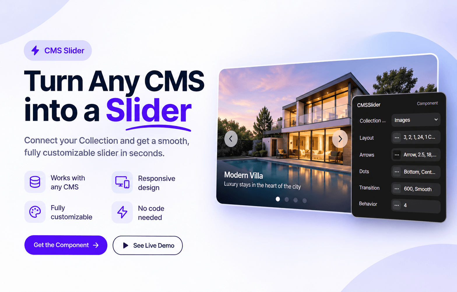
About CMS Collection Slide
Turn any CMS collection into a smooth, fully customizable slider. Link your Collection List and every item becomes a slide, whether you have 10, 20 or 50+ items. No code needed.
Everything is controlled from the Properties panel, organized in clear groups: Layout, Arrows, Dots, Transition and Behavior.
What you can do
• Works with any CMS collection: blogs, products, team, testimonials, images
• Set how many cards show on desktop, tablet and mobile (decimals like 1.2 supported for a peek effect)
• Scroll by one card or by a full page
• Choose arrow icons: Chevron, Angle, Arrow, Double Chevron, Triangle, or upload your own image
• Style arrows with size, radius, colors, border, shadow and hover colors
• Position arrows left, center or right, at the top, center or bottom, space them apart or keep them together, inside or outside the slider
• Dots with custom size, colors, alignment, top or bottom position, and a long active pill
• Counter mode (like 3 / 50) for long collections
• Control transition duration and easing (Smooth, Ease, Expo, Back and more)
• Mouse drag and touch swipe
• Loop and autoplay with pause on hover
• Respects reduced motion settings
How to use
1. Add a Collection List and design your card. Set the card width to Fill.
2. Turn off the list limit and pagination so all items load.
3. Put the Collection List inside a Frame and create a component from it.
4. Add CMS Slider to your page and link that component in the Collection List slot.
5. Customize everything in the Properties panel.
Good to know
• Only items loaded on the page are shown in the slider, so check your CMS list limit.
• Leave a little padding around cards if they have shadows, so they don't get cut off.