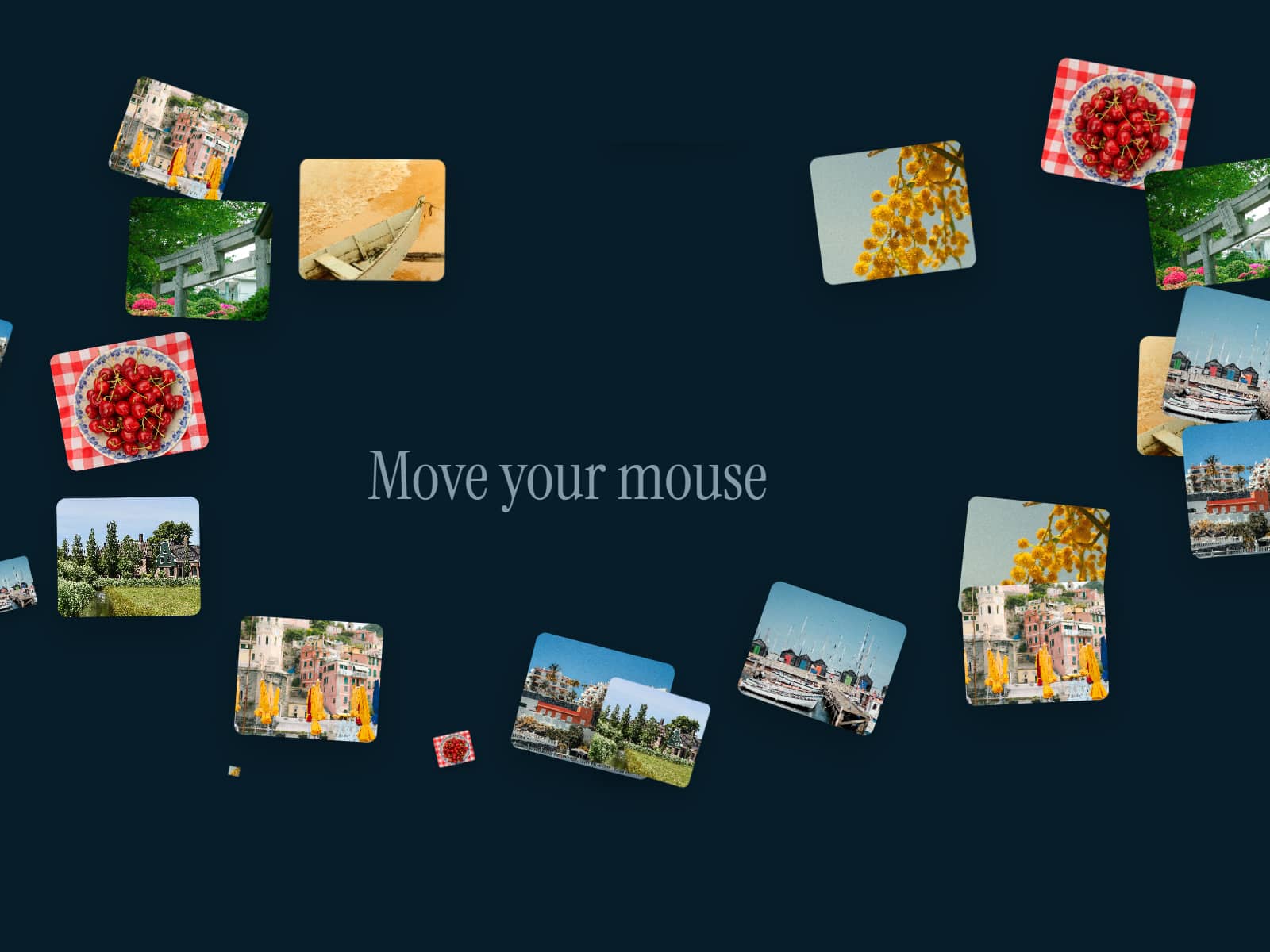
About CursorGrid
About Cursor Grid Component
Cursor Grid brings a sleek, interactive motion layer to your Framer projects.
It generates a grid of lines and anchor points that dynamically follow the user’s cursor — creating a sense of spatial depth and precision without blocking normal interactions. All hover, click, and drag events on underlying elements remain fully functional.
Features & Controls:
Adjust Line Color and Line Width for visual contrast
Choose Center Cursor shape: Square, Circle, or upload a custom SVG
Control Grid Size to define spacing density
Toggle Show Default Cursor to hide or display the system cursor
Fine-tune Container Padding for clean framing within your layout
Customize End Square Color, Size, and Corner Radius
Uses:
Add interactive energy to hero sections or landing pages
Create minimal, tech-inspired backgrounds
Use as a motion overlay for studio or portfolio sites
Enhance hover states and cursor-based UI interactions
Preview: https://cursor-grid.framer.website/