About Donate Button (Glow)
About
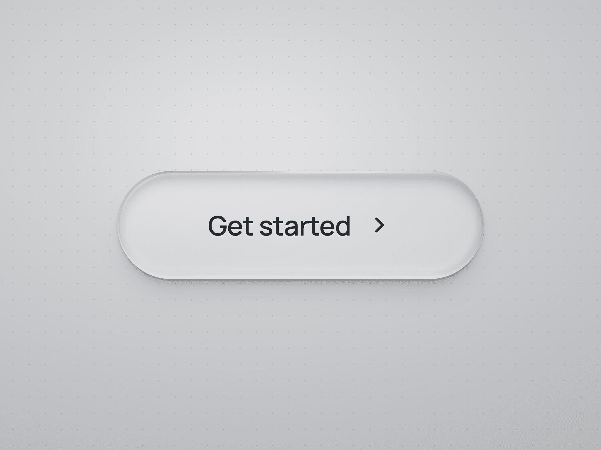
Gradient Donate Button is a high-converting, glowing call-to-action component designed to capture attention effortlessly. On hover, its custom dynamic linear gradient shifts smoothly while maintaining an inner and outer ambient glow effect—making it the ideal micro-interaction to boost click-through rates and engagement.
What it does
Smooth Gradient Shift: On hover, the background gradient smoothly transitions across the button surface via a fluid 0.8s CSS transition.
Ambient Glow & Depth: Features dual-layer inset and drop shadows tuned to match your chosen gradient colors, creating a vibrant glowing backlight effect.
Static Canvas Optimization: Automatically detects SSG/SSR and static canvas rendering using to guarantee zero flickering or unwanted animation state shifts while editing inside Framer.
Accessible & Motion-Friendly: Built with focus-visible accessibility outlines and automatic fallbacks for users
What you can customize
Full control directly from the Framer Canvas properties panel — no coding required:
Text — Button label (e.g. "Donate now", "Support Project")
Font — Choose any system or web font
Font Size — Adjustable font size in pixels (default:
16px)Weight — Select typography weight (
Regular,Medium,SemiBold,Bold,ExtraBold)Text Color — Custom color for label and focus outline (default:
#ffffff)Glow Color 1 — Primary highlight color for the gradient & inset glow (default:
#60C9FF)Glow Color 2 — Secondary deep color for the gradient shift (default:
#1F75FF)Radius — Border corner radius adjustment (default:
8px)Width & Height — Explicit dimensions or dynamic auto sizing
Padding — Visual control over top, right, bottom, and left spacing
Need help?
Questions or feedback? Reach me anytime at karimsaif010@gmail.com or on X @karimsaif0.