About CTA Button Pro
About Component
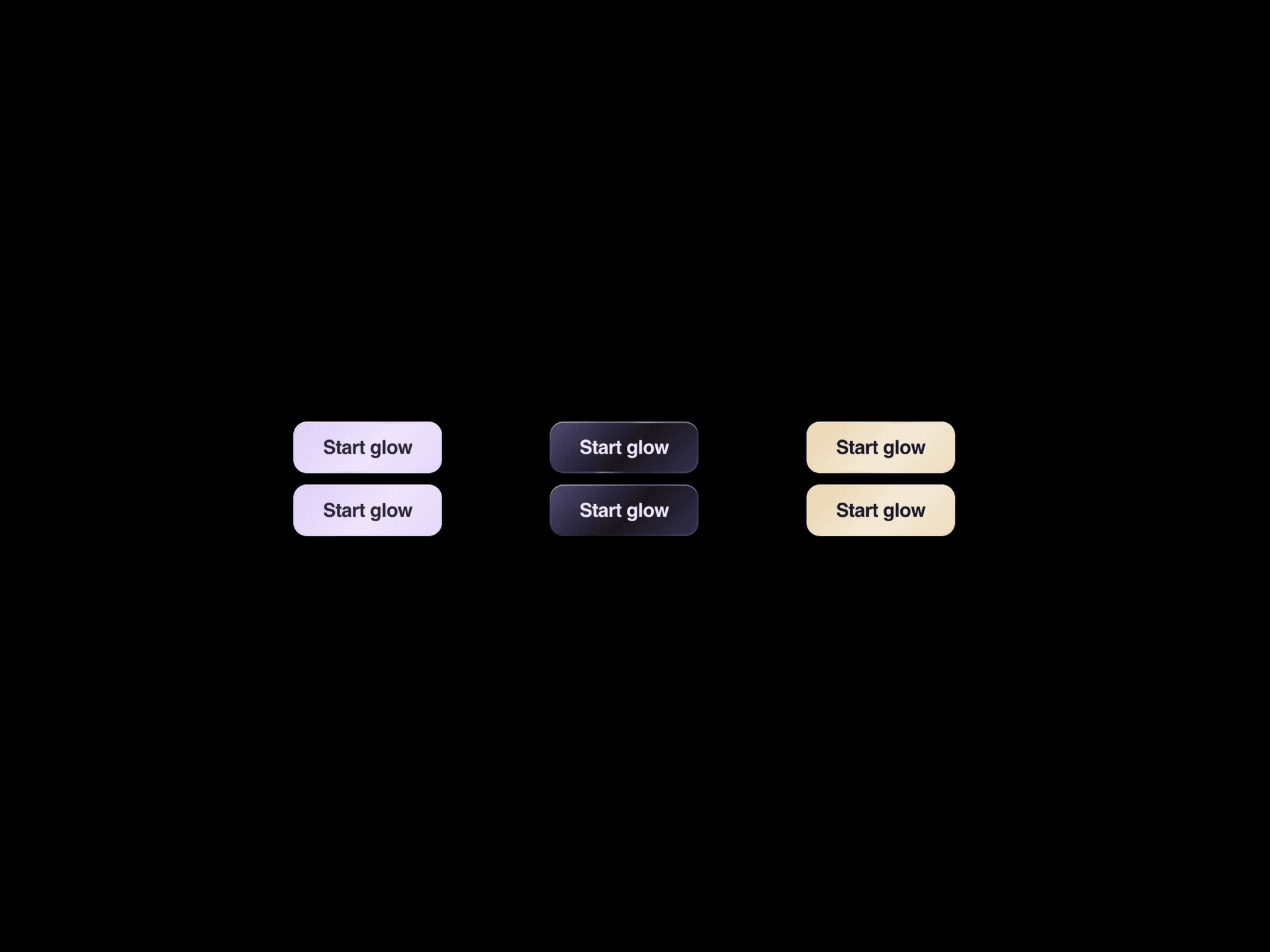
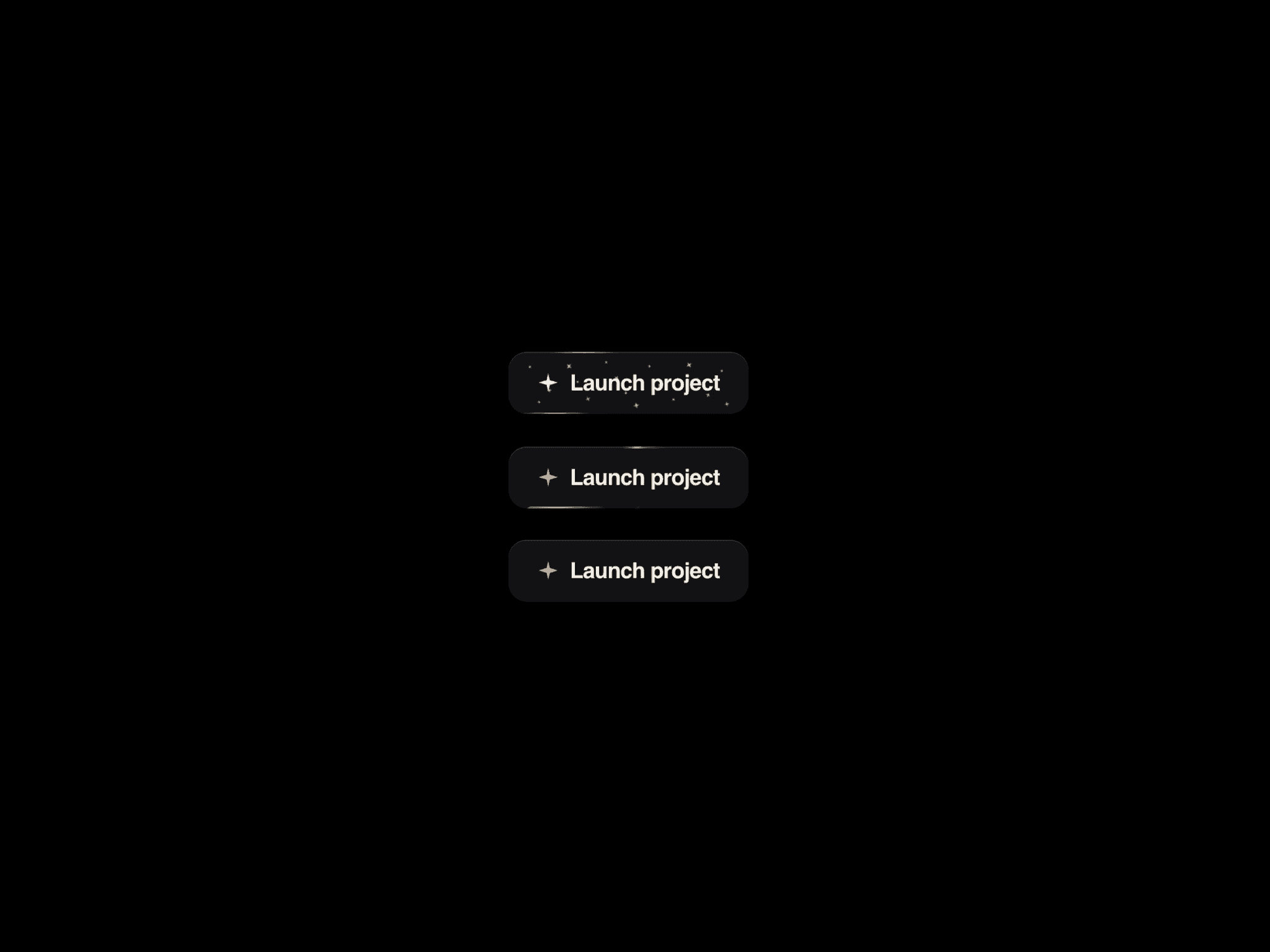
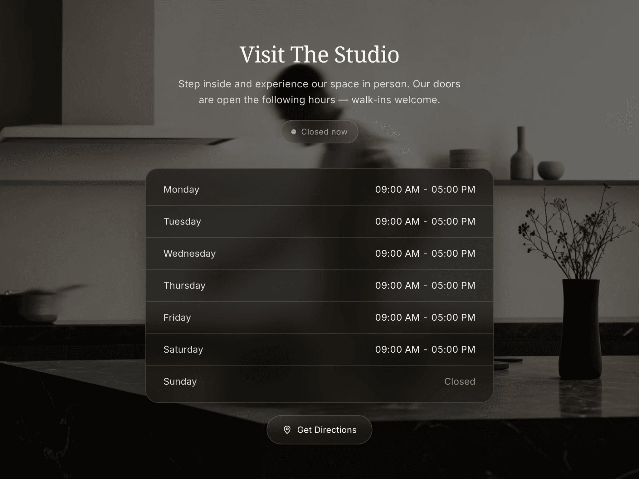
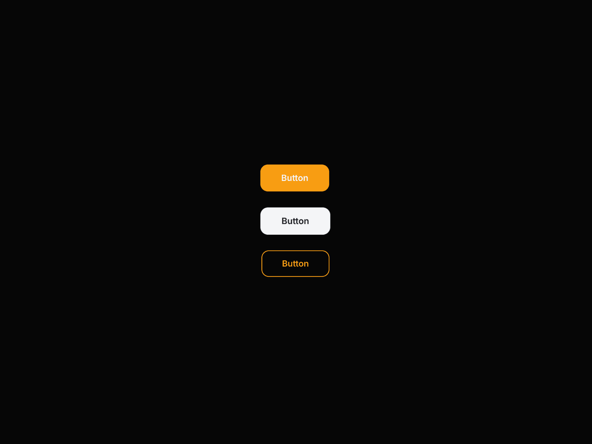
CTA Button Pro is a production-ready call-to-action button. It ships four core variants—Primary, Secondary, Outline and Ghost—plus live accent color, height, loading spinner and disabled state. Hover and tap scale, optional icon and a focus ring keep interactions clear. A Demo Mode panel lets you preview variants and states without leaving the canvas. Fully responsive, including a wrapping mobile demo bar. Drop it into heroes, pricing tables, forms and nav actions.
Use Cases
Hero section primary and secondary
CTAs Pricing plan and checkout action buttons
SaaS signup, login and trial flows
Contact, quote and booking forms
Navbar and header action buttons
Feature section “Learn more” links
E-commerce add-to-cart and buy buttons
Waitlist and newsletter submit actions
Onboarding continue, skip and back steps
Portfolio and agency contact
CTAs Event ticket and registration buttons
App download and get-started banners
Keywords
cta button, framer button, animated button, hover button, loading button, disabled button, primary button, secondary button, outline button, ghost button, call to action, accent button, button component framer, ui button, form button, signup button