About Sparkle Buttons
MORE FRAMER COMPONENTS LIKE THIS
✦ Browse +38 FREE + 85 premium components: https://frameze.com/components
About Sparkle Buttons
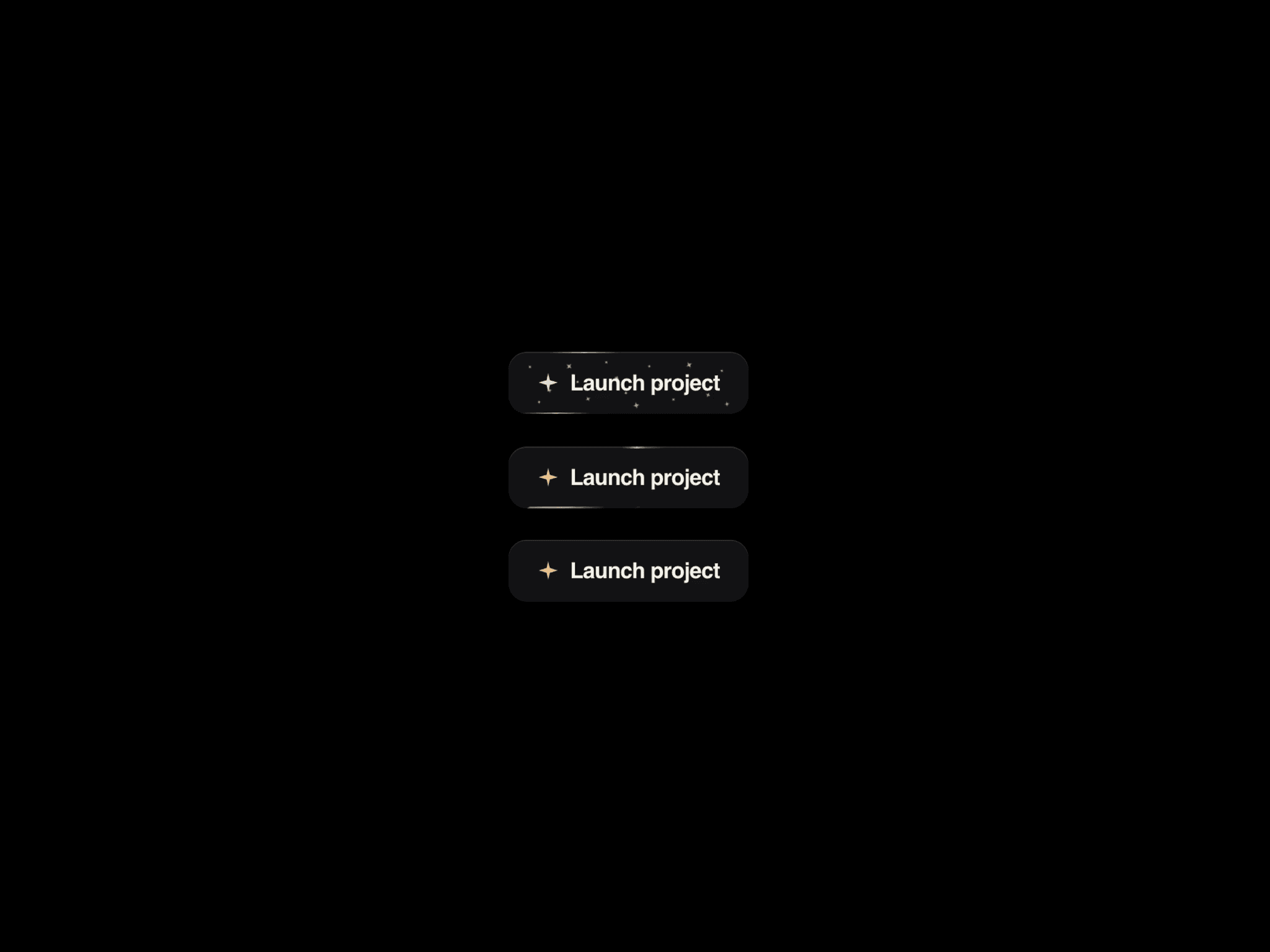
Sparkle Buttons are a premium Framer CTA component built for sites that need more presence than a flat button. It layers a moving gleam stripe or a rotating halo, optional star-shaped motes, hover lift, press feedback, and clear idle, loading, and done states. Designers can switch dark or light themes, accent, neutral, or danger tones, three sizes, icons, radius, speed, and colors without leaving the canvas. Off-screen animation pauses automatically, reduced-motion preferences are respected, and the same control can render as a button or a link.
Gleam stripe that sweeps across the face Rotating halo ring with dual-tone highlights Still mode for a quiet, non-animated look Star motes with few or more density
Idle, loading spinner, and done check states Dark and light themes with tone-aware mixing Accent, neutral, and danger color treatments Small, medium, and large sizing presets Gleam, arrow, plus, or no icon
Pauses when off-screen to save work Respects prefers-reduced-motion Works out of the box in Framer with full property controls
Use Cases
SaaS signup and pricing CTAs Agency and studio landing pages Portfolio launch and project buttons Product waitlist and download actions Fashion and lifestyle shop CTAs
Event ticket and registration buttons Architecture and interior design sites Editorial and magazine feature links Fitness brand class and plan buttons Photography and visual storytelling pages Dashboard primary and danger actions Campaign hero and footer conversion blocks
Keywords
sparkle button, gleam button, halo button, animated cta, framer button component, shine button, loading button, done state button, particle button, mote animation, hover gleam, rotating halo, premium cta framer, dark light button, accent danger button