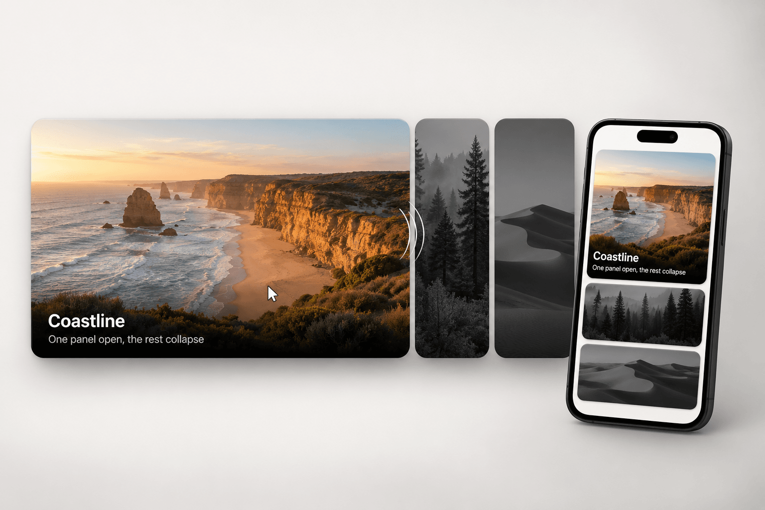
About Expanding Carousel
Expanding Panels keeps one image panel open and pushes the rest into dimmed grayscale. The open panel carries its own title, description and link. Built for portfolio grids, service rows and category sections that need movement without a carousel.
About Component
Hover or click trigger, set per instance
Horizontal row or vertical accordion from one control
Autoplay that pauses on hover, focus and tap
Adjustable grayscale, dim and gradient scrim on closed panels
Per panel image, title, description and link
On touch, first tap opens a panel, second follows its link
Keyboard accessible: tab focus, Enter and Space, tablist roles
Respects prefers-reduced-motion
What's Included
One code component, no external dependencies
40+ property controls named in plain English
Three placeholder panels drawn as inline SVG, nothing to load
Stays still on the canvas so the editor never lags
How It Works
Remix the file or paste the component URL into your project.
Drop it on the canvas and fill the Panels list with images, titles and links.
Pick horizontal or vertical, choose hover or click, tune speed and grayscale.
Use Cases
Photography and design portfolio sections
Agency service and capability rows
Product category navigation for ecommerce
Hotel and venue galleries
Team and artist rosters
Event lineup sections
Keywords expanding panels, framer component, hover expand, accordion, image gallery, portfolio grid, interactive panels, grayscale hover, panel slider, framer, vertical accordion, touch friendly
Refund Policy Due to the digital nature of this product, all sales are final and refunds are not available. Please review the product details and the live preview carefully before purchasing.
Support If you experience any issues or need help customising the component, reach out within 3 business days of your purchase. Email: framercore@siddhantbaghel.art