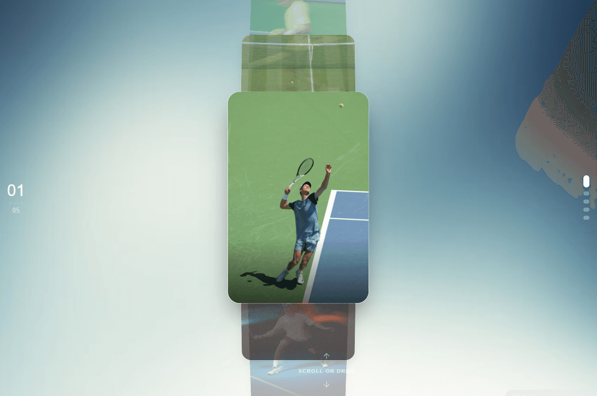
About VerticaI Carousel
Vertical Image Stack for Framer
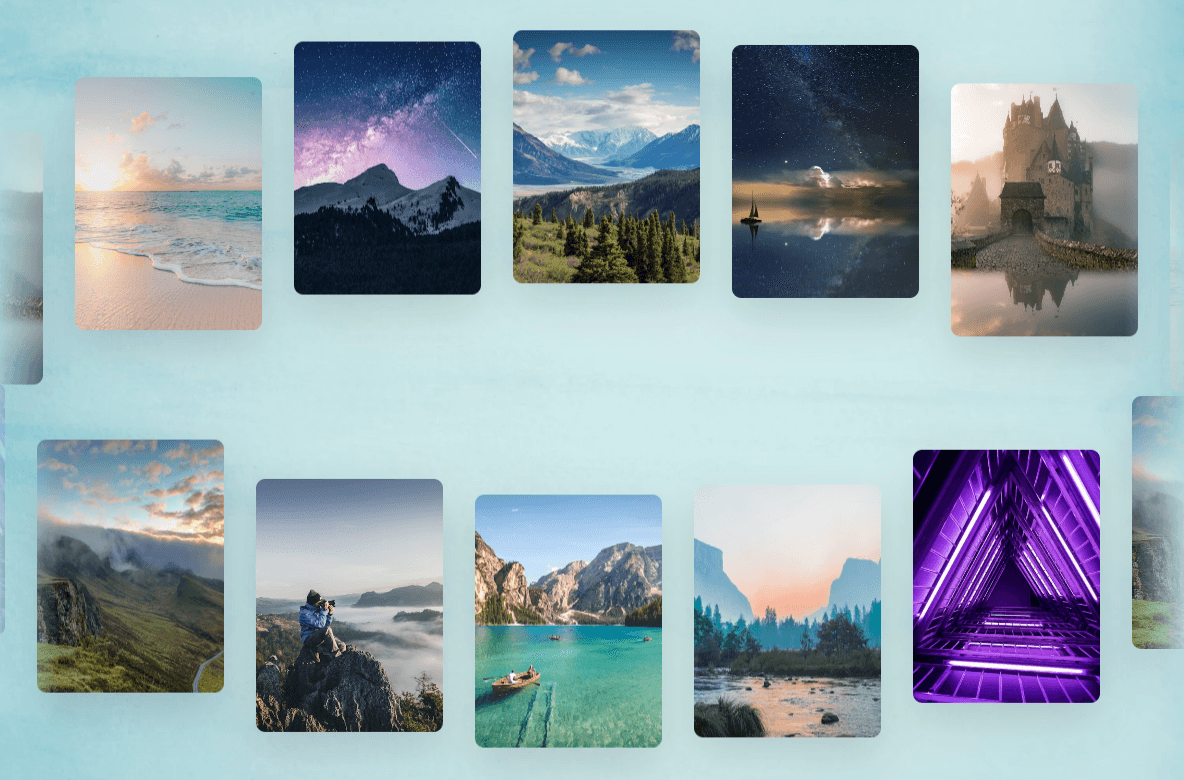
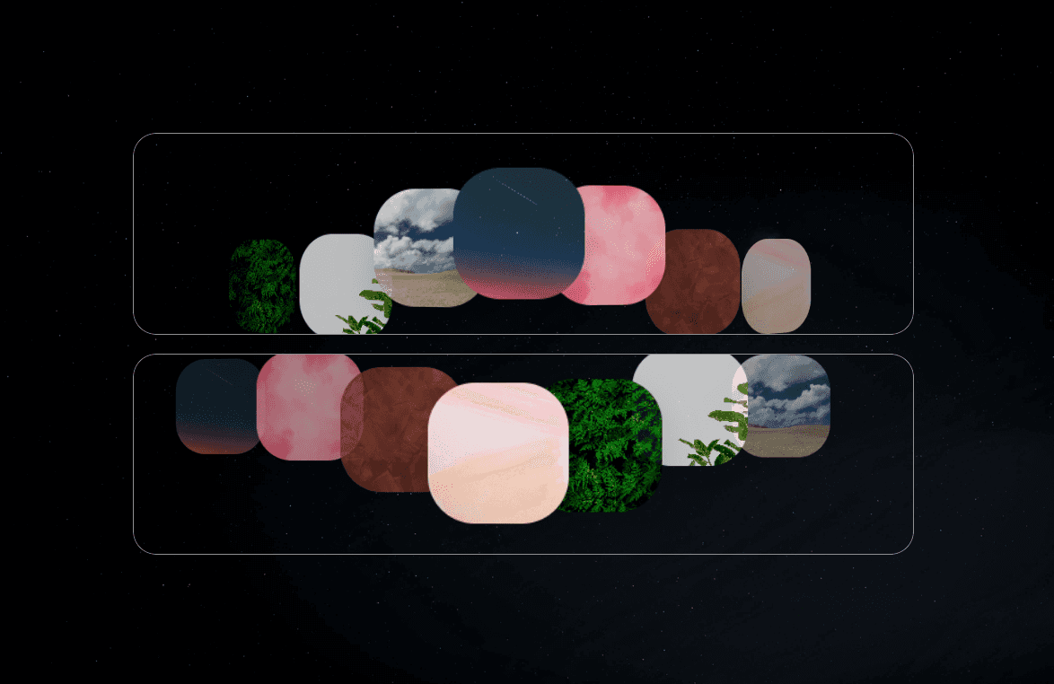
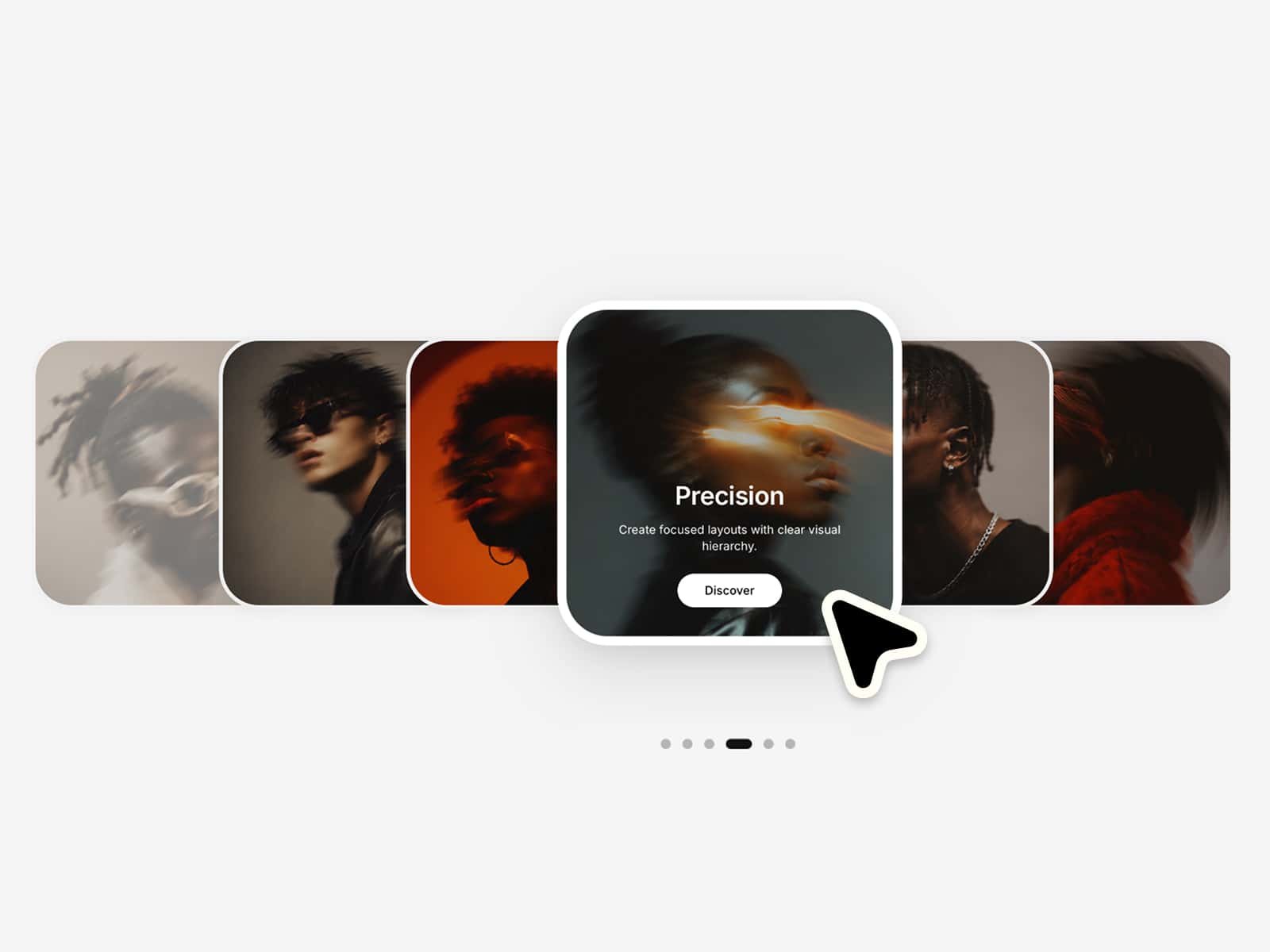
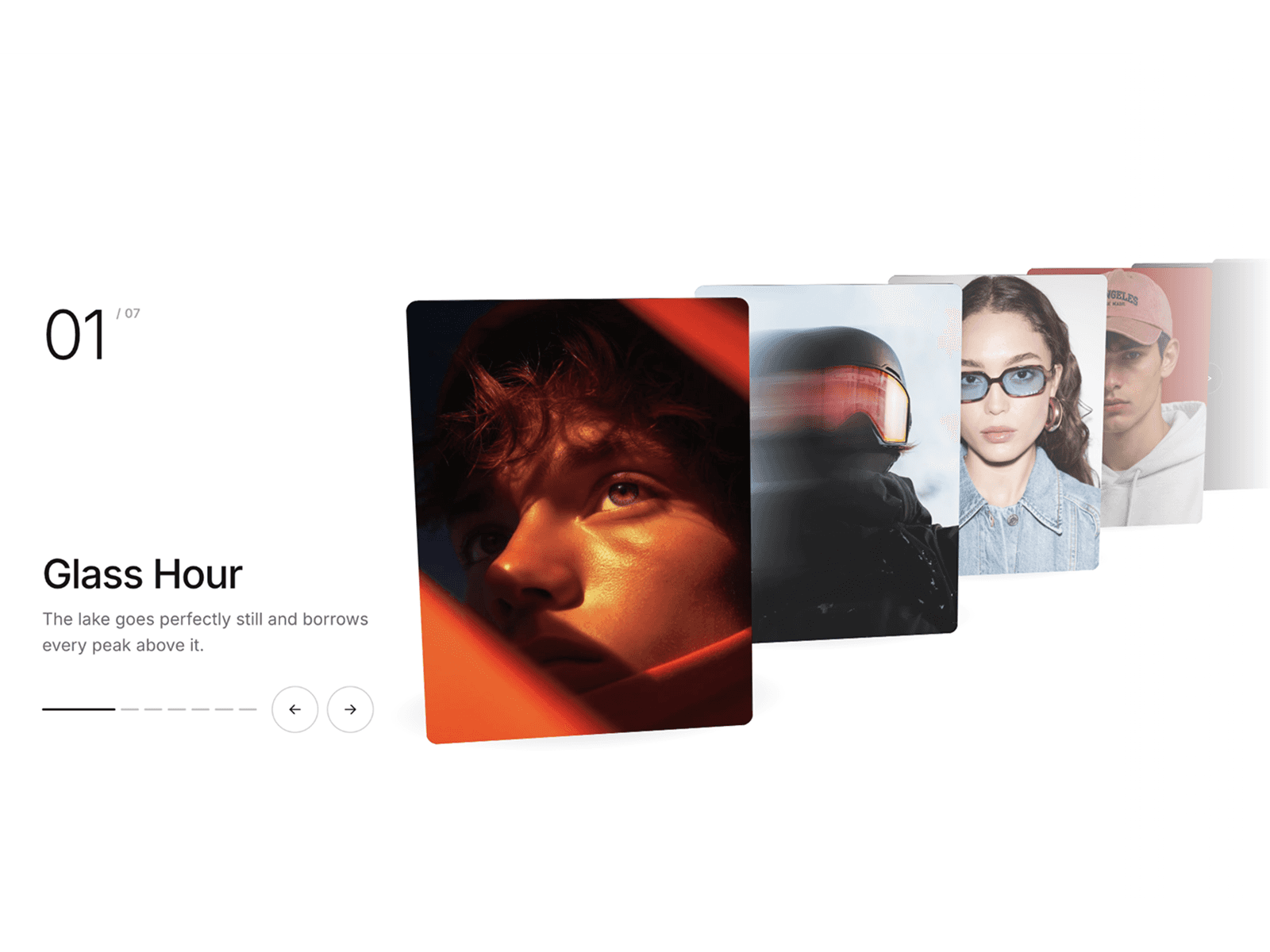
Vertical Image Stack is an immersive, 3D layered media showcase component for Framer. Featuring depth-based card transformations, touch drag gestures, mouse wheel navigation, keyboard support, and dynamic UI indicators, it provides a tactile and modern gallery experience.
Key Features
3D Perspective Stack: Multi-layer depth layout utilizing dynamic scaling, opacity gradients, and 3D rotation transforms.
Multi-Modal Navigation: Seamlessly navigate cards using mouse wheel scrolling, vertical touch-drag gestures, keyboard arrow keys, or side navigation dots.
Interactive Hint Indicators: Configurable animated bounce arrows and custom text prompts to guide user interaction.
Dynamic Index Counter: Tabular-num active index tracking paired with total count indicators.
Canvas Optimization: Built-in safeguards and static renderer awareness to ensure smooth editing inside the Framer canvas.
Property Controls
Content
Images: Array list to add card images and individual accessibility alt text.
Dimensions & Style
Width: Custom width for individual cards (150px to 600px).
Height: Custom height for individual cards (200px to 800px).
Radius: Corner rounding configuration for cards (0px to 50px).
Cooldown: Minimum delay threshold between scroll and drag transitions (100ms to 1000ms).
UI Elements & Toggles
Show Dots: Toggle right-hand vertical navigation dots.
Show Counter: Toggle left-hand numerical index display.
Show Hints: Toggle scroll/drag directional hint container, with independent sub-controls for hint arrows and text.
Background: Container background color picker.
Text Color: Foreground color for typography and icons.
Aria Label: Accessibility description for screen readers.
Need Help?
For support, feedback, or feature requests:
X / Twitter: @Karim Saif
Email: karimsaif010@gmail.com