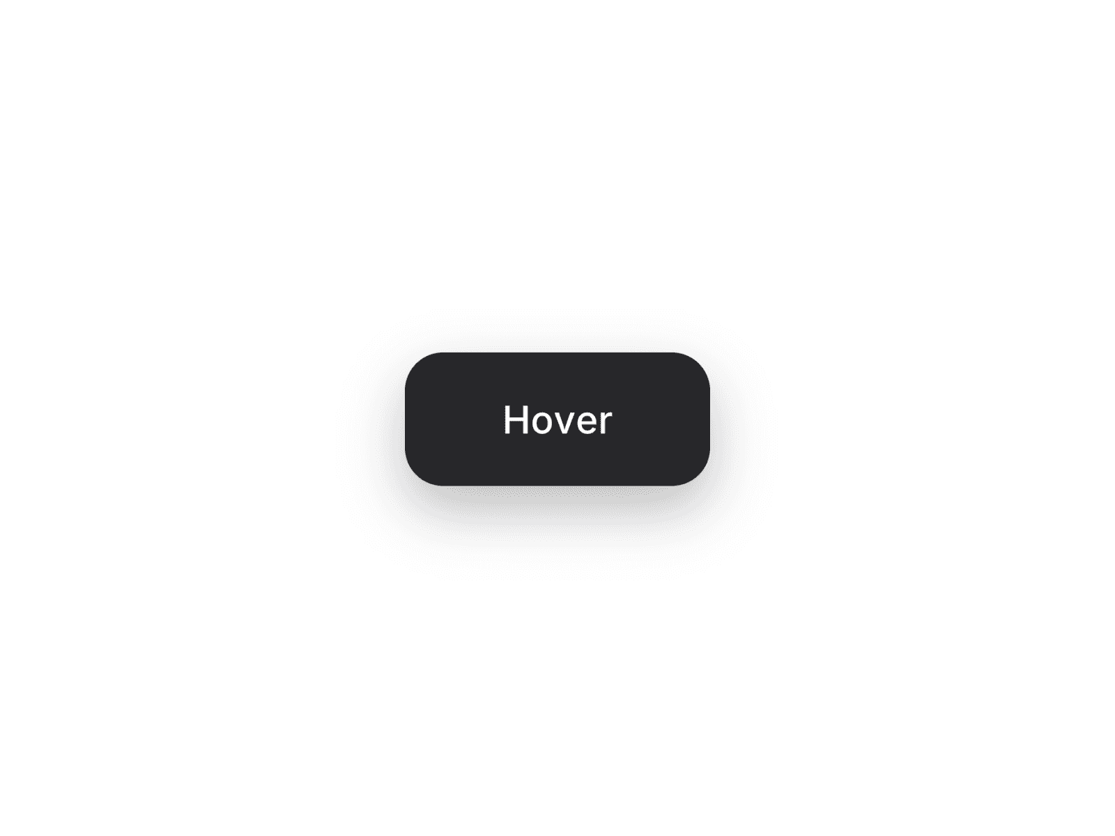
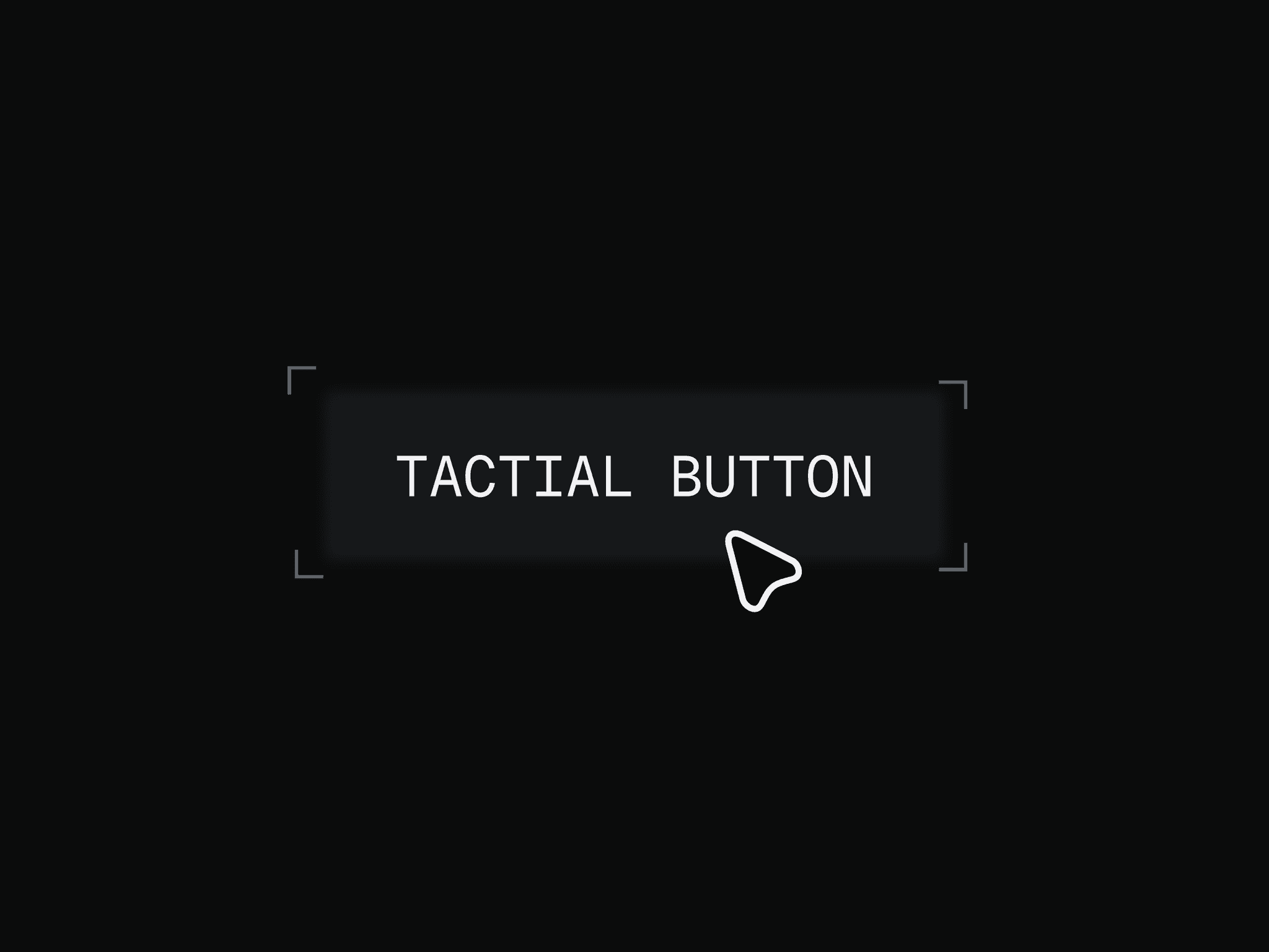
About Hover Focus Button
About the component
The component is fully customizable through the following properties found on the right panel:
Customizable button text via the "Text" property
Ability to set a link destination
Adjustable background colors for default and hover states
Customizable text colors for default and hover states
Blur intensity control (how blurred the text starts)
Transition duration settings for focus and color effects
Optional scale effect toggle and amount
Padding, border radius, and font styling options
Usage To use the component, simply add it to your Framer project and customize the properties as needed. The blur-to-focus animation will automatically trigger on hover. This provides an easy way to add an engaging, interactive button element to Framer websites that creates curiosity and encourages clicks without any coding required.