About Rippler Button
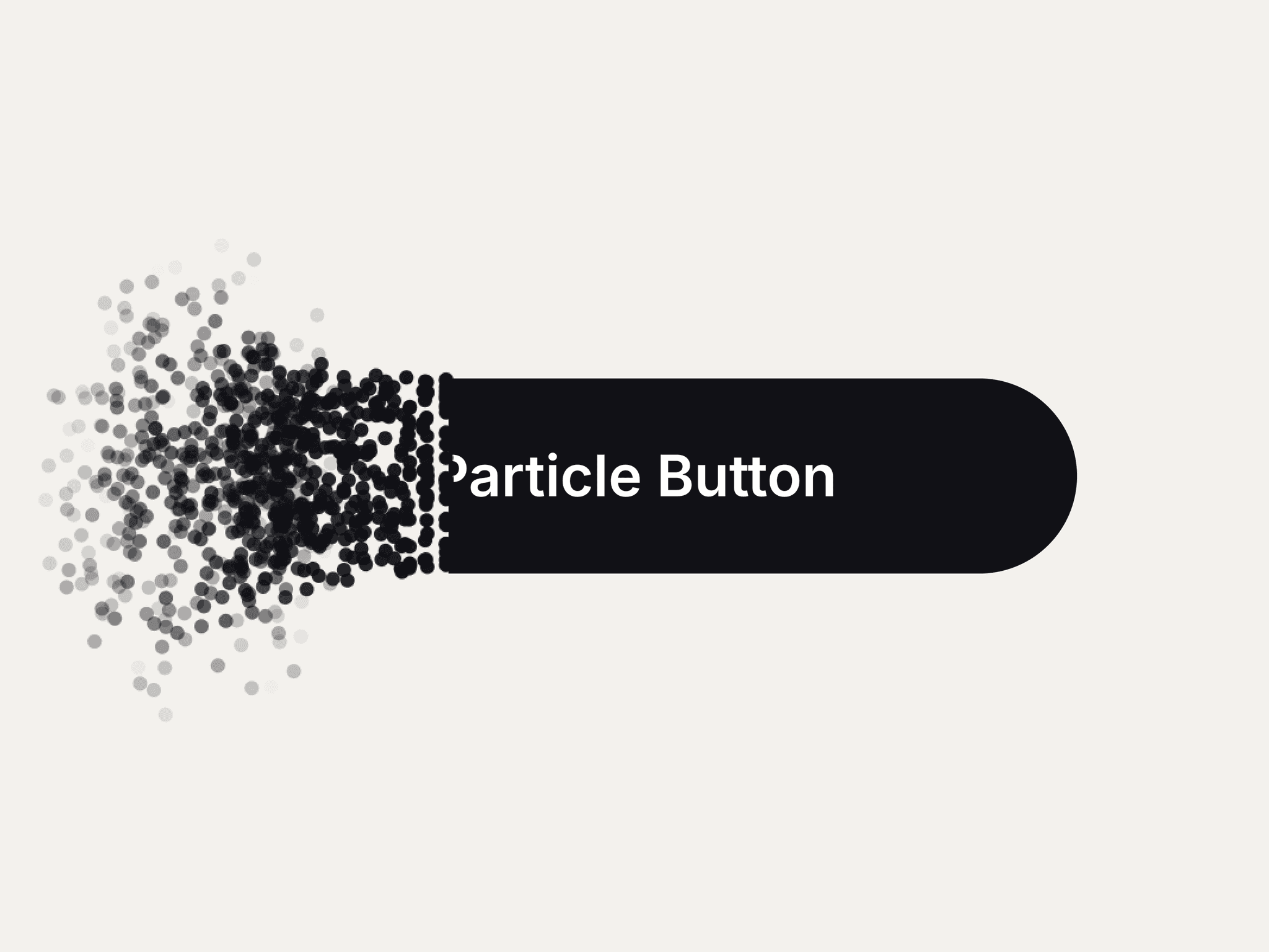
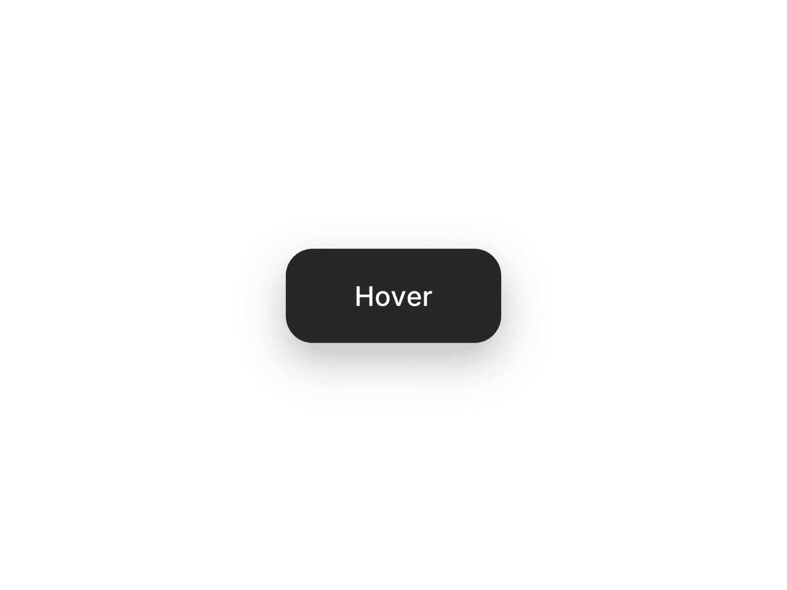
About the Component: Rippler Button transforms a simple hover into a delightful interaction. As the cursor enters the button, a ripple originates from the exact point of entry and expands to fill the entire button, creating a smooth, responsive effect that feels both natural and engaging.
Features
Cursor-aware ripple animation
Ripple originates from the pointer's entry point
Smooth hover interaction
Lightweight and responsive
Fully customizable in Framer
Easy to drop into any project
Customization Options
From the properties panel, you can:
Change the button label
Customize colors
Adjust corner radius
Edit padding and size
Choose typography
Perfect For
Call-to-action buttons
Landing pages
Portfolio websites
SaaS products
Marketing pages
Modern UI designs
What's Included
Rippler Button component
Cursor-aware hover ripple animation
Fully customizable properties