About How It Work Timeline
A single Framer component with three layout variants, 11 theme presets, and a full scrollytelling implementation. Swap between Alternating, Stacked, and Scroll Steps from one property control — no duplication, no extra components.Layout Variants
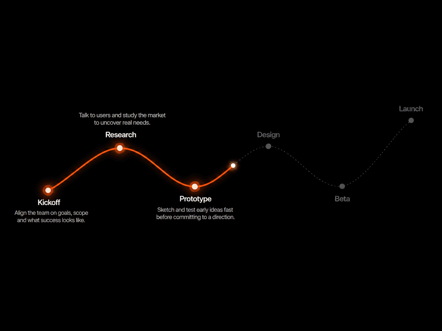
Alternating Cards alternate left and right of a central spine on desktop. Best for 4–6 step processes, agency methodologies, and balanced visual rhythm. Reflows to a single-column left-bar layout on tablet and mobile.
Stacked Single column with a left-side timeline bar and connector dots. Best for short explainers (2–3 steps), mobile-first content, and minimal aesthetics. Works identically across every breakpoint.
Scroll Steps Sticky two-column layout — text on the left, media panel on the right that crossfades through images or videos as the viewer scrolls. Best for hero-level product tours, premium SaaS landing pages, and immersive case studies. Falls back to Stacked on mobile automatically.Theme Presets
11 presets included — Purple, Minimal, Ocean, Sunset, Dark, Light, Indigo, Emerald, Rose, Amber — plus a fully custom mode with individual control over background, accents, text, panels, dots, glow, and progress bar. Every preset themes the entire system in one click.Scroll Steps — Feature Details
Sticky media panel with crossfade transitions between per-step images or short looping videos
Cursor-reactive glow — a soft accent halo follows the pointer across the panel
Dot pulse synchronized to the active step
Viewport progress bar anchored to section progress, not full-page scroll
Per-step rich content — phase label, 5-word title, 2-sentence description, and a stat block (e.g. "3× faster delivery")
Configurable scroll distance per step, gap, padding, and max width
Canvas-only Preview Step override so you can design each step in Framer without scrolling
Reduced-motion aware — animations degrade gracefully for users with prefers-reduced-motion
Built-In Marketplace Variant SwitcherA sidebar toggle adds a sticky, themed pill to the top-right of the section so viewers can click between all three variants live — perfect for the Framer Marketplace cover. Off by default on production sites. Pill auto-themes to match the active preset.
Responsive Behavior
The component measures its own container width using ResizeObserver — not the viewport — so it adapts correctly inside any parent grid, flex layout, or stack.
Desktop (≥ 1024px) — Full layout per variant
Tablet (810–1023px) — Alternating becomes left-bar single-column; Scroll Steps stays two-column with adjusted gap
Mobile (< 810px) — All variants converge on the Stacked left-bar layout
Sidebar Property Controls
Section — Theme, background, padding, max width
Header — Eyebrow, title, subtitle, alignment
Steps — Repeating list of step content
Layout — Variant dropdown, variant switcher toggle
Scroll Steps — Sub-grouped into Layout · Visibility · Colors · Typography
Animation — Fade-in, progress bar, reduced-motion
Accessibility
Semantic <section> with proper heading structure
Variant switcher uses role="tablist" / role="tab" / aria-selected
Progress bar exposes role="progressbar" with live aria-valuenow
All animations honor prefers-reduced-motion
All color presets meet WCAG AA contrast on text against panel backgrounds