About Image Card Hover
Image Card Hover
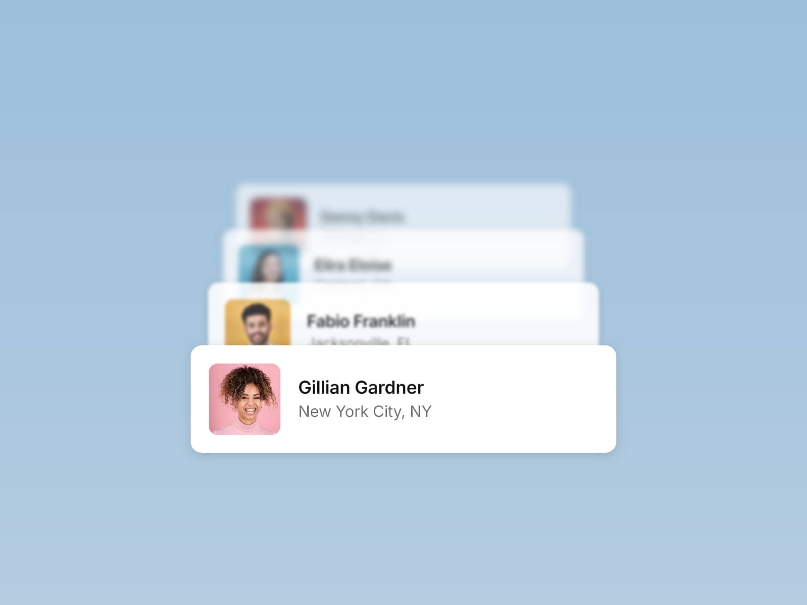
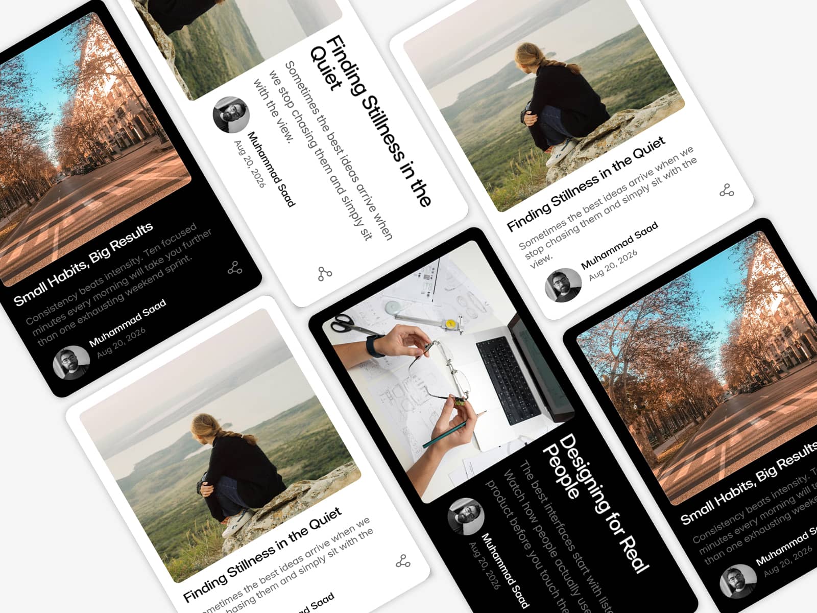
A versatile hover-effect component designed to make images feel alive and interactive. It supports a primary image that scales and blurs on hover, paired with a secondary floating image that follows the cursor for extra depth and motion.
Customize the container size, hover image size, scaling amount, blur intensity, border radius, and animation speed to match your design. Choose from multiple hover effects including Sticky Follow, Circular, Ripple, Liquid, Hologram, and Spotlight—each creating a unique interactive style.
Features at a glance:
Primary image with hover scale + blur
Secondary floating image that follows cursor
Multiple hover styles (sticky, ripple, liquid, hologram, spotlight)
Adjustable scale, blur, animation speed & easing
Fully customizable width, height, and border radius
Toggle child image for mobile-friendly experiences
Ideal for portfolios, galleries, and hero sections, this component lets you craft interactive image cards that stand out with motion and depth.