About PixelTransitionCard
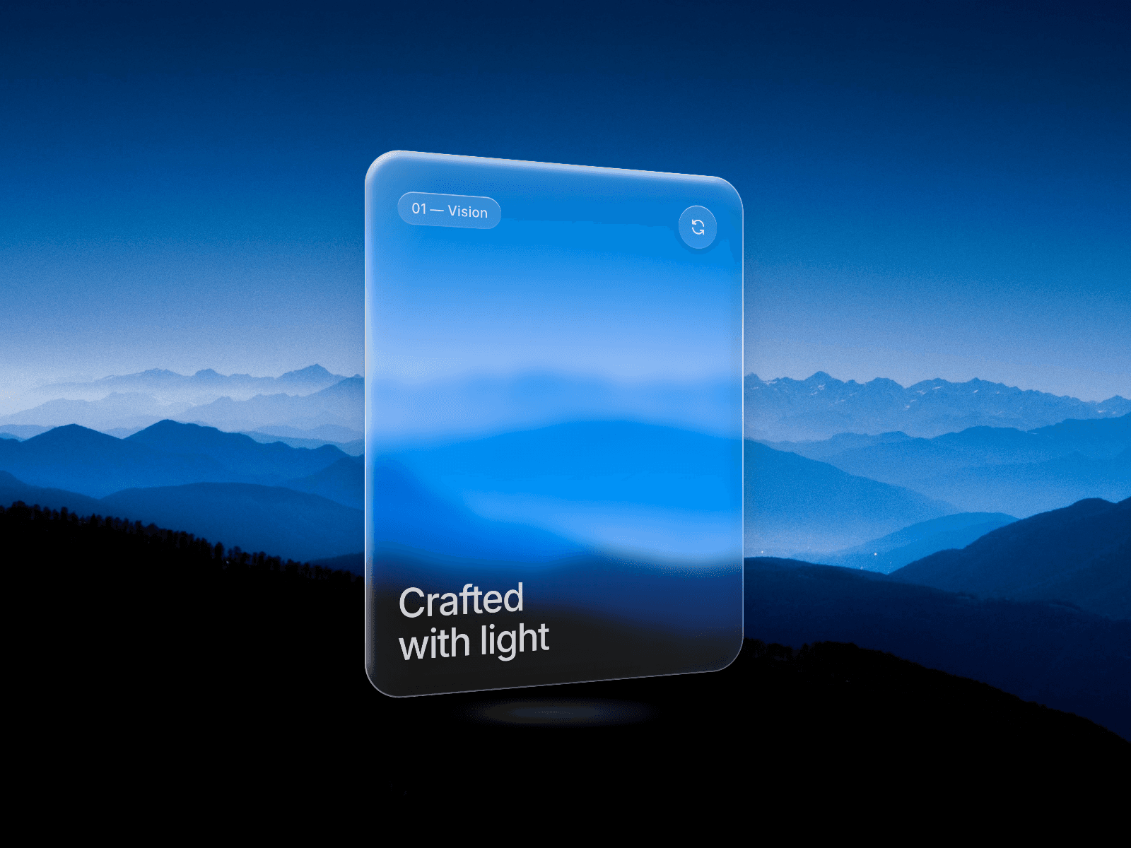
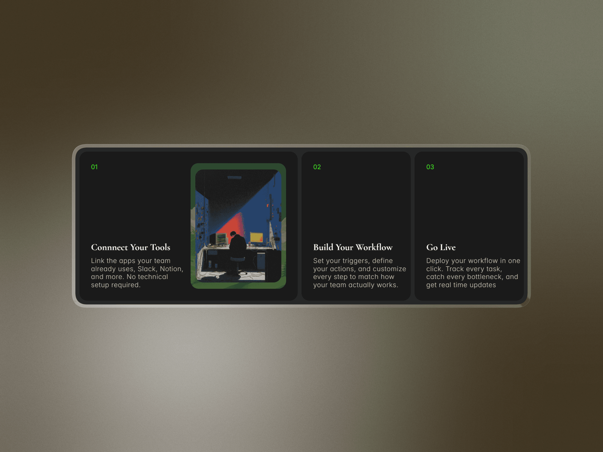
The Pixelated Reveal Card brings a bold, digital-inspired transition effect to your Framer projects. When triggered, the card uses a grid of square pixels that appear in random order, covering the surface before smoothly revealing the alternate content.
Interactive Behavior
On desktop: reveal triggers on hover enter and revert on hover leave.
On mobile: toggle reveal with a tap.
The transition feels crisp, playful, and modern — no fades or blurs, just a clean pixel swap.
Customizable Controls
First Content / Second Content: Add any layer, text, image, or component.
Grid Size: Choose how many pixels (default 7×7, adjustable 2–20).
Pixel Color: Match your brand style.
Animation Duration: Control how fast the transition runs (default 0.3s).
Aspect Ratio: Set flexible dimensions (1:1, 16:9, etc.).
Background / Border / Radius: Style the card to fit seamlessly into your design.
Trigger Mode: Auto-detect, hover, or tap.
Use Cases
Product reveal cards
Portfolio galleries
Interactive hero sections
Any creative swap between two visual states
Responsive & Lightweight
Works across screen sizes with aspect-ratio support.
Runs efficiently with randomized staggered animations.
Add a pixel-perfect interactive twist to your site — your users will love the playful reveal effect.