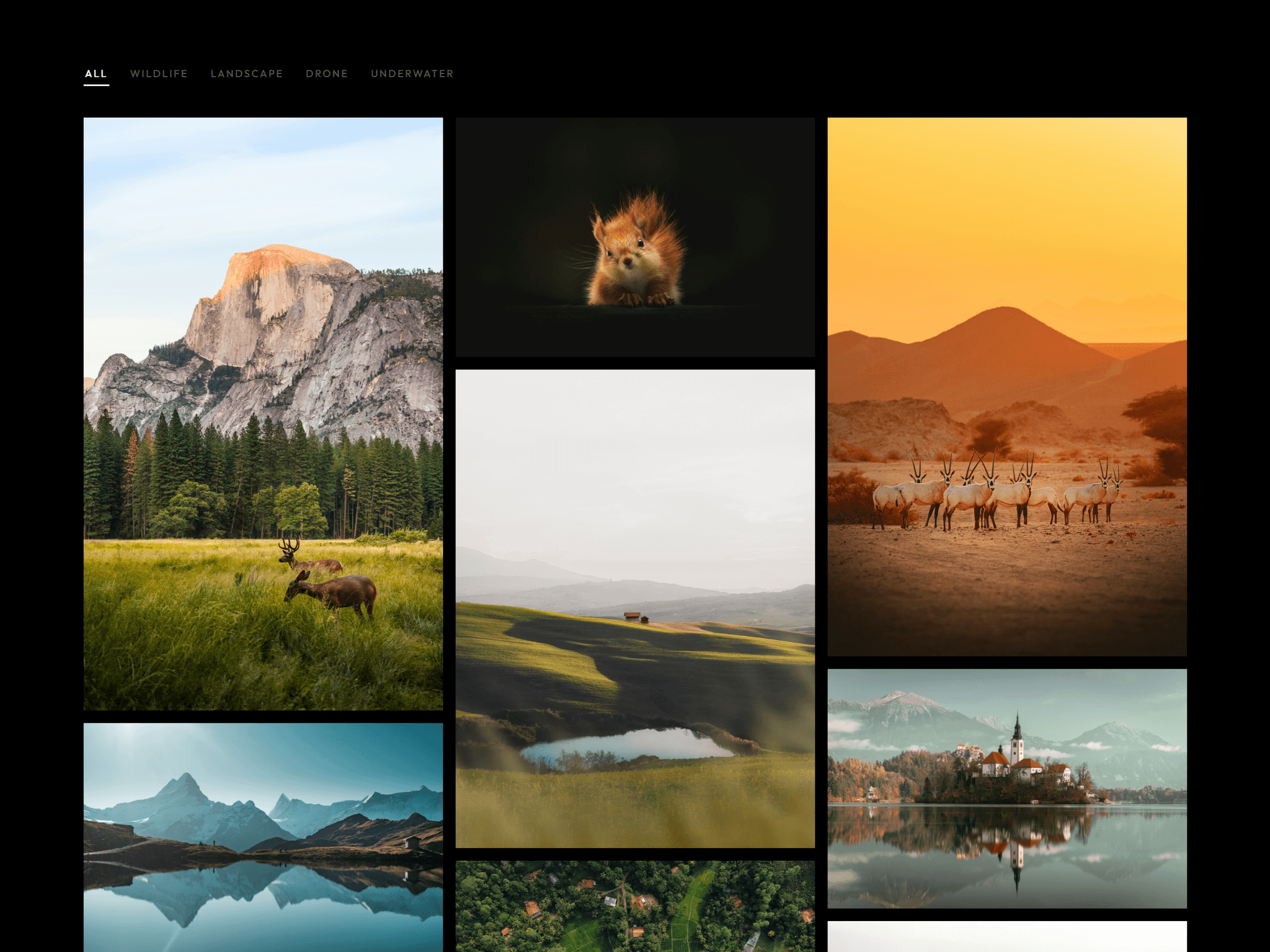
About Kinetic Grid Gallery
Minimalist 3-column grid component with an elegant hover-expand interaction for premium storytelling. Designed for Framer, it delivers fluid state transitions and a structured, Swiss-inspired layout that seamlessly connects typography, media, and context.
Ideal for landing pages, curated travel/location guides, artist portfolios, multi-step feature breakdowns, or any showcase module where negative space and sharp visual hierarchy drive user engagement. Component can be
Content is managed directly from the properties panel: update copy, assign distinct highlight accent colors, toggle social/action links, and swap multi-image assets effortlessly without touching a line of code.
Core Features
Swiss-inspired minimal layout: Structured 3-column grid prioritizing negative space and clean alignment.
Fluid hover-to-reveal states: Smooth, reactive transitions that dynamically reveal deeper text and imagery.
Contextual link system: Easily show/hide predefined action buttons (Instagram, Location, Website) per item.
Stackable grid scaling: Easily repeat the component to build clean, multi-row interactive layouts without breaking the visual rhythm.
Custom color accents: Choose highlight colors directly from the properties panel to match individual item branding.
Dual-image visual storytelling: Supports multiple layered images per column for a rich, narrative-driven layout.
Fully responsive layout: Adapts seamlessly to different viewports and screens.
Zero-code customization: Clean property panel configuration makes deployment instant.