About Lens Reveal Grid
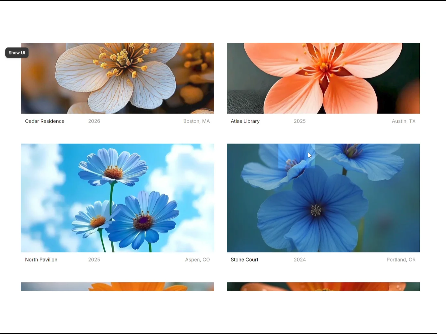
Make your portfolio feel alive. Lens Reveal Grid is a Framer component that turns a normal project grid into an interactive showcase: hover a card and the image softly dims while a bright "lens" window follows your cursor, revealing the picture underneath.
Why you'll like it
Smooth lens that follows the cursor with adjustable easing and zoom
Works with the Framer CMS: drop in a Collection List and it builds the grid in its own design
Or add projects manually, with image, title, year, location and link
Set Columns and Rows separately for Desktop, Tablet and Mobile
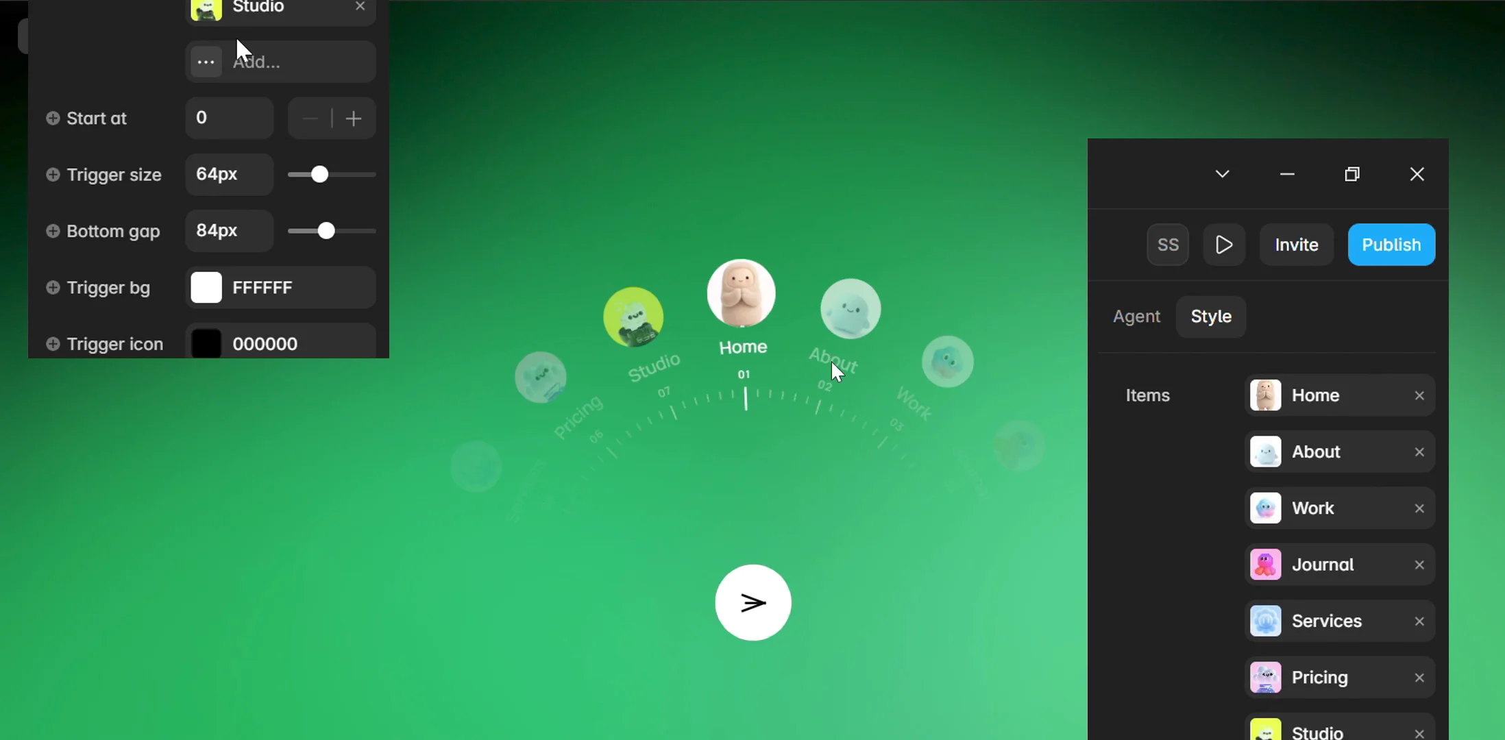
Fully customizable lens: size, radius, zoom, dim color, border, speed
Clean caption row with your own font, colors and spacing
Touch, keyboard focus and reduced-motion friendly
Lightweight: no heavy libraries, images load lazily
What's included
LensReveal.tsx (the component)
Sample CMS file (CSV) to import in one click
Step-by-step user manual
Usage license
User manual (short version)
Framer → Assets → Code → New Component → paste LensReveal.tsx → Save.
Drag "Lens Reveal Grid" onto your page.
Add projects in the right panel, or use the CMS:
Import the included CSV into a collection named "Projects".
Add a Collection List and drag it into the component's CMS slot.
Inside each item add: Image, then Title, Year, Location text layers.
Keep Source = Auto.
Set Columns / Rows for Desktop, Tablet and Mobile, then tune the lens.
Good to know
In CMS mode the text layers must be in order: Title, Year, Location.
Sample images are placeholders. Replace them with your own.
License Use on unlimited personal and client projects. No resale or redistribution of the source code.