About Live Website Preview
Live Website Preview
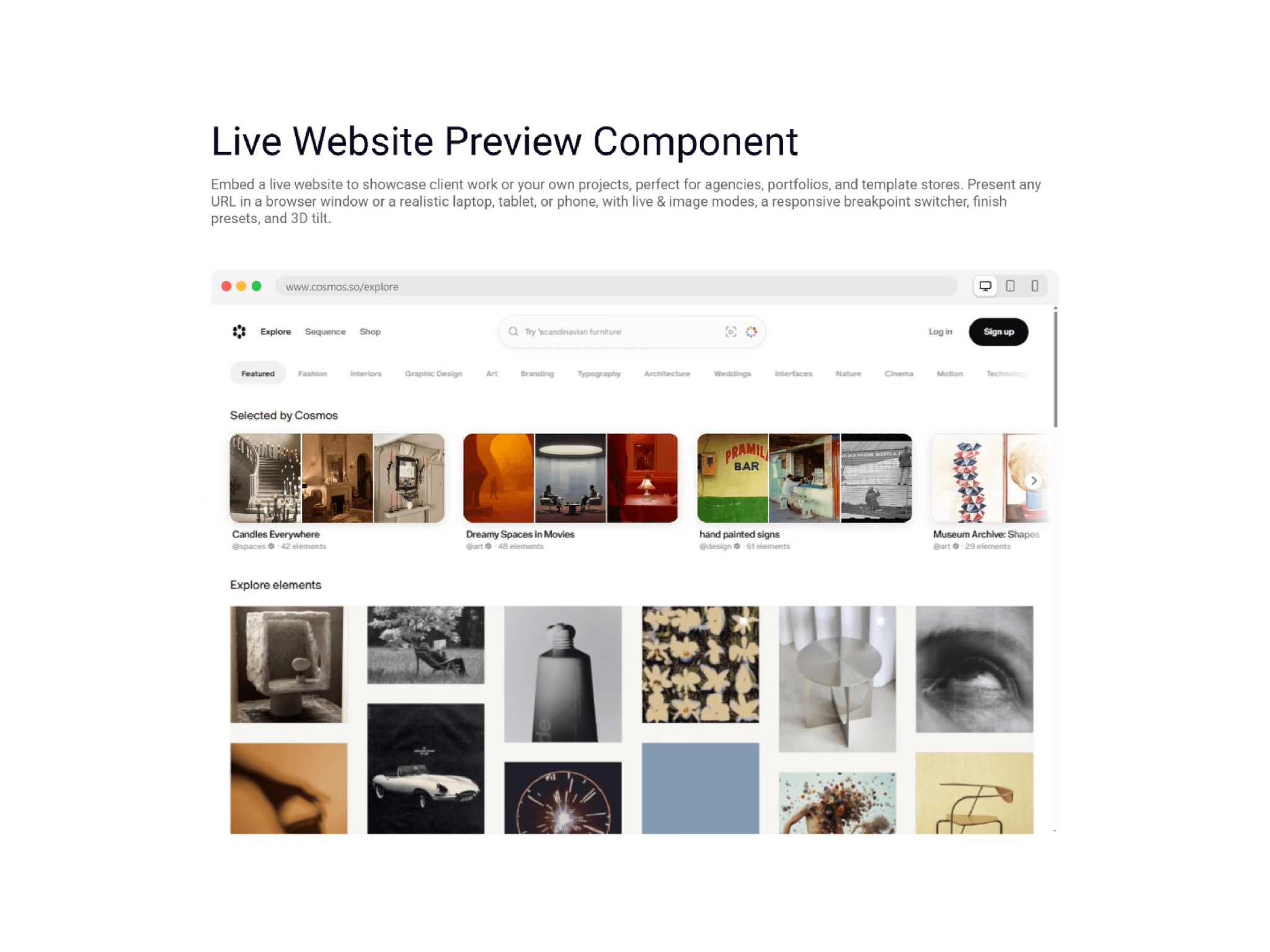
Showcase any website inside a refined, interactive mockup, inside your Framer page.
Turn a plain URL into a polished product shot. This component embeds a real, scrollable web page inside a sleek browser window or a realistic device (desktop, laptop, tablet, or phone) and scales it perfectly to fit. Ideal for agencies, portfolios, and template stores that want to present client work and projects the way they deserve.
Features
Four device mockups: desktop monitor, laptop, tablet, and phone with realistic bezels, plus a clean browser-window mode.
Live and Image modes: embed a live, scrollable site, or use a screenshot for sites that can't be embedded.
Automatic Fallback: blocked sites gracefully switch to your screenshot.
Responsive breakpoint switcher: let visitors toggle Desktop, Tablet, and Mobile and watch the site reflow.
Portrait and landscape: rotate the tablet and phone mockups.
Smooth, uninterrupted browsing: The embedded site keeps its scroll position and page while you resize it or switch breakpoints, with no reloads.
Click to interact: The preview stays out of the way until a visitor clicks into it, so scrolling your page never gets stuck inside an embedded site. Choose Always, On Click, or Never, and customise the label text.
Finish presets: Space Black, Silver, Starlight, and Midnight, or any custom color.
3D tilt: add a premium, angled hero look in one click.
Status bar: optional iOS-style status bar on phone and tablet for added realism.
Fully customizable: colors, corner radius, border, shadow, loading color, and more.
Auto-scaling: looks sharp at any size and every breakpoint.
Perfect for
Agencies showcasing client work
Freelancers presenting projects and case studies
Template and product stores displaying live demos
Portfolios that want to stand out
Good to know
Live mode works with any site that allows embedding. Some larger platforms block embedding for security; for those, simply switch to Image mode and add a screenshot.