About Media Feature tabs
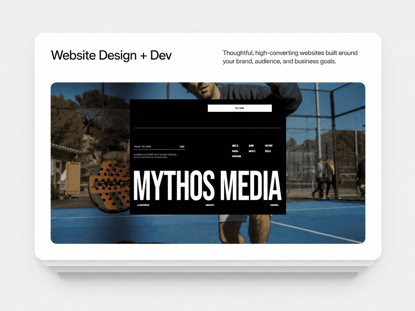
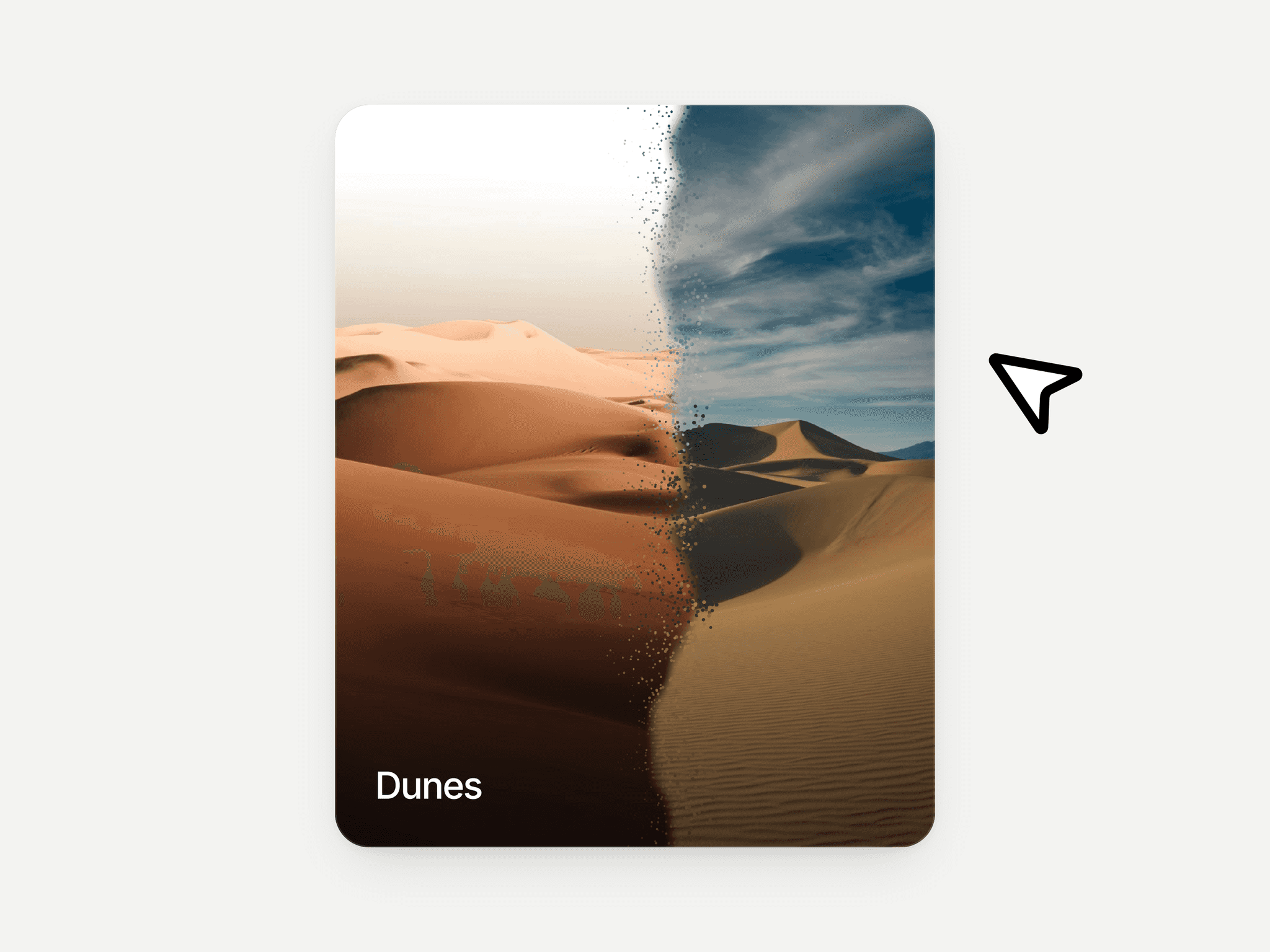
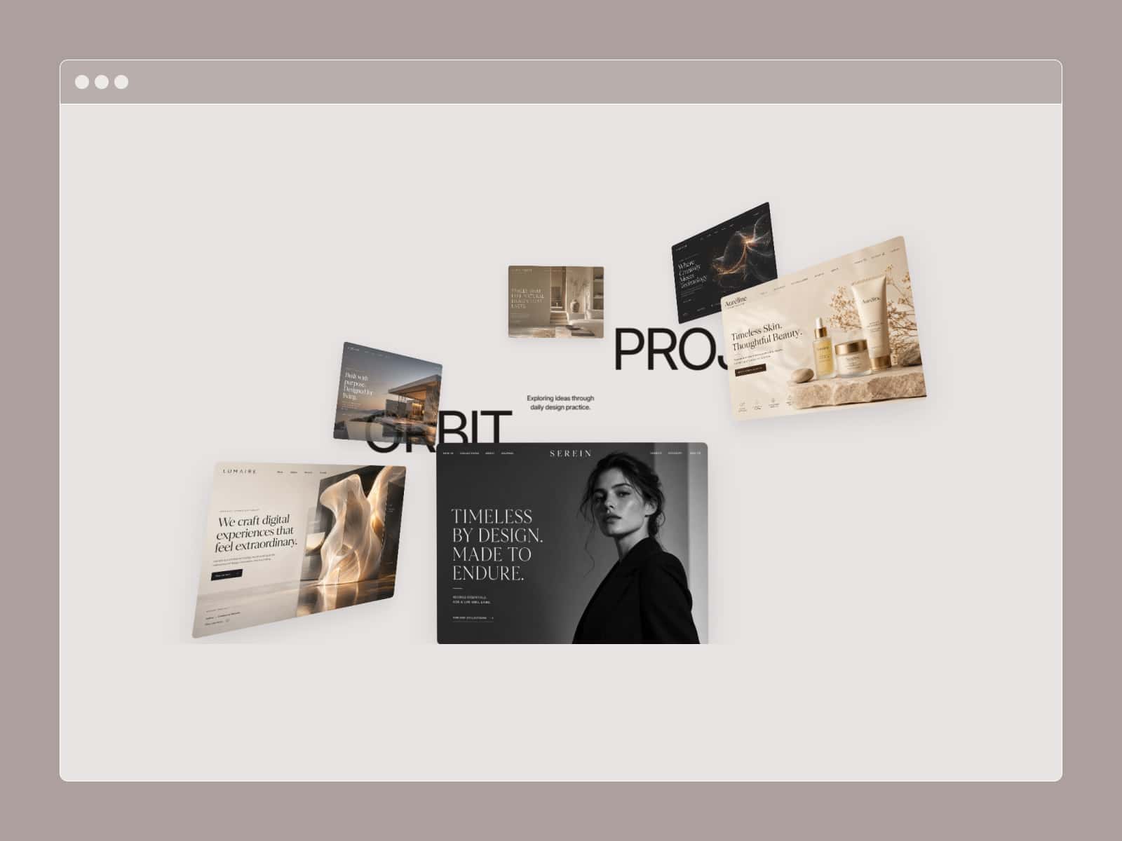
Interactive Feature Explorer is a visual tabbed showcase for presenting different features, services, audiences, projects, or content categories in one focused layout.
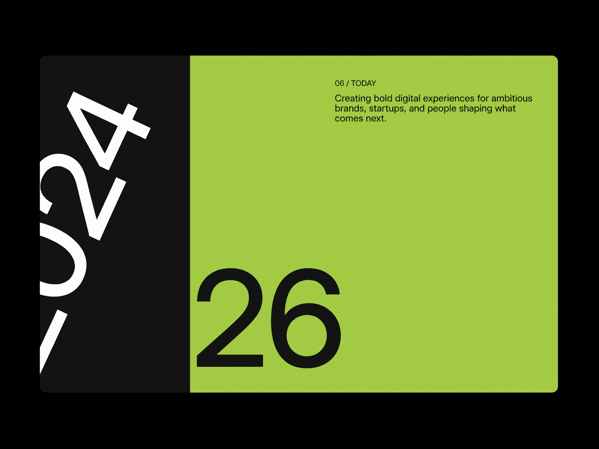
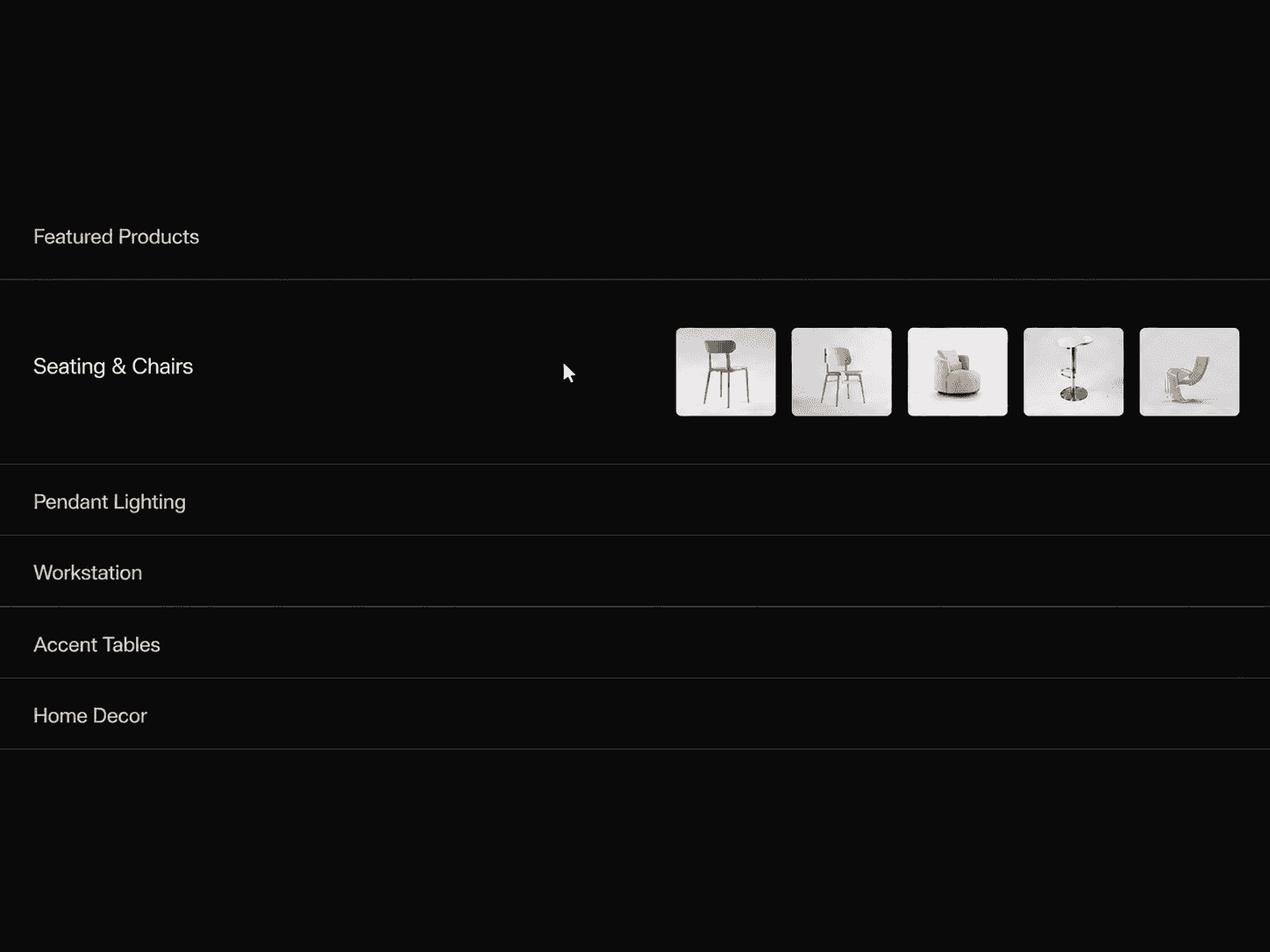
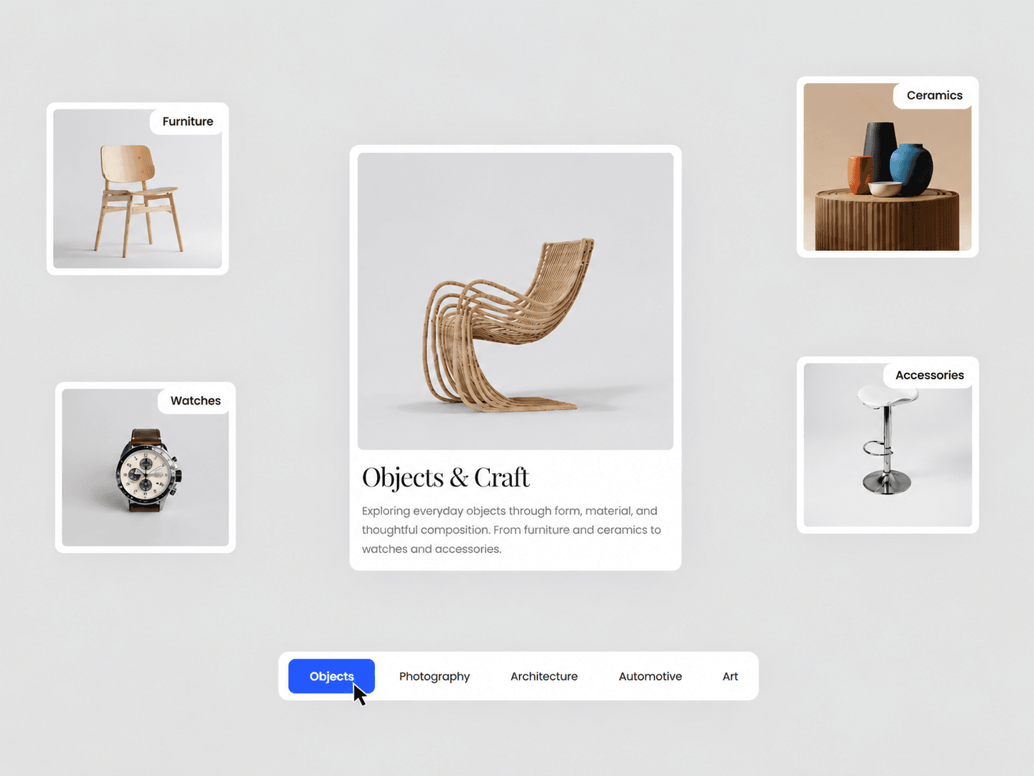
Each tab reveals a central feature card with its own heading, description, image or video, while the remaining cards stack behind it with smooth vertical movement and scaling. Four supporting thumbnail cards appear around the main card on desktop and update with each selected tab.
Features:
Interactive tab-based content switching
Stacked cards with smooth animations
Individual image or video for every tab
Four supporting thumbnails per tab
Animated active tab indicator
Optional links for feature cards
Responsive mobile layout
Horizontally scrollable tabs on mobile
Custom typography, colors, spacing and sizing
Adjustable stack depth, scale and animation speed
Static-render optimized
Fully Customizable:
Build the layout around your own content and visual style directly from Framer's property panel. Every tab can have unique content and media, while the card, thumbnails, tabs, colors, typography, spacing, and animation behavior can all be adjusted to fit your design.
Customize:
Tab labels, headings and descriptions
Image or video per tab
Four thumbnail images and labels per tab
Optional card links
Card width and height
Card and image radius
Content padding
Heading and description typography
Thumbnail size and typography
Tab typography and spacing
Active and inactive colors
Tab container background and radius
Tabs position
Card-to-tabs spacing
Number of visible cards
Stack offset and scale
Animation duration
How It Works:
Choose a tab and the selected feature moves to the front of the stack while the other cards shift behind it. The supporting thumbnails update with the selected content, and the active tab indicator smoothly moves between options.