About Motion Patterns
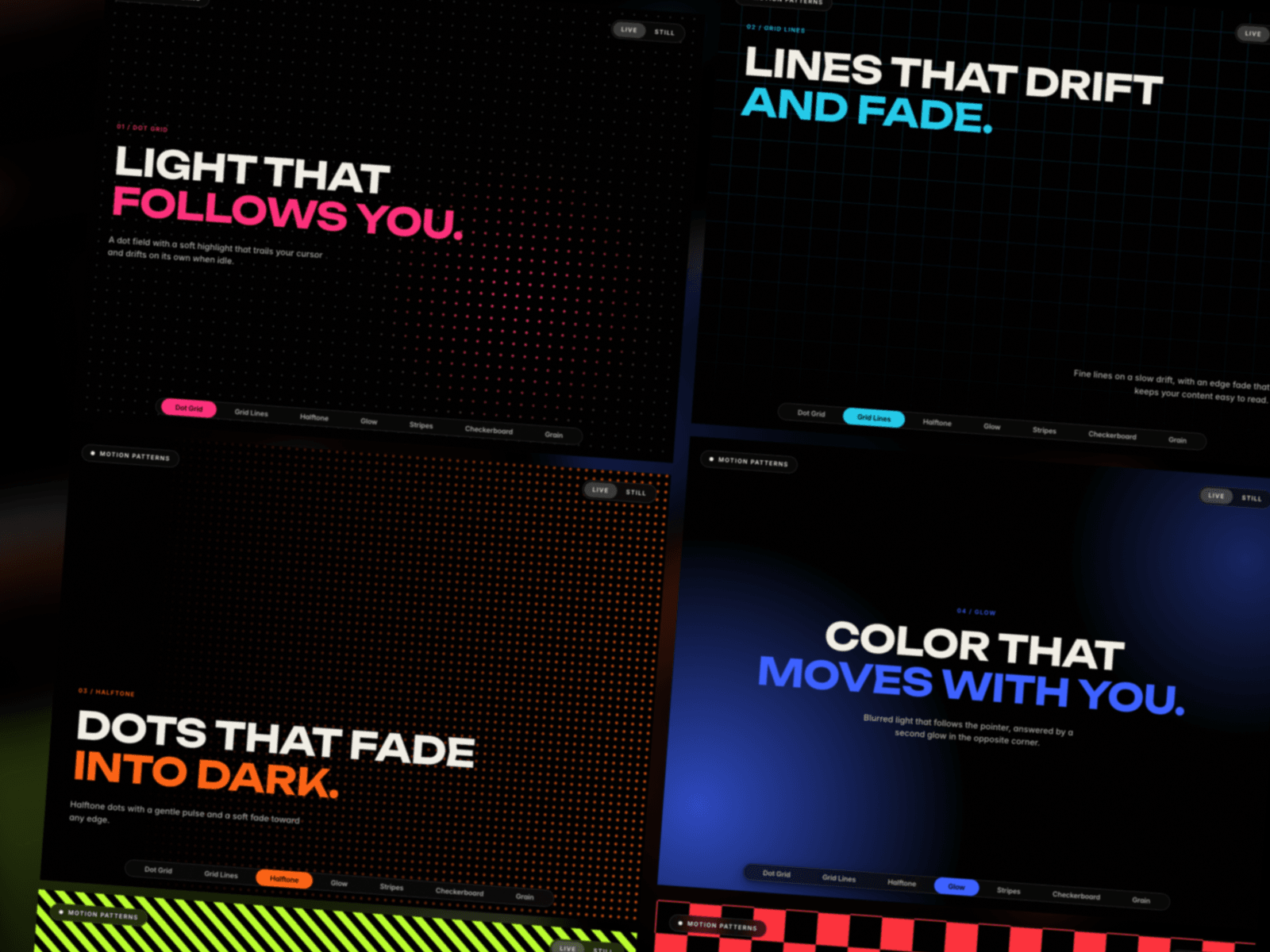
Motion Patterns is one component with eight background styles. Place it behind any section, pick a style in the property panel and set your colours. Everything is drawn in code, so there are no images or videos to load.
STYLES
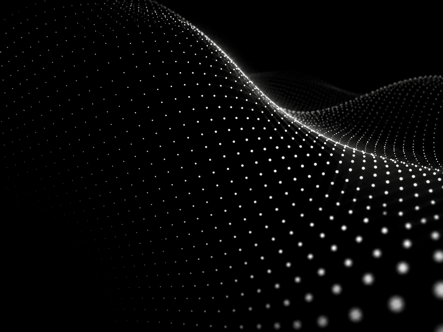
Dot Grid: a dot field with a highlight that follows the cursor and drifts on its own when idle.
Grid Lines: fine lines on a slow drift.
Halftone: dots that slide and pulse.
Glow: soft light with an optional second glow in the opposite corner. It can follow the cursor or drift on its own.
Stripes: seamless stripes at any angle, with adjustable width and speed and optional border lines.
Checkerboard: two colours, any square size and a slow slide.
Grain: film grain with a light flicker, ready to layer over any colour.
Plain: a solid fill for sections that need nothing else.
CONTROLS
Live or Still: one switch freezes every animation. Visitors who prefer reduced motion get the still version automatically.
Edge fade on every pattern, toward the top, bottom, left or right, with adjustable start and length.
Colours and sizes for every style, plus speed controls wherever a style moves.
Solid or transparent background, so the pattern can sit over your own colour or image.
A separate Dot Grid highlight radius for components under 600px wide.
GOOD TO KNOW
The component ignores pointer events, so buttons and links on top stay clickable.
Cursor tracking pauses while the component is off screen.
It fills any container, fixed or responsive.
Built for hero sections, cards and footers. Drop it in, choose a style, done.