About Native Date Picker
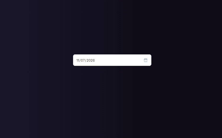
Bring native, fully functional date selection to your Framer forms with this lightweight, highly customizable Date Picker component.
Designed specifically to integrate seamlessly with Framer's native form blocks and third-party form backends, this component gives you absolute design freedom without sacrificing native browser calendar accessibility or mobile responsiveness.
✨ Key Features
Seamless Form Integration: Fully compatible with standard Framer form naming attributes (
name,required,disabled) for smooth data submission to tools like Formspark, Formspree, or custom endpoints.Full Design Customization: Style every single detail directly from Framer’s right-hand property control panel—no code editing required.
Custom Calendar Icon & Tinting: Easily match your brand identity by picking a custom color for the calendar icon.
Polished Micro-Interactions: Includes smooth focus states with independent active border colors, placeholder styling, and clean padding controls.
Responsive & Accessible: Leverages native browser date pickers to ensure a frictionless user experience across desktop, tablet, and mobile devices (with clean rounded overlay styling).
🎨 Customizable Property Controls
Field Settings: Field Name, Placeholder text, Required toggle, Disabled toggle.
Typography: Font Family, Font Size, and Font Weight (Light, Regular, Medium, Semi-Bold, Bold).
Colors: Text Color, Placeholder Color, Background Color, Border Color, Focus Border Color, and Calendar Icon Color.
Layout & Spacing: Border Width, Corner Radius, and Vertical/Horizontal Padding controls.