About Neon Checkbox
Neon Checkbox — A Little Glow Goes a Long Way
A simple checkbox doesn't have to feel ordinary.
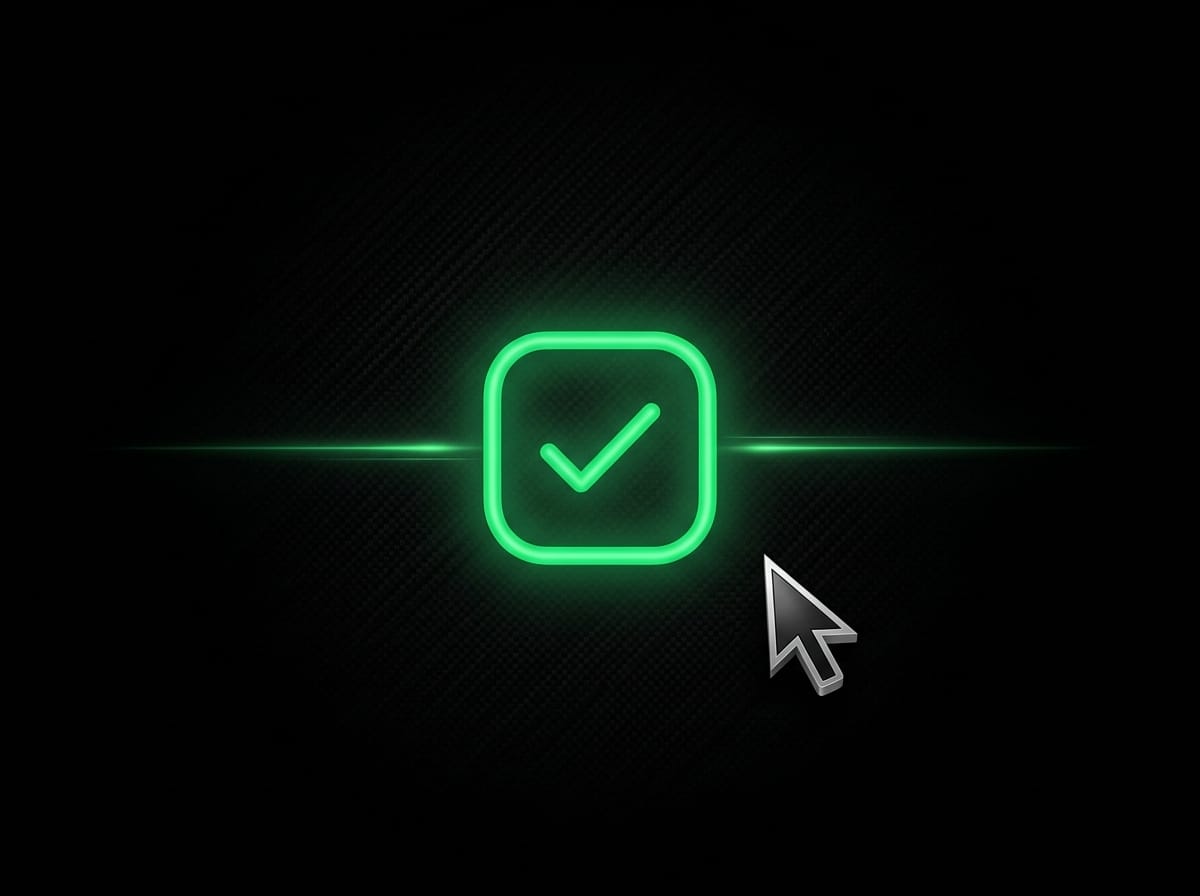
Neon Checkbox transforms a familiar UI element into an expressive micro-interaction. Select it to reveal a vibrant neon gradient, a spring-animated checkmark, and a pulsing glow. Hover to discover subtle movement and glowing details.
Inspired by the neon aesthetic of Uiverse, this Framer component brings playful, code-driven interactions straight to your canvas.
✨ What Makes It Different?
Animated Checkmark — Rotates and scales into view with a spring-like feel.
Neon Gradient — Transitions into a vivid gradient when selected.
Pulsing Glow — Adds visual feedback without overwhelming the interface.
Interactive Hover — Subtle movement brings the checkbox and label to life.
Customizable Styling — Adjust colors, size, corner radius, glow intensity, and typography directly in Framer.
🎨 Make It Yours
Customize the component to match your design:
Label text and font size
Neon and gradient colors
Checkbox size and corner radius
Glow intensity
Initial checked state
No need to edit the code just to personalize its appearance.
🚀 Perfect For
Cyberpunk websites, dark-mode settings, gaming interfaces, creative portfolios, futuristic landing pages, and experimental UI designs.
For the best visual impact, pair it with dark backgrounds, clean typography, and plenty of breathing room.
📦 Getting Started
Add Neon Checkbox to your Framer canvas.
Customize its label, colors, and dimensions.
Adjust the glow to suit your design.
Preview the interaction and use it in your project.
Small component. Distinct personality. A little neon, right where you need it.