About Shift Circle Button
About Shift Circle Button
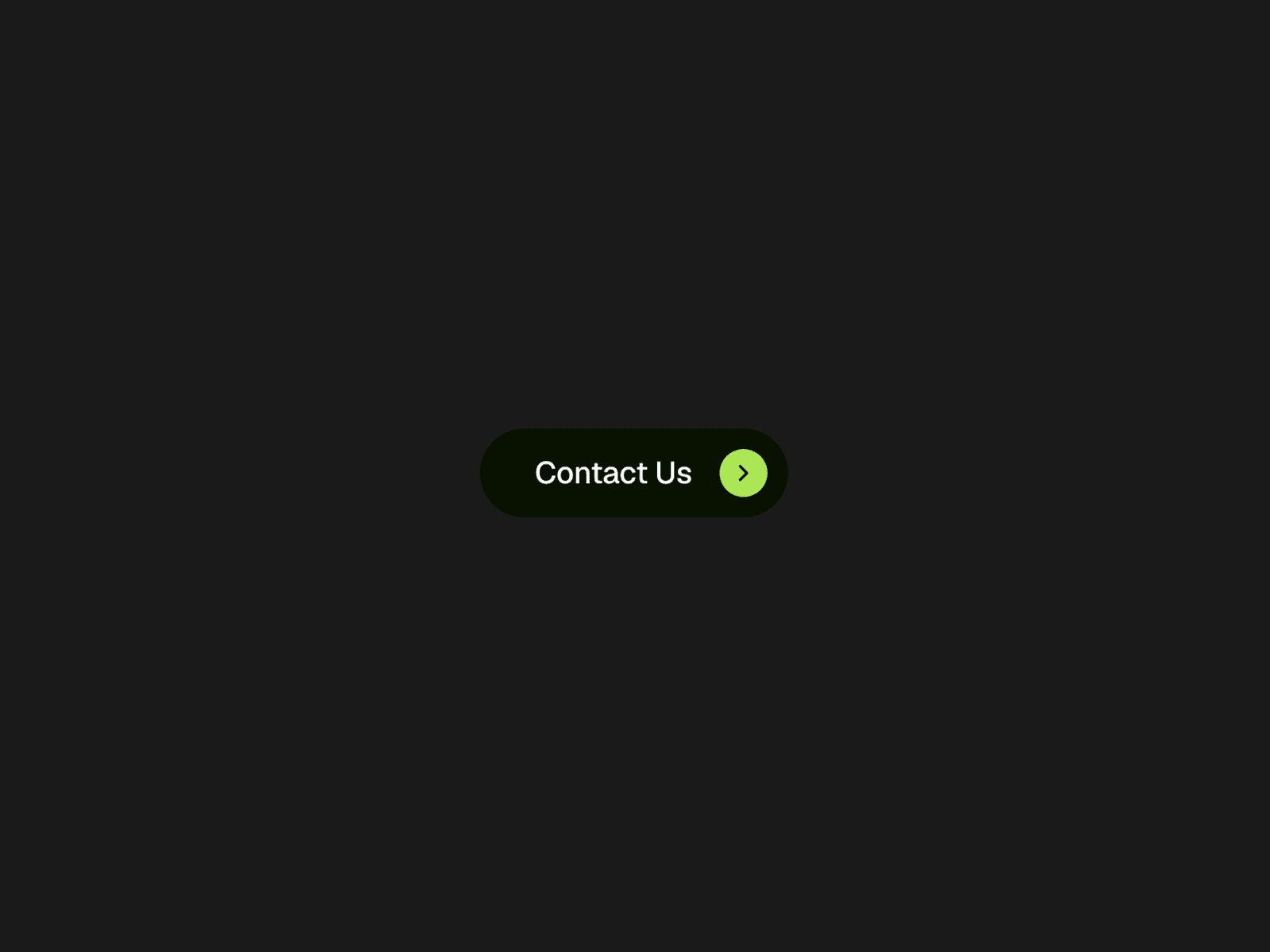
Shift Circle Button is a dynamic, interactive CTA component for Framer. In its default state, the circular icon badge rests on the right side of the button. On hover, it smoothly slides and expands to the left, creating an engaging directional microinteraction. Designed for modern web experiences, it brings a fresh, playful animation to your CTAs while staying clean, responsive, and fully customizable.
What you can customize:
Customize the label, font, typography, text color, initial background color, circle badge background color, hover colors, icon (arrow/custom), icon size, button padding, border radius, transition speed, and easing curve. The self-contained Framer code component requires no external dependencies and works effortlessly across all devices.
Great for (examples):
Just a few ideas, use it anywhere you want an eye-catching interactive button:
• Hero section Call-to-Actions (CTAs)
• Interactive buttons and landing pages
• Agency, design studio, and portfolio websites
• SaaS platforms and startup launches
• Product case studies and showcase pages
• Conversion-focused promotional banners
• Microinteractions and hover animations
• Responsive Framer projects and templates
Need help?
Questions or feedback? Reach me anytime: tkach.web.designer@gmail.com