About Page Transition Kit
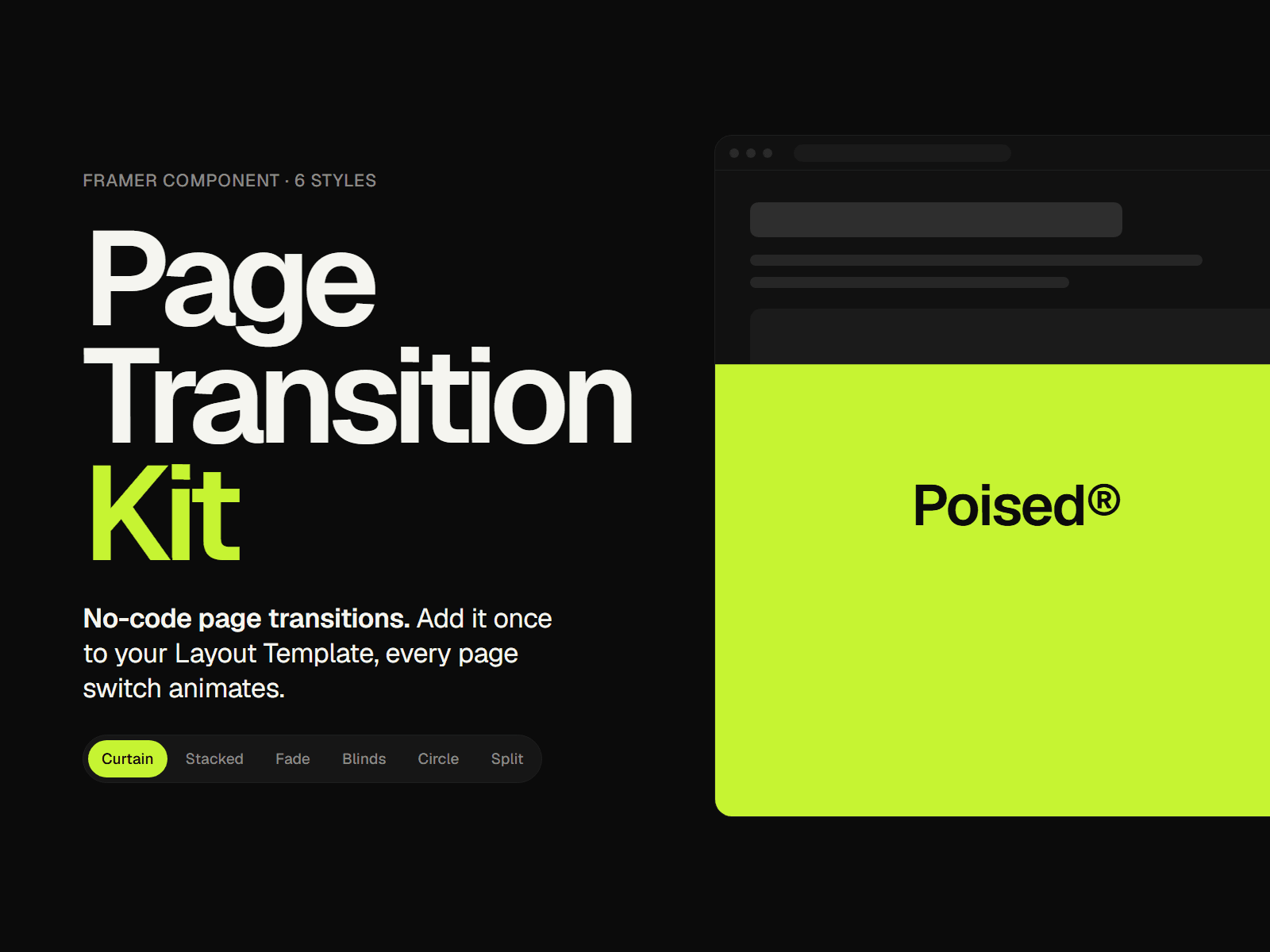
Page Transition Kit gives your page switches a smooth, branded cover animation. Add one instance to your Layout Template (Use as: Layout) to set the style, then use it for your nav links (Use as: Link). No code and no interactions to wire up. It only handles its own links, so nothing else on your site is touched.
Key Features:
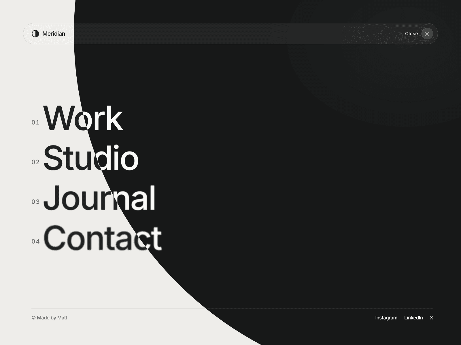
• 6 Transition Styles: Curtain, Stacked, Fade, Blinds, Circle and Split.
• Set Once, Use Everywhere: one Layout instance holds the style; every Link instance plays it.
• Brand Label: show your logo or a word in the middle of the transition.
• Intro Mode: optionally play the reveal once when the site first loads.
• Clean & Safe: it only handles its own links, so the rest of your site works exactly as before.
• Accessible: visitors with Reduce Motion turned on get a short, gentle fade instead.
• Responsive: works on desktop, tablet and phone, with an option to turn it off on mobile.
⚙️ Complete Property Controls:
• Use as Layout (holds the style) or Link (link, text, font, color & hover color)
• Transition style & direction (up, down, left, right)
• Cover color, plus a second accent color for Stacked
• Number of bars for Blinds
• Duration, hold time & easing (Smooth, Expo, Out, Linear)
• Label: none, text (font & color) or image (with width)
• Play on load & Disable on mobile
💡 Designed for portfolios, agency and studio sites, SaaS and product marketing sites, and personal brands.
How to install:
1. After purchase you get the component link by email and on the receipt page.
2. Open your Layout Template and paste the link onto its Desktop frame. Keep "Use as: Layout" and pick a style, color and label.
3. For each nav link, drag another Page Transition from the Assets panel into your nav, set "Use as: Link", then set its Link, Text, Font and colors. Delete the old text link.
4. Publish and click your nav links.
Tip: use only one Layout instance. All Link instances use its style.