About Particle Hover Card
About
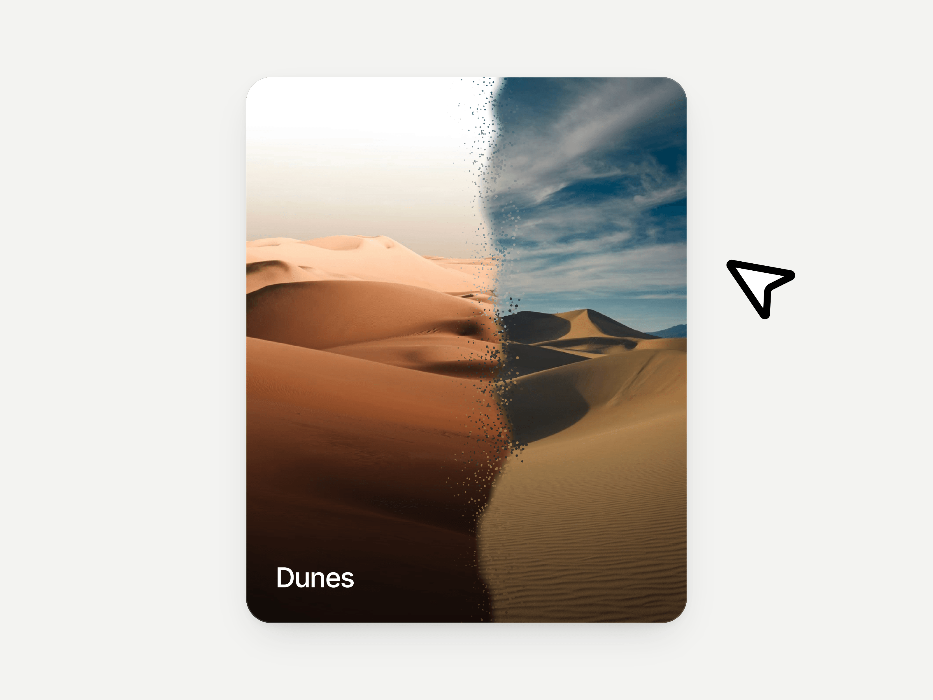
Particle Hover Card is an interactive image card for Framer that reveals a second photo through a directional particle transition. Fine grains scatter and fade as the reveal moves across the image, reversing smoothly when the pointer leaves. Choose hover or click interaction, with tap-to-toggle on touch devices, optional titles, and a separate arrow link for project pages or product details.
What you can customize
Built as a Framer code component with easy property controls. Customize both images, titles, typography, image fit and position, colors, shading, corners, shadow, and link settings. Adjust particle density, size, scatter, direction, pattern, color, and animation duration without editing code. Includes keyboard controls and a reduced-motion image fade.
Great for (examples)
Just a few ideas, use it anywhere two images tell a better story:
Portfolio cards, project previews, and case studies
Product images, packaging, and alternate product views
Photography previews, photo edits, and retouching reveals
Travel destinations, hotels, and seasonal scenery
Architecture projects, interiors, and renovation imagery
Fashion editorials, lookbooks, and campaign visuals
Artwork details, illustrations, and creative experiments
Before-and-after images with hover or tap reveals
Share your build
If you ship something cool with it, post it on X and tag me @Matthias_Oel, or send it over. I’d love to see what you create.
Need help?
Questions or feedback? Reach me anytime: matthias@lmvision.de or on X @Matthias_Oel.
Need a matching component?
Show more of your work with Real Folder or MacBook Carousel.