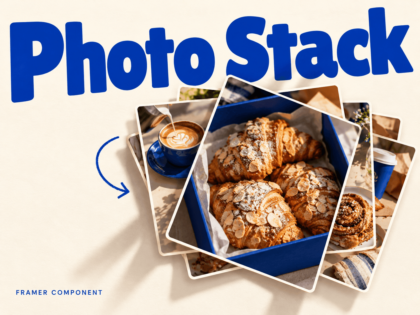
About Photo & Card Stack
Image & Card Stack is a Framer image or card stack component for photo galleries and connected native cards. Give portfolios, brand stories and step-by-step content a tactile, layered presentation.
This is a free code component we created for our Framer template. See how it looks like in real project here: https://framer.link/AVGjxxi
Features
Click, tap or drag horizontally to cycle through the stack.
Browse with Enter, Space and arrow keys.
Up to 12 images or connected canvas frames/components.
Smooth return-to-back motion and reduced-motion support.
What you can customize
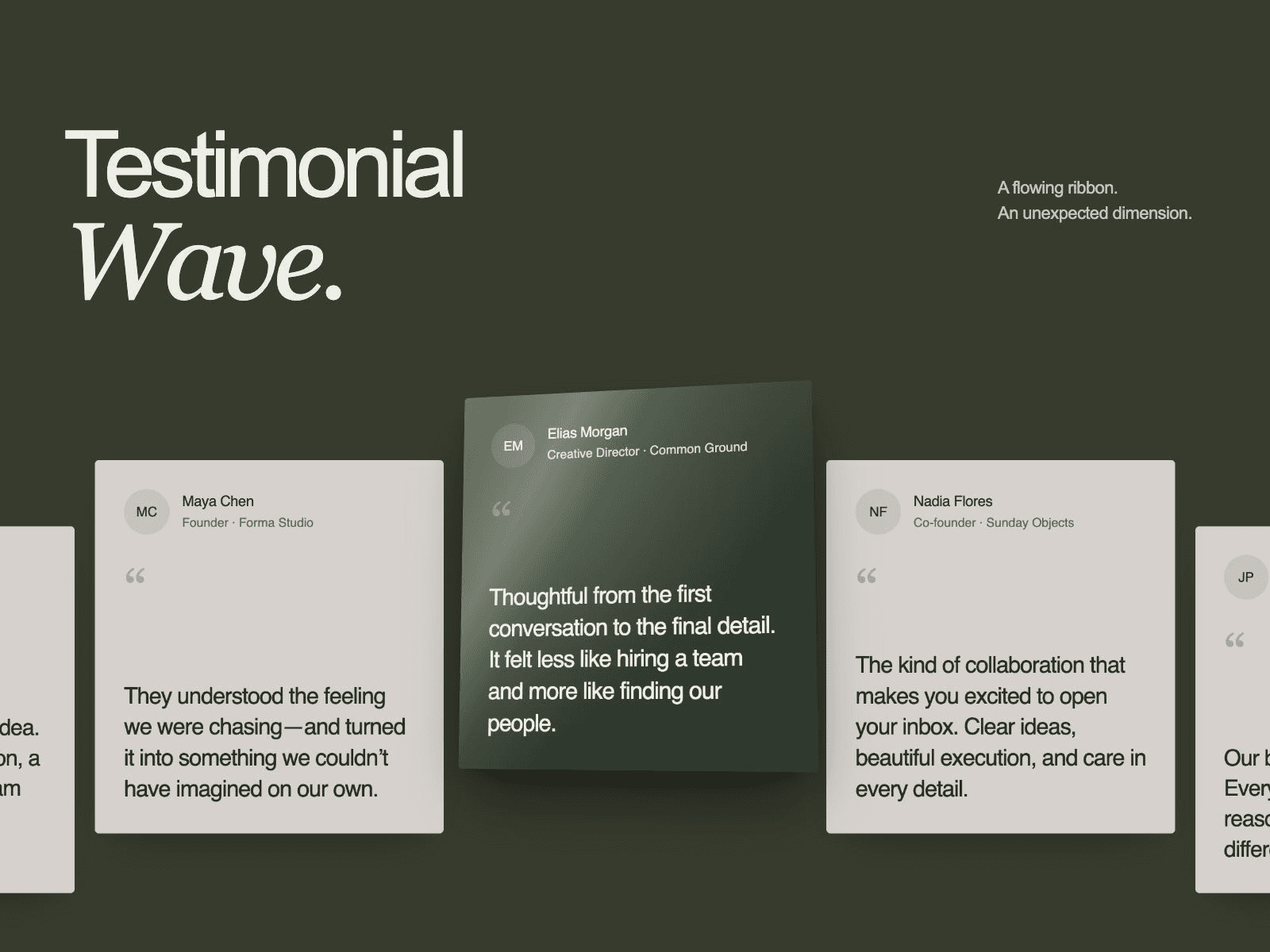
Choose Images or connect it to the Cards as your content source.
Upload photos with descriptions, or connect your own cards.
Adjust spread, image corners, paper and focus colors.
Set the instance size; image mode needs an explicit height. Cards keep their own styling.
Best for
Portfolio galleries that reveal projects one image at a time.
Brand photo stories with an informal, scattered layout.
Process cards that turn a sequence into an interaction.
Product or editorial highlights using native Framer content.
Share your work
Tag me on X or send your project to hello@struxent.com. I'd love to see it.
Need help?
Questions or feedback? Email hello@struxent.com.
Need a matching component?
Pair the stack’s playful image layering with:
Product Ribbon for a looping outline around product imagery.
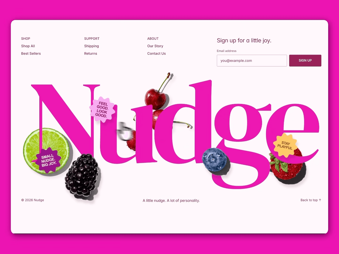
Playful Footer for layered fruit and sticker artwork; match its colors to your stack.