About Plan Ledger
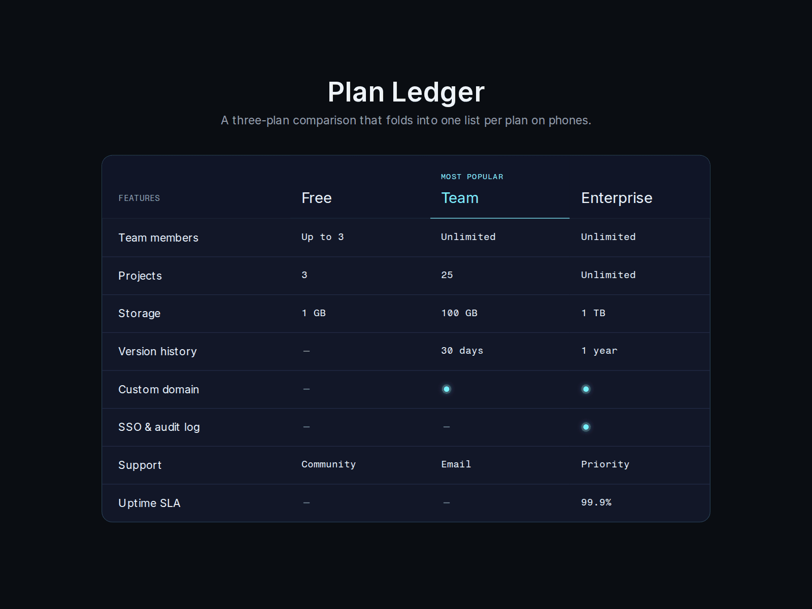
A side-by-side comparison of three plans. From 700 px wide it is a table with a header row that stays under your nav while the page scrolls. Narrower than that it turns into one list per plan that folds open and shut, so there is no sideways scrolling on a phone. The switch follows the width of the component, not the window, so it also works inside a narrow column.
Type "yes" or "no" in a cell and you get a lit dot or a dash with a text label for screen readers. Anything else, such as "Up to 3", "30 days" or "99.9%", is shown as written. The recommended plan gets a badge and an accent line. The folds are real buttons: Tab to one, Enter or Space opens it, and you pick which plan starts open on phones.
Set it up in the properties panel: three plan names, the highlighted plan and its badge text, the corner label, the plan that starts open on phones, the sticky offset in pixels (put your nav height there), the rows (up to 20, each with a feature and one value per plan) and the two screen reader labels. Pick one of two skins: Glass, a dark translucent panel with a cyan accent, or Light, paper and ink with an orange accent. Seven color controls (leave them empty to use the skin colors) and three fonts. It runs on its defaults, so you can drop it on a page and try it first.
It is one file with no images and nothing fetched. Works in any Framer plan. Free for personal and commercial projects.
The preview shows the component on its own, so you can try both skins and the settings without a whole site around it. It was pulled out of our Bathysphere template: https://www.framer.com/marketplace/templates/bathysphere/